Crayola Flowers
Brand Identity | Logo Development | Style Guide
StyleWorks developed a brand identity Crayola Flowers, providing a style guide for the sub-brand that included a logo system, color palette, support fonts, signature patterns, and direction for various product, packaging, and marketing applications.
Logo Development
We started by adapting the official Crayola logo, adding a flower graphic to the “O” to give it a whole new feeling. Our guide included one-color versions as well as additional options using custom backgrounds made exclusively for the program.

Color Palette
We developed an expanded color palette with bright, bold hues to coordinate with Crayola’s signature yellow and green, as well as with the beautiful flowers being sold.
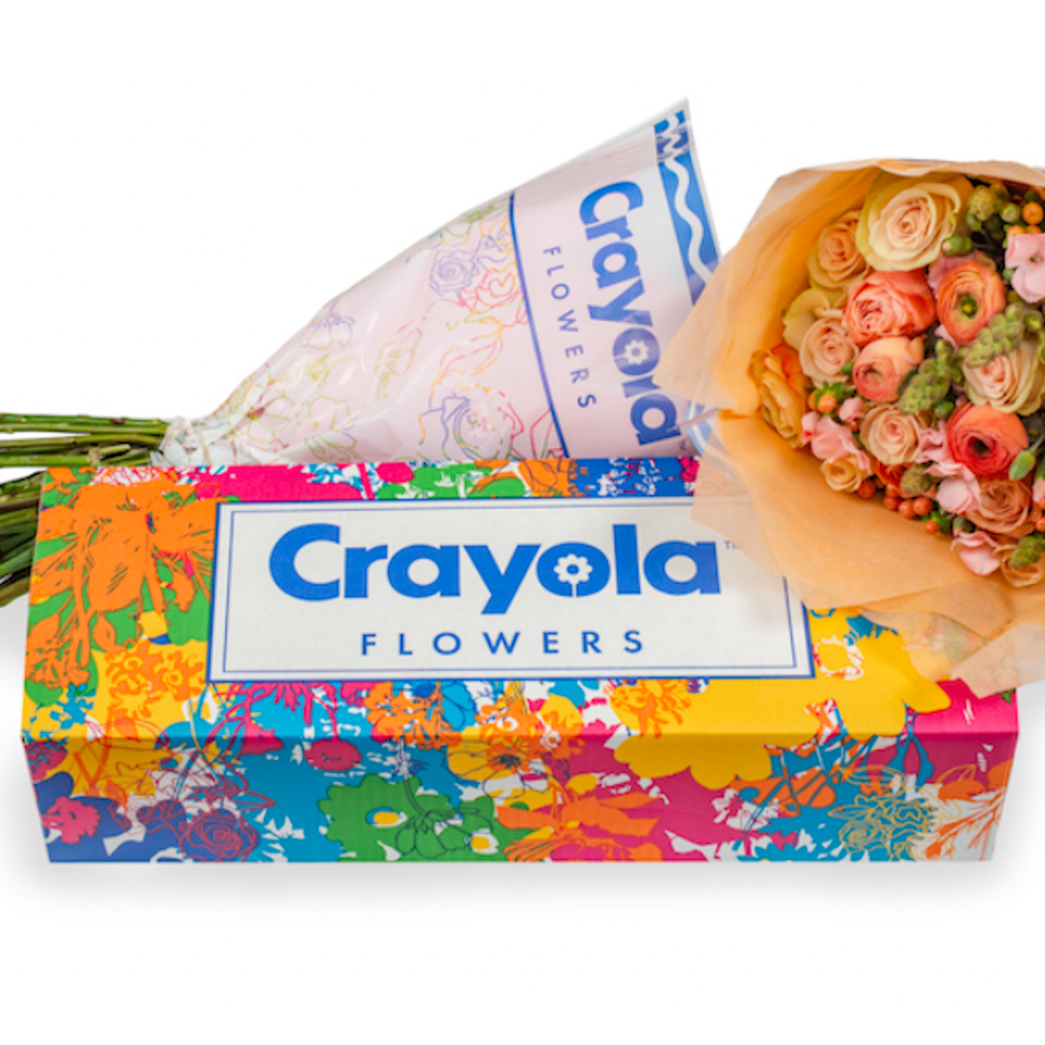
Signature Patterns
Our guide also provided a series of repeat patterns in a variety of colorways for bouquet wraps and other branded elements.

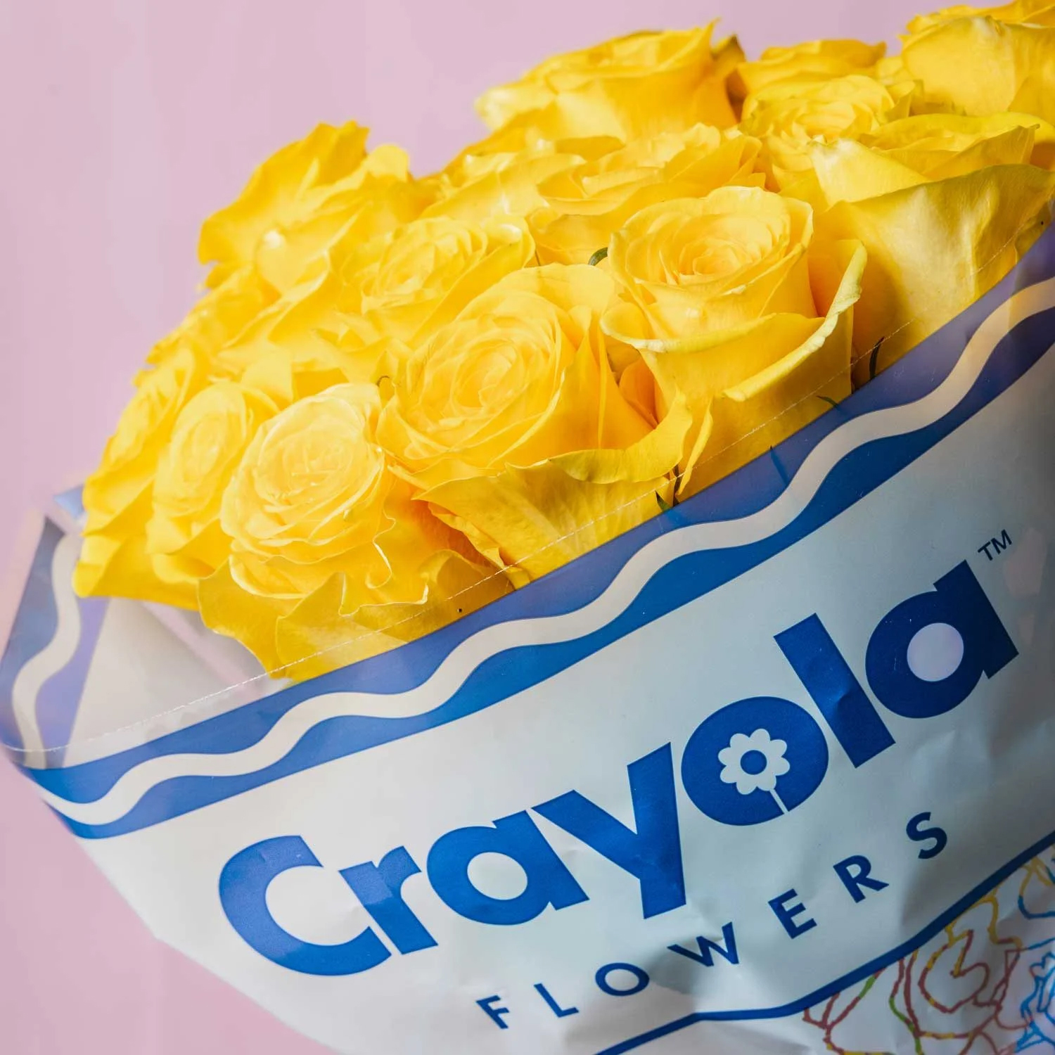
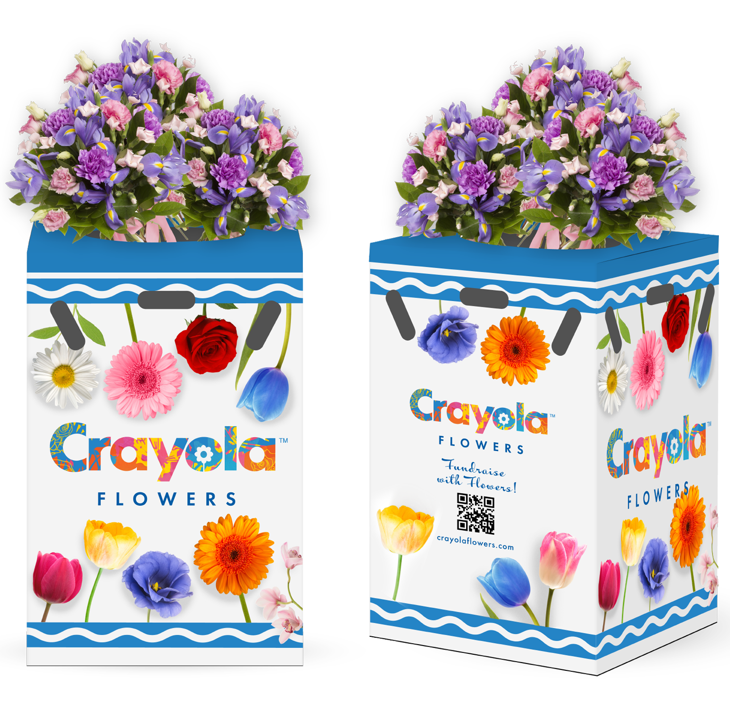
Packaging
Reinforcing the core brand, we included Crayola brand elements, including their trademarked Serpentine, pairing them with the patterns, colors, and logos for an exciting packaging system.

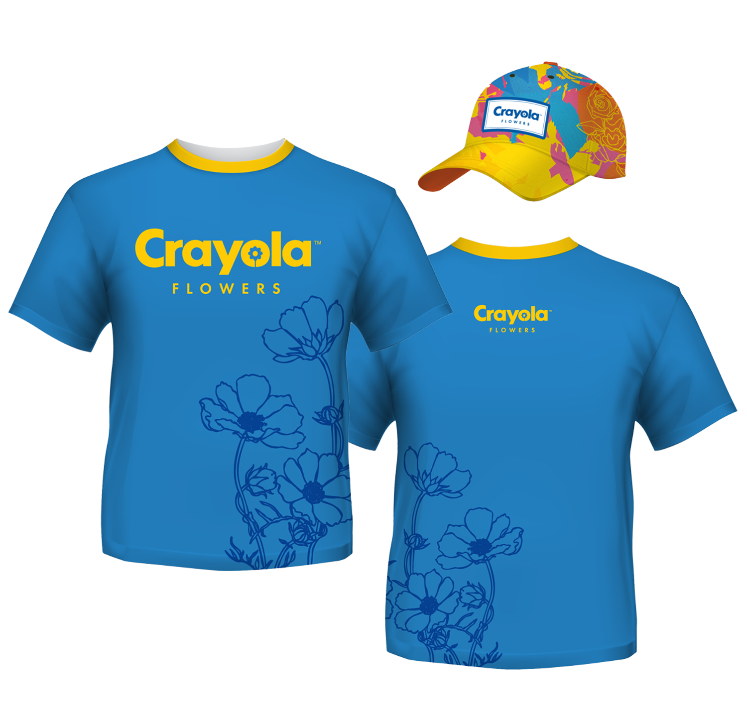
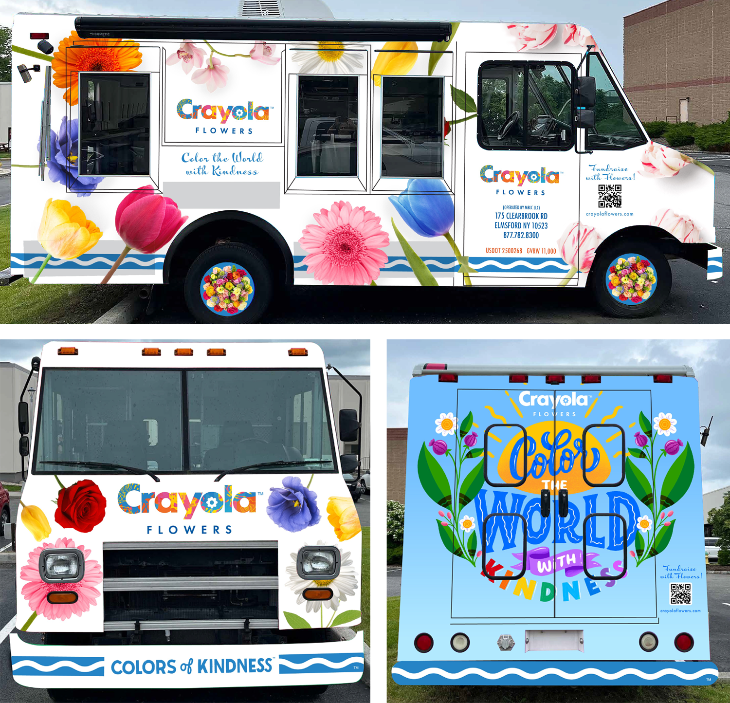
Brand Activations
In addition to marketing activations for social media and advertising, we were developed art assets for the official Crayola Flowers vehicle, as well as uniforms and retail fixtures.

Crayola Flowers came into full bloom with a special fundraising platform and user friendly website, where you can purchase flowers with part of the proceeds going to the non-profit of their choice. The brand launched with a spectacular event at Grand Central Station that received national attention.
