Rita’s Italian Ice
Brand Vision | Style Guide | Creative Asset Collection | Packaging System | Product Vision
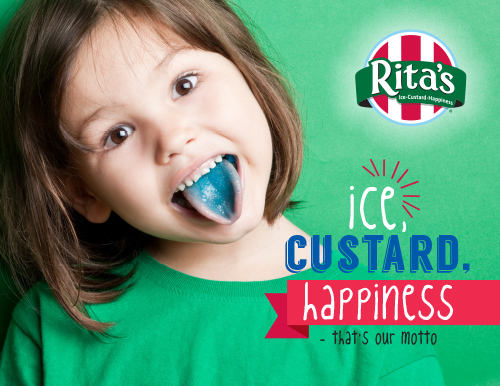
For Rita’s Italian Ice, StyleWorks developed a consumer products brand vision and creative asset guide that built on the brand’s original marketing style, using its playful personality to inform a variety of composed designs and packaging applications.

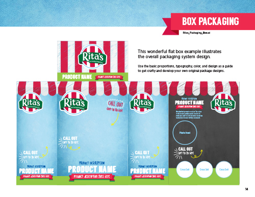
Packaging for Consumer Products
We were able to translate the major visual elements of the Rita’s brand into packaging for consumer products, keeping the overall look and feel of the brand extension compatible with their original marketing.


Sweet Color Palette
For our color palette, we found inspiration in some of our favorite Rita’s flavors, using their actual colors as a tasty starting point.

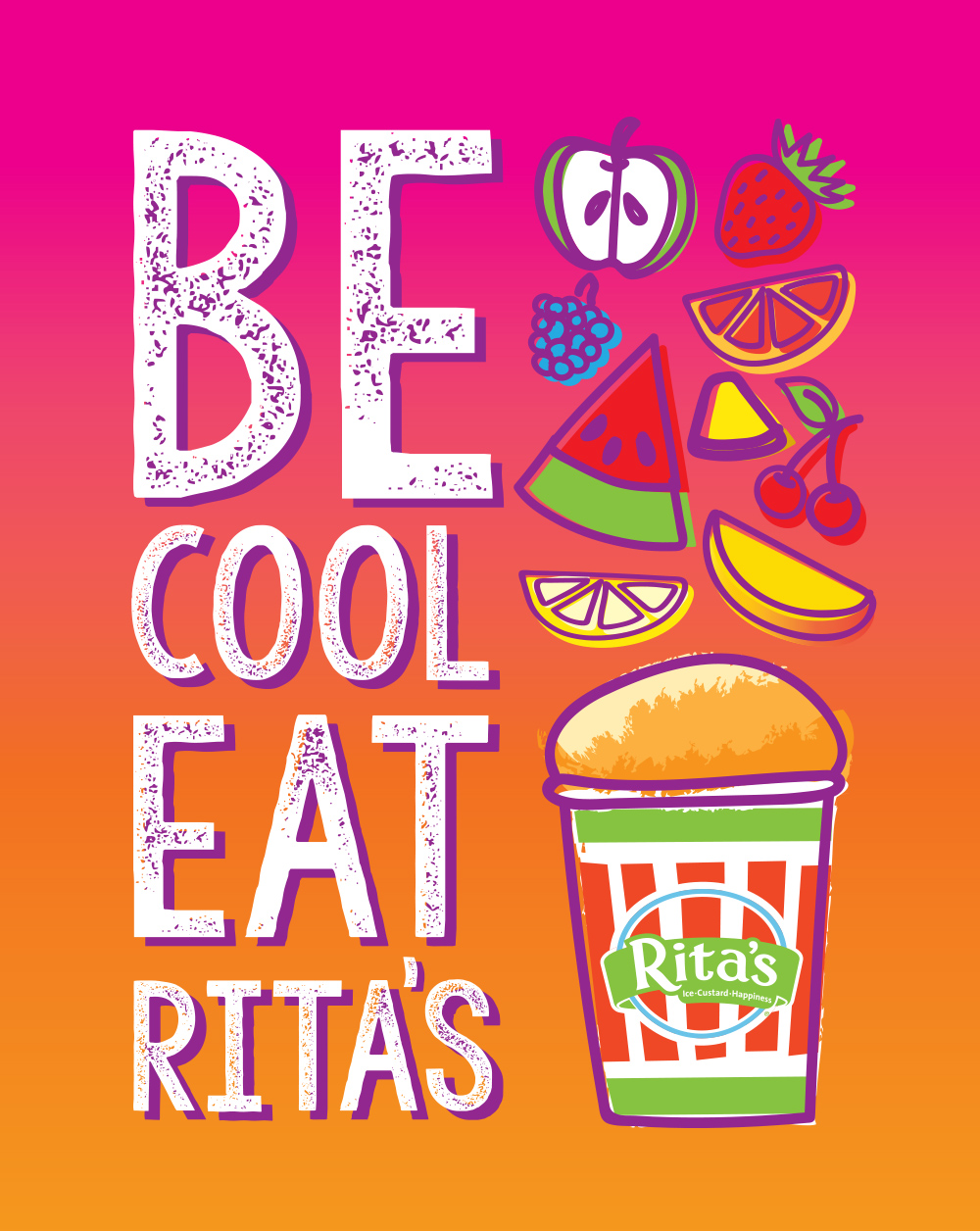

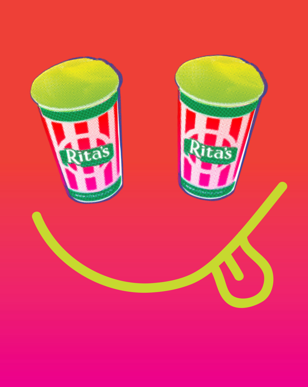
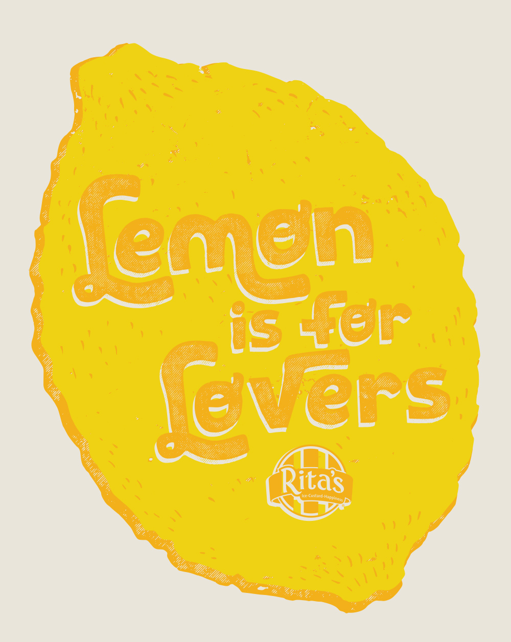


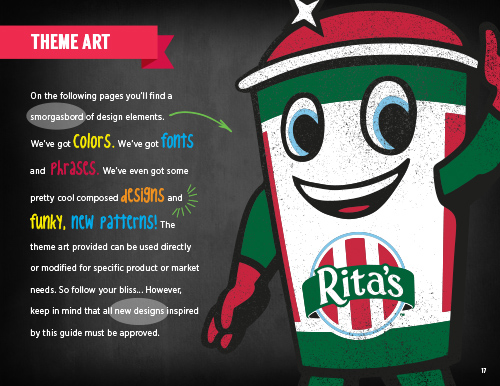
Delicious Designs
Our composed designs captured the brand’s fun and freewheeling attitude through a dynamic combination of expressive illustrations and campy editorial sayings.
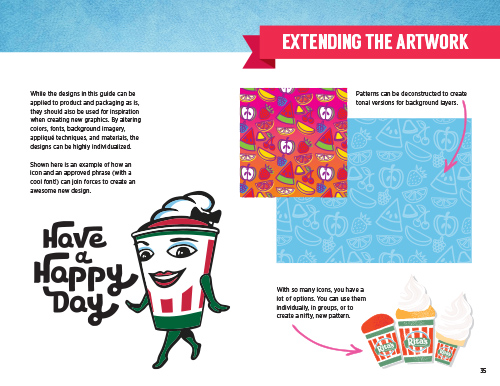
Licensees can use these designs as they appear or for inspiration when creating new designs. They can even create new designs by modifying the various graphic elements.
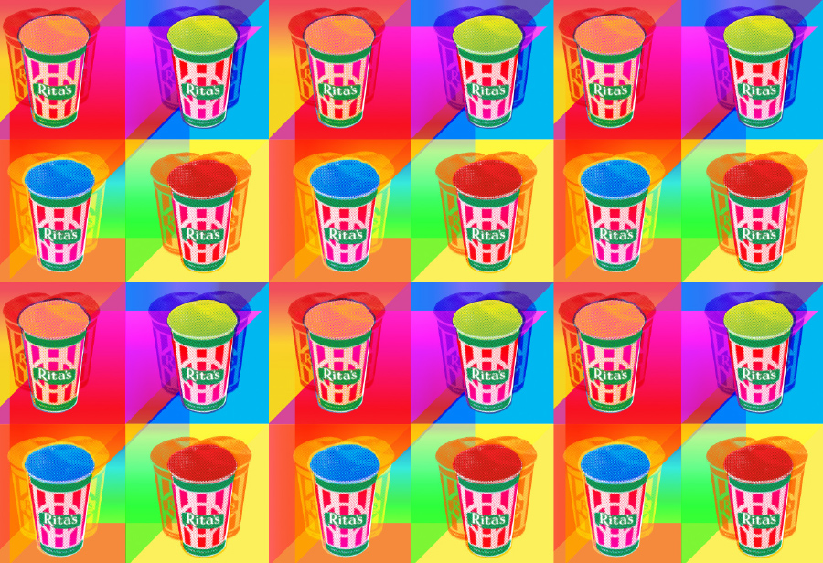
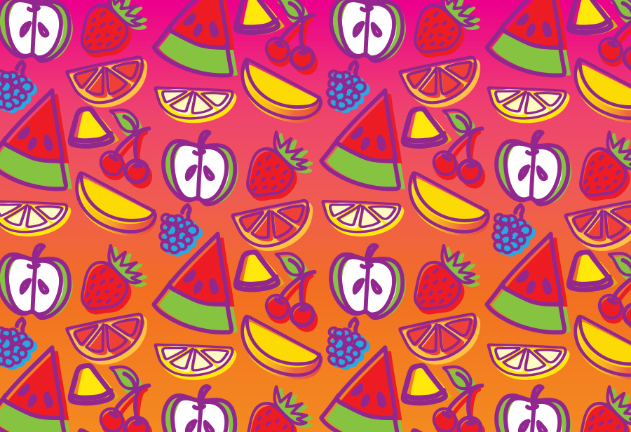
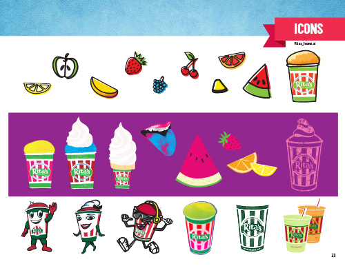
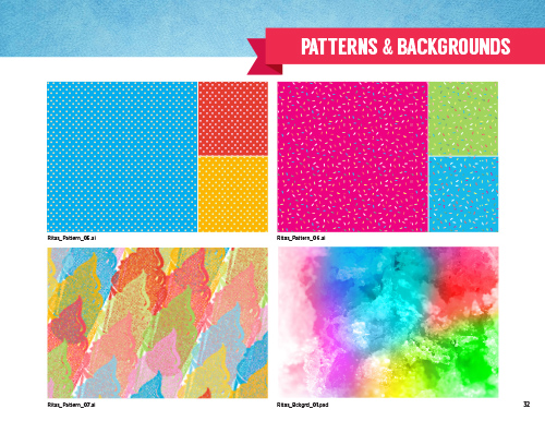
Playful Patterns
With so many new graphic elements at our disposal, we also provided repeat patterns that could be used with a variety of product and packaging applications.
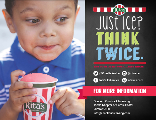
Other projects for popular food and beverage brands include our style guides for White Castle and Cheetos.