White Castle
Licensing Style Guide | Creative Asset Collections | Packaging System | Product Vision
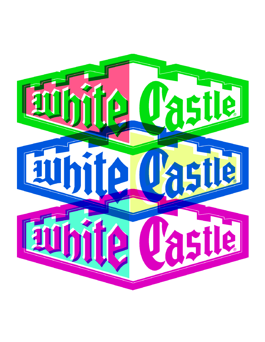
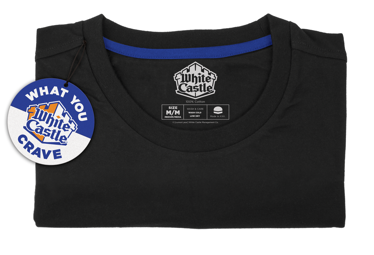
For White Castle, StyleWorks joined Brandgenuity to develop a licensing style guide and packaging system that extended the core brand further into consumer packaged goods, including apparel and accessories, as well as three spirited creative asset collections, each capturing a different aspect of the brand.
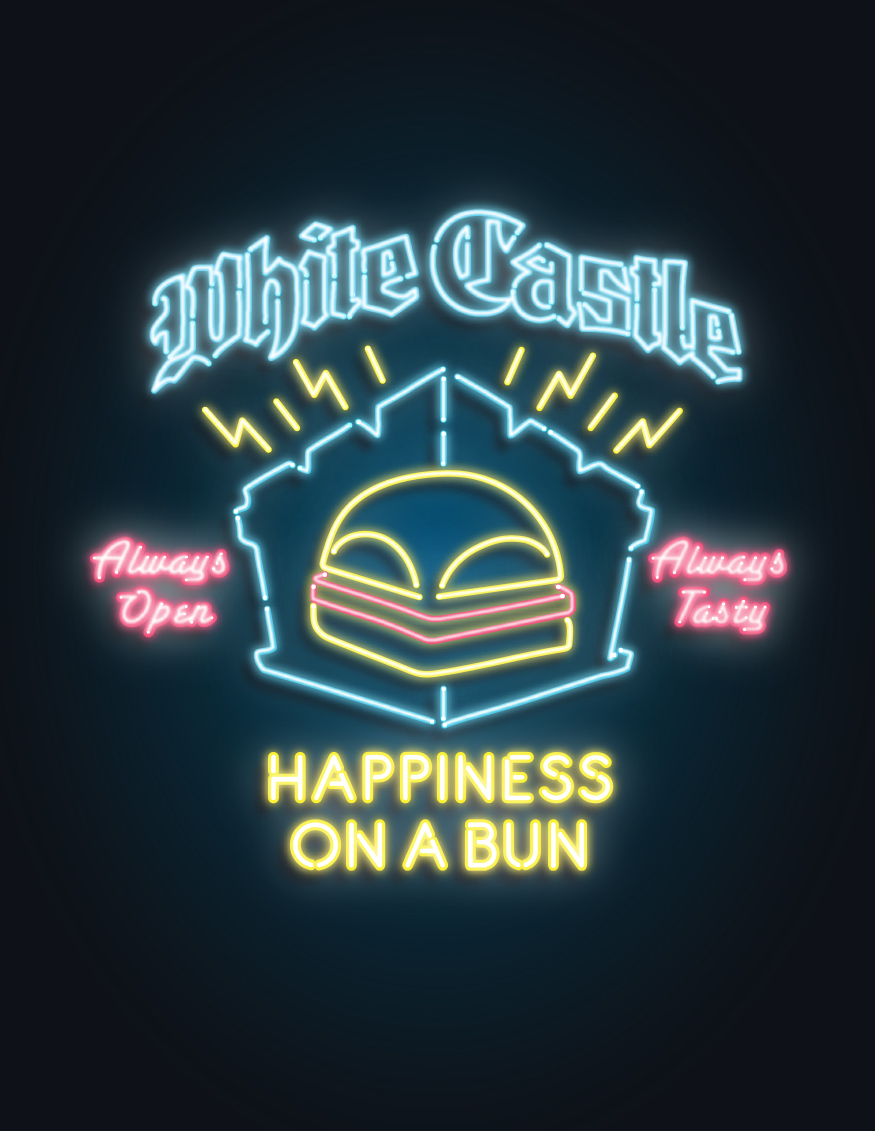
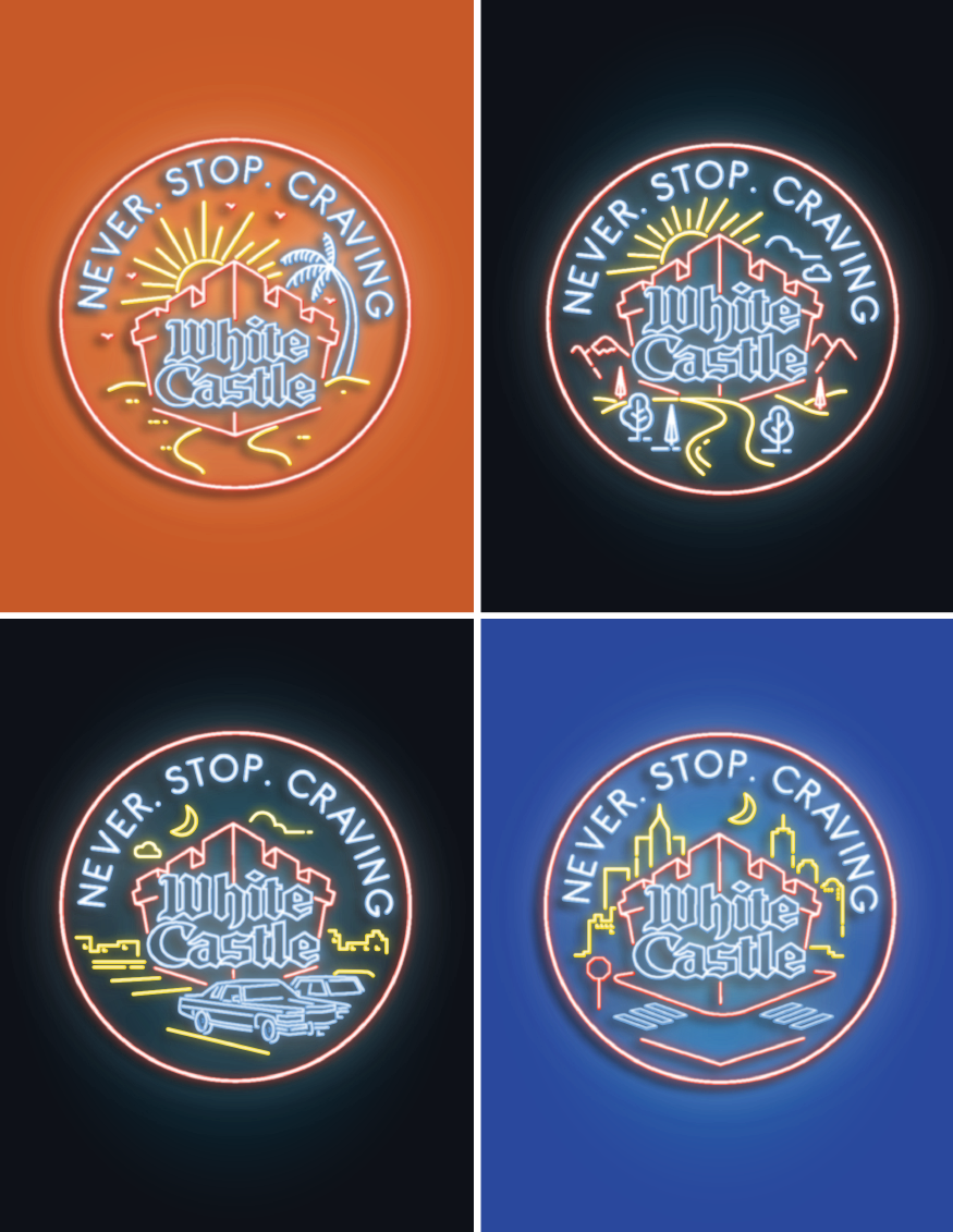
Destination White Castle
With the Castle being the ultimate road-trip destination, our first trend collection used neon and vintage-style signage to give consumer packaged goods a taste of nostalgia.
The mix of muted colors and retro stylings harkened back to a breezy but adventurous time in American history.
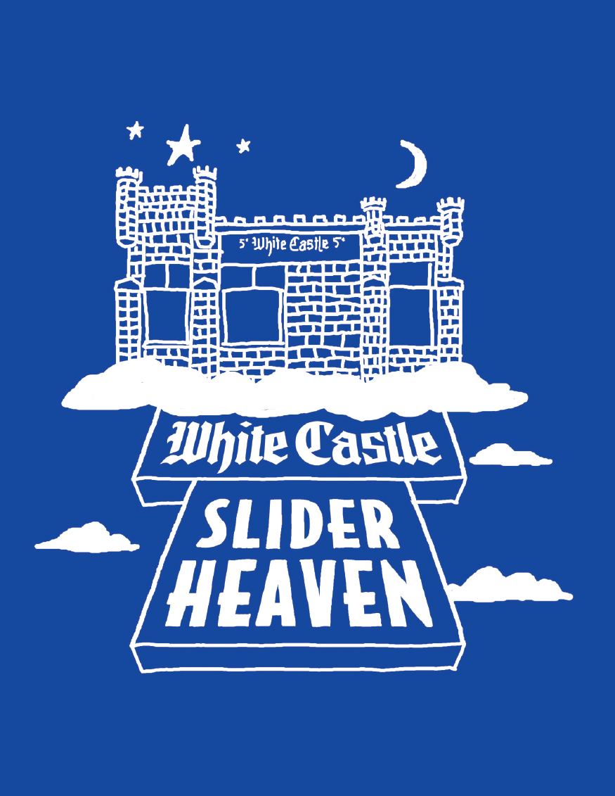
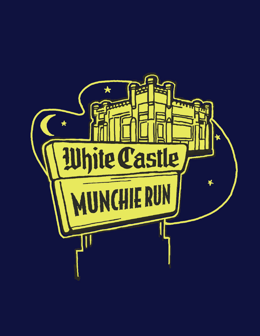

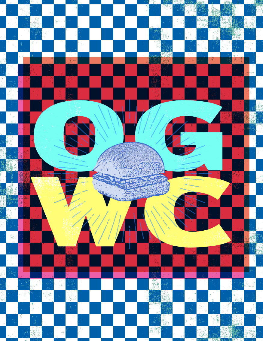
Lowbrow Illustrations
With jaw-dropping illustrations and skater sensibilities, this collection provided ample space for White Castle’s sense of humor.
The trend personified the irreverent Craver in all of us through a motley cast of comic-book heroines, hunger-struck zombies, and anthropomorphic sliders.
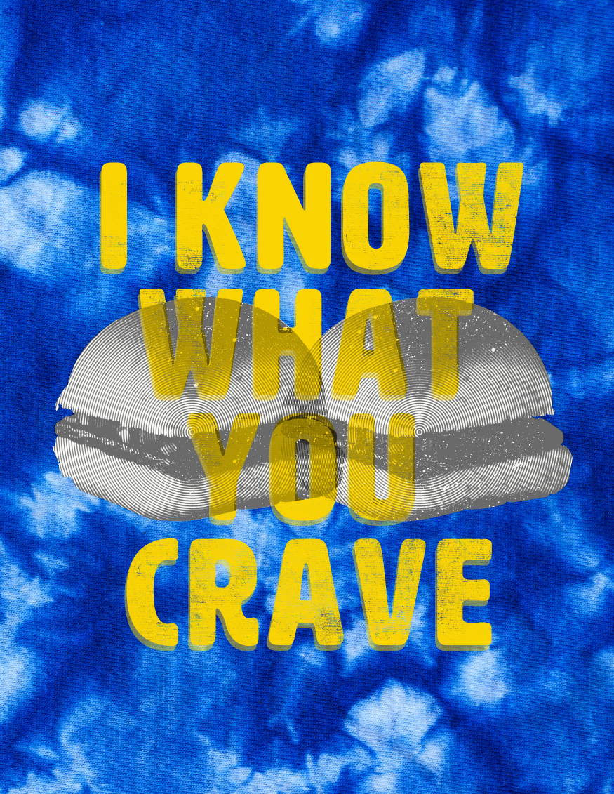
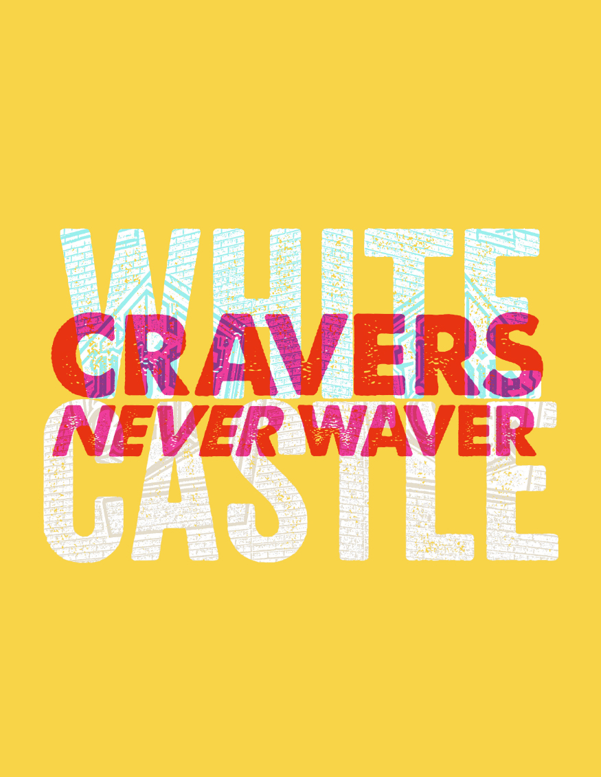
Letterpress Overload
This editorial-based collection relied on layers of striking graphics topped with witty, forward-thinking sayings.
Using pops of bold color in addition to the traditional palette, the trend reached out to fashion-minded millennials and old-school Cravers alike.
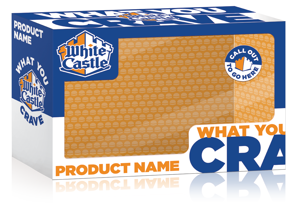
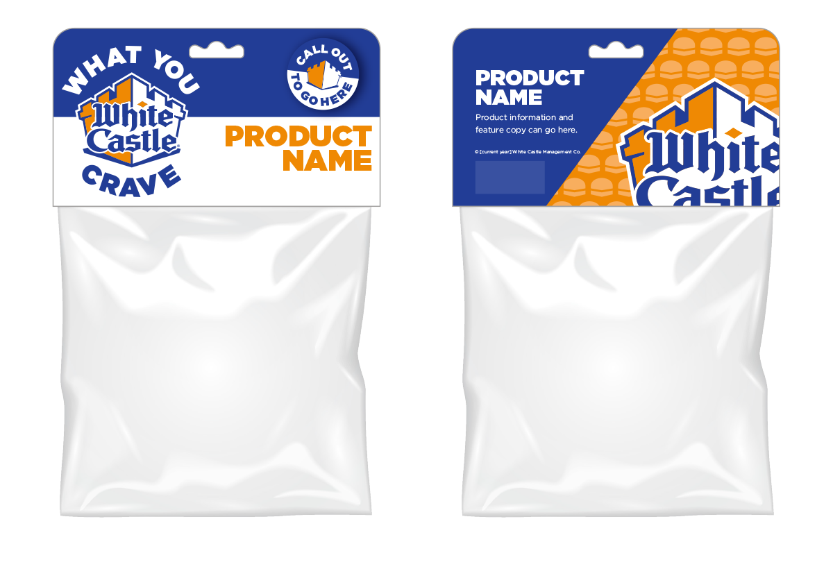
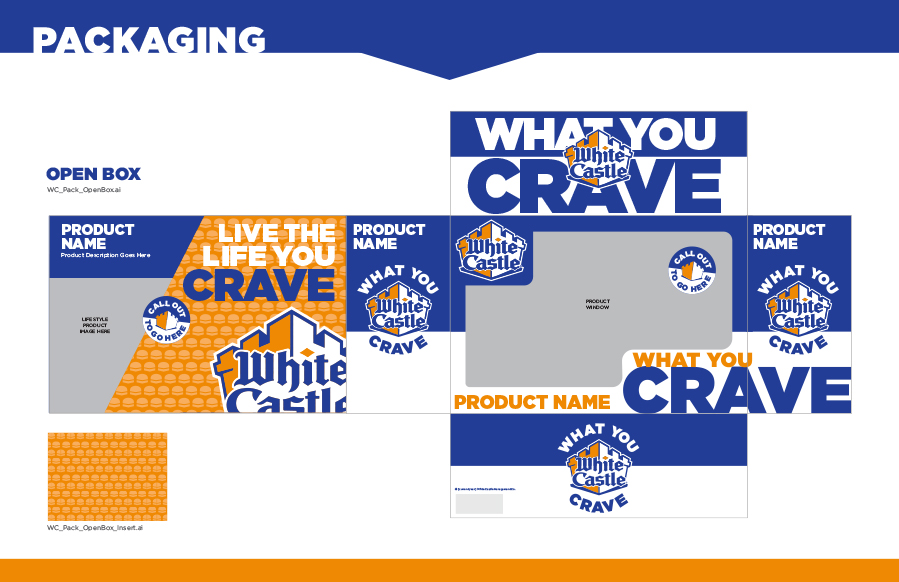
Consumer Packaged Goods and Extending the Brand
Building on core brand identifiers, we found inspiration in the Crave Case, which informed not only our packaging system but even the layout of our guide.
After our success with Cheetos, this project was a natural fit. You can learn more about our work with consumer foods on our Services page.
