HarperKids
Brand Identity | Style Guide | Strategy & Insight
Through Brandgenuity, StyleWorks developed a brand identity and style guide for HarperKids, an extension of HarperCollins children’s book publishing. Geared towards early readers, the branding system included a new logo along with various icons and other graphic elements.
Children’s Book Publishing
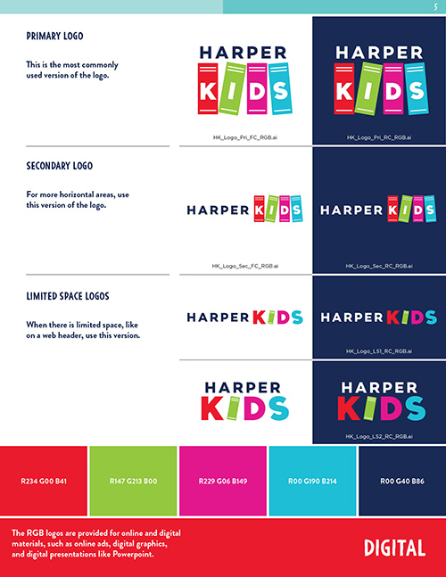
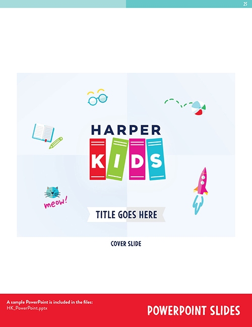
We started by creating an eye-catching logo that would help the brand stand out in the competitive world of children’s book publishing. After presenting a few different options to HarperCollins, we settled on a logo that uses a sans serif font and four book spines, each in its own color and playfully tilted. It’s a mark that can double as an icon, with alternate versions for a variety applications.


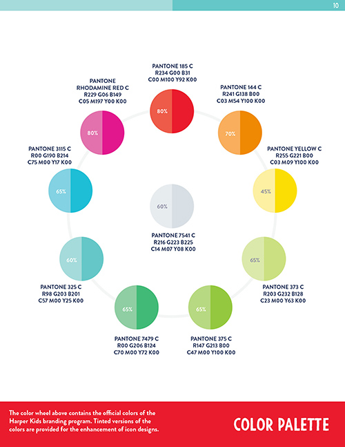

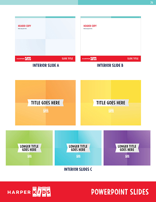

Tonal Color Palette
For our icon system and background art, we developed a vibrant color palette that also included a softer version of each hue.
The addition of softer colors added another dimension to the branding system, giving the icons and other graphic elements a more original look and feel.
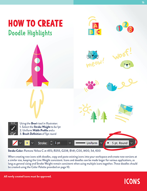
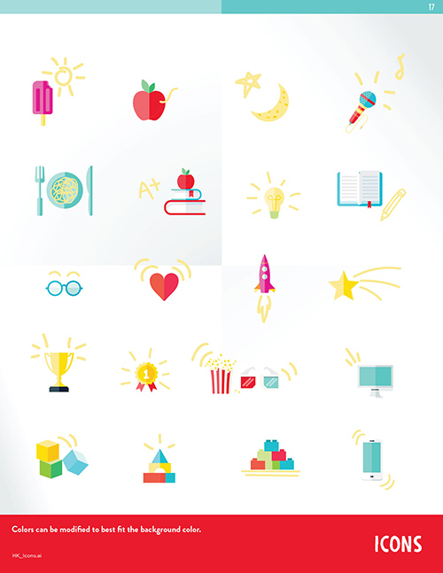
Doodle-Style Icons
Having begun with simple two-tone icons, we soon found ourselves adding doodle effects for a touch of childlike whimsy.
The guide also included tutorials for the HarperCollins in-house staff, so they could easily recreate the aesthetic.

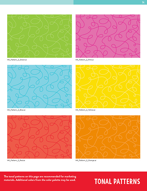
Base-Layer Patterns
We provided a number of base-layer patterns to complement the trade dress. They were designed for any application, no matter the medium, from in-store retail displays to social media posts.
In a related project, we created a new brand identity for the children’s book series Magic Tree House.

