Harlem Globetrotters
Licensing Style Guide | Packaging | Creative Asset Collections | Product Vision
StyleWorks Creative developed the first licensing style guide for the Original Harlem Globetrotters. The guide provided licensees with creative assets and direction for working with the brand’s core elements, as well as multiple theme art collections and an updated packaging system.
Logo and Packaging Direction
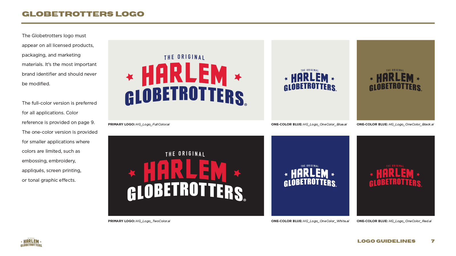
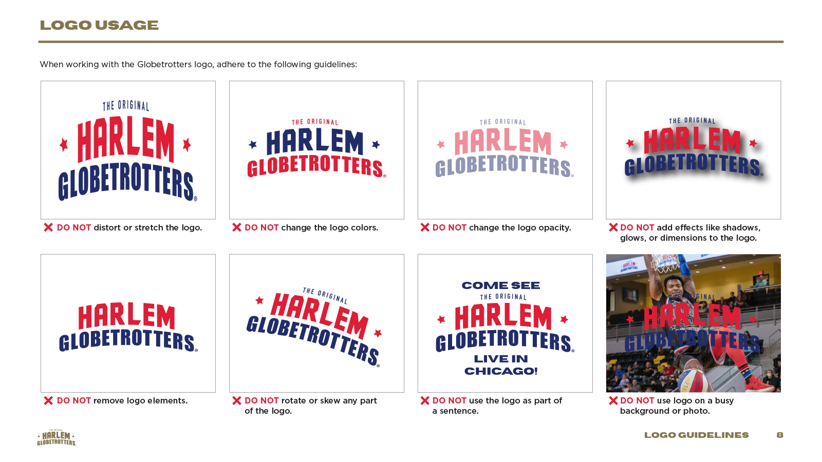
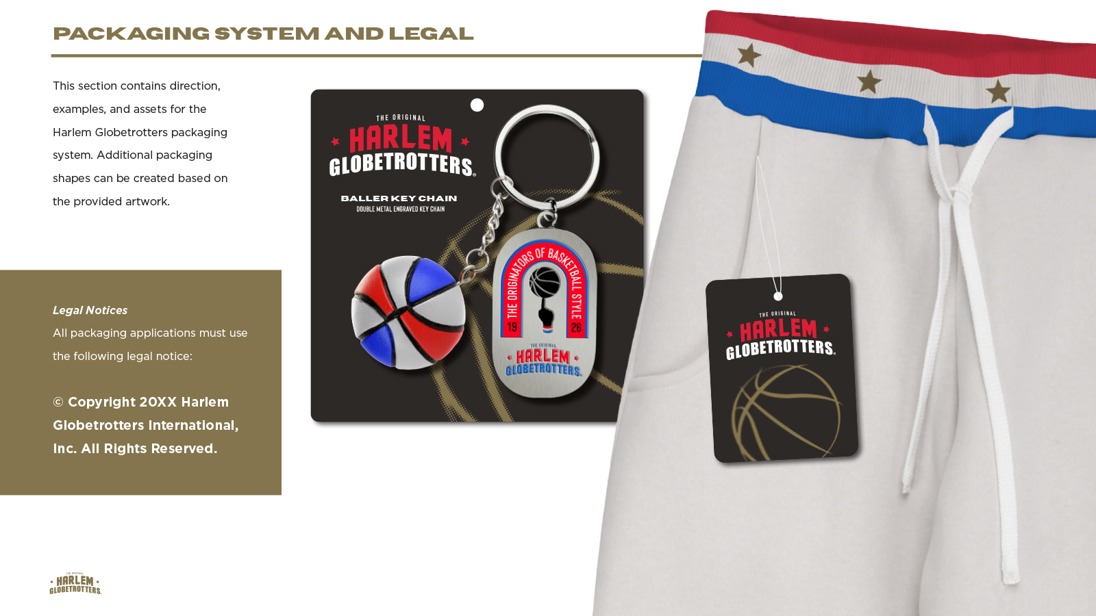
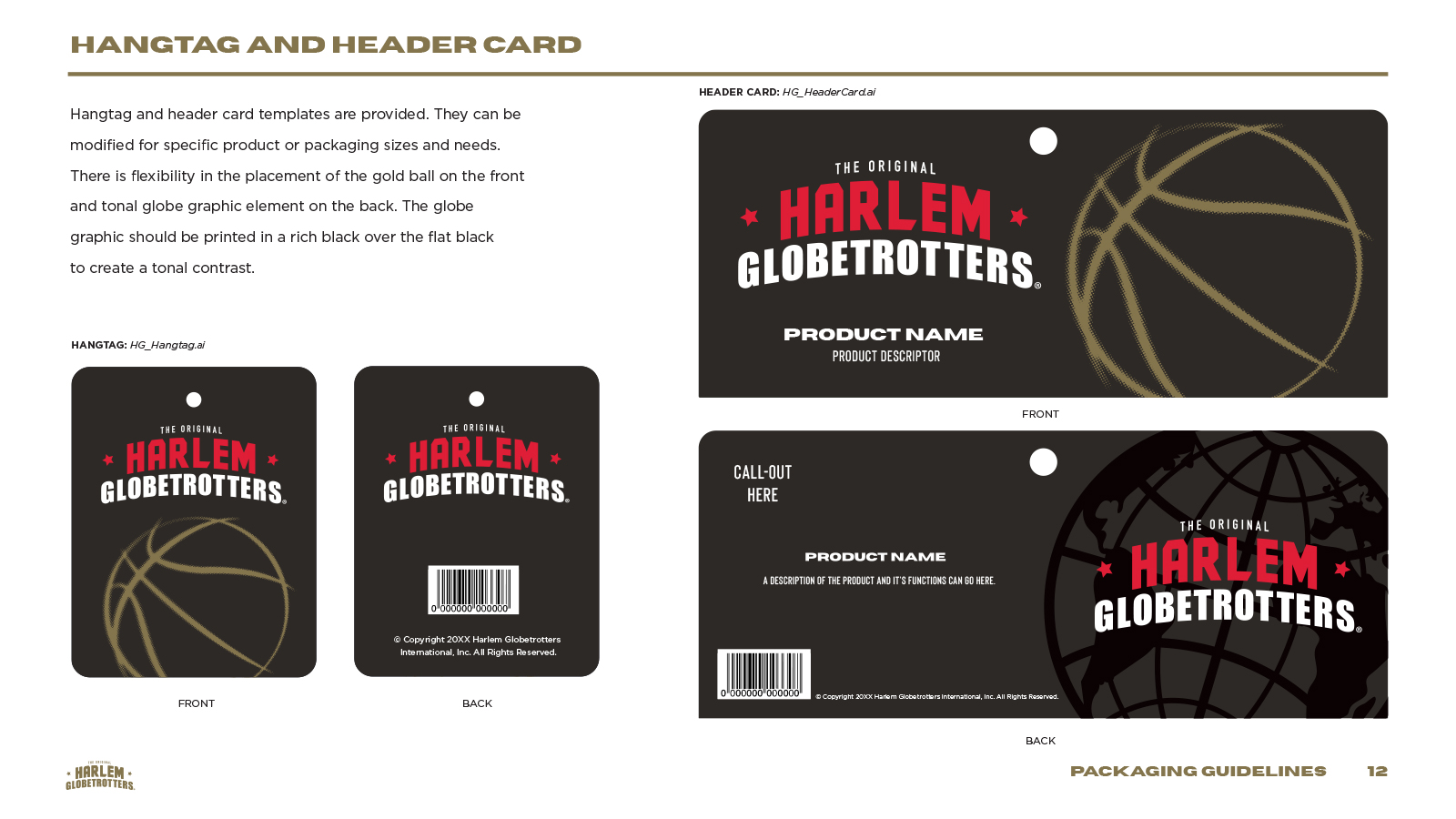
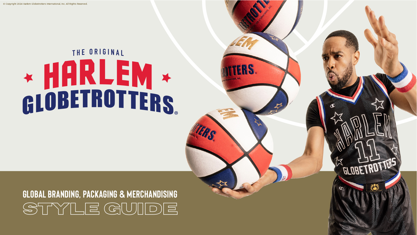
We started by updating and color-correcting the Globetrotters’ main logos and identifiers, refreshing the current packaging system with examples and design direction on how to use them.
The Core Tour Collection was an extension of the current brand aesthetic from the World Tour. We curated graphic elements from the latest Globetrotters style guide and enhanced them with clean lines and bold colors for a dynamic and cohesive new set of art assets.
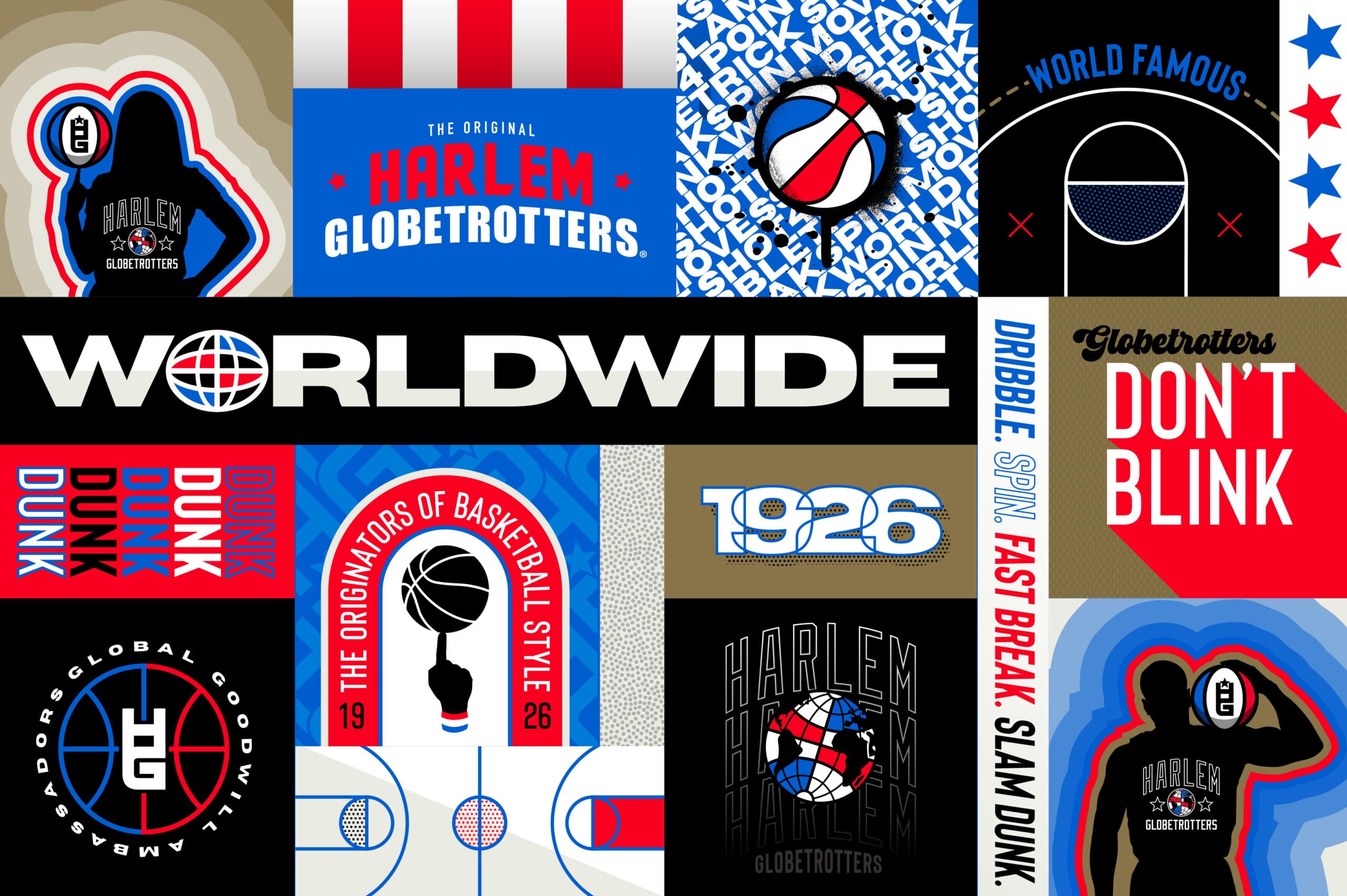
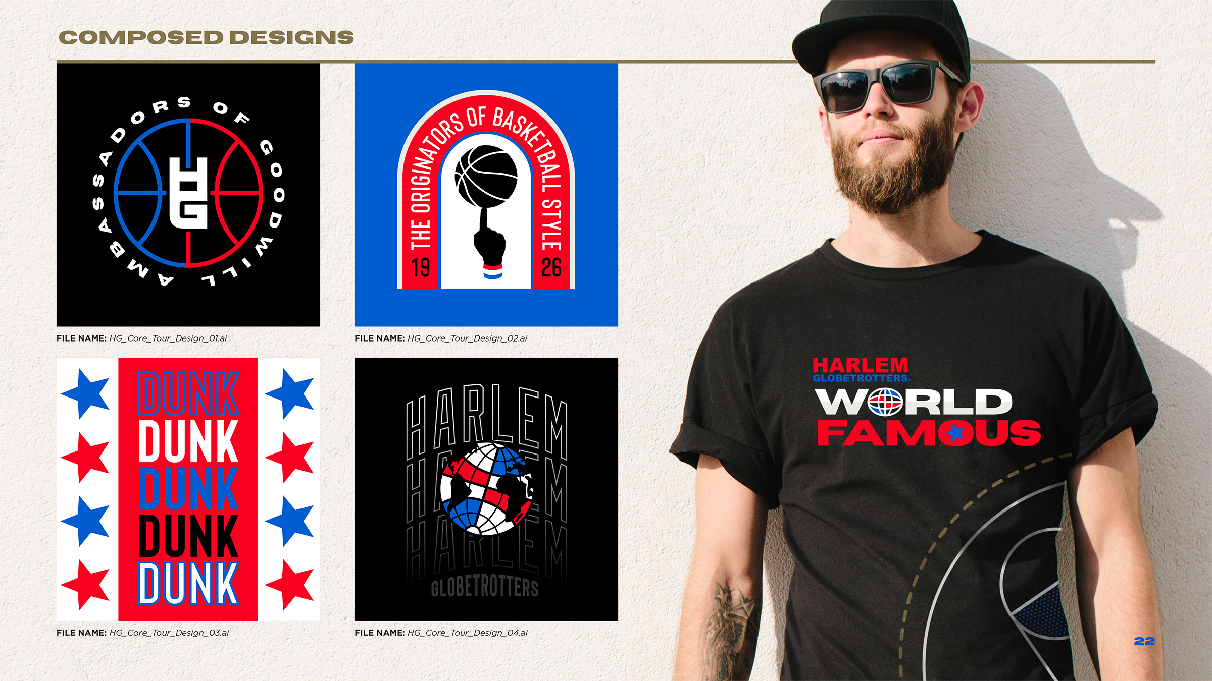
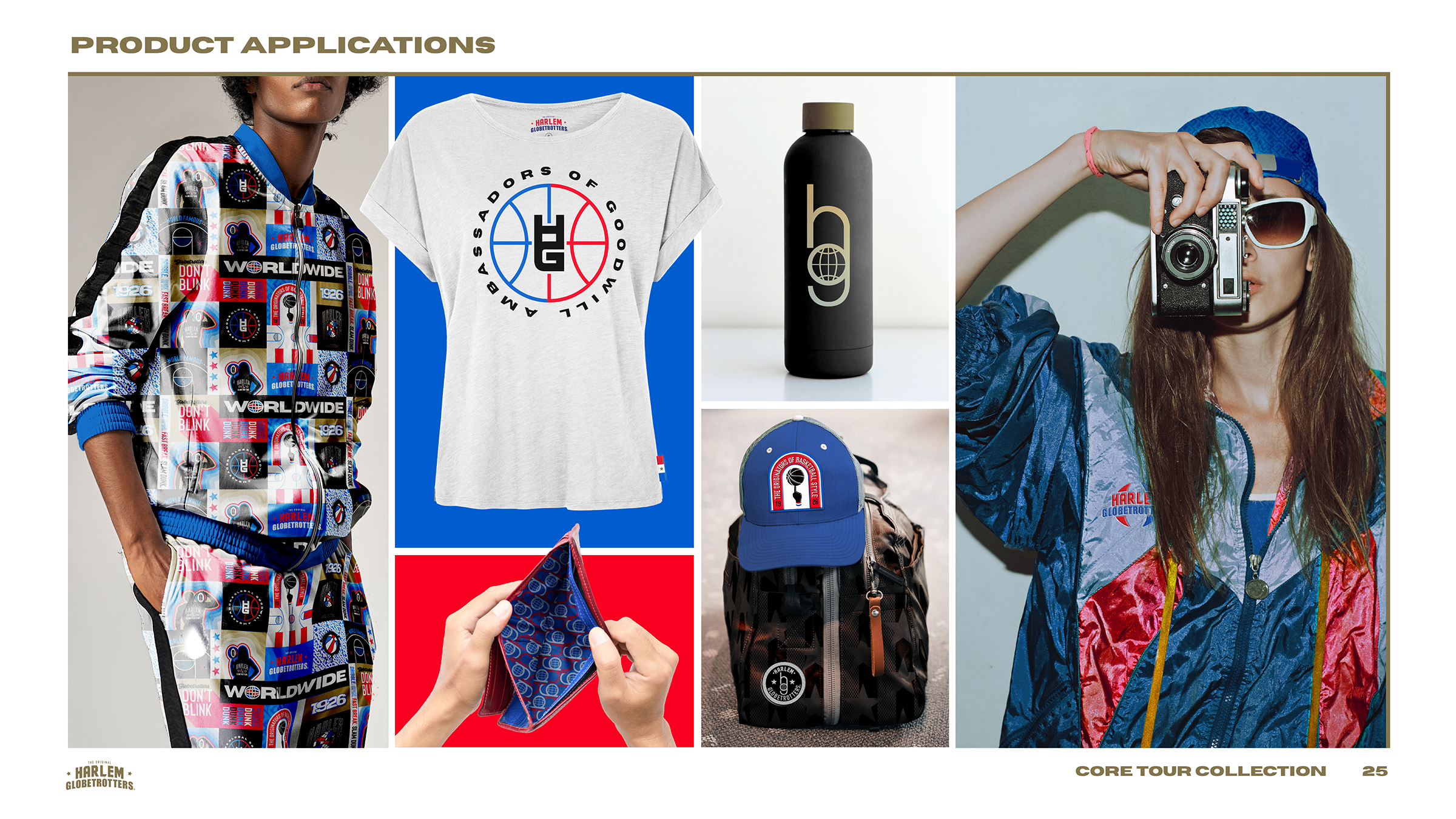
The Core Icon collection featured strong graphic badges and typography that could be applied as stickers, patches, and subtle graphic patterns.
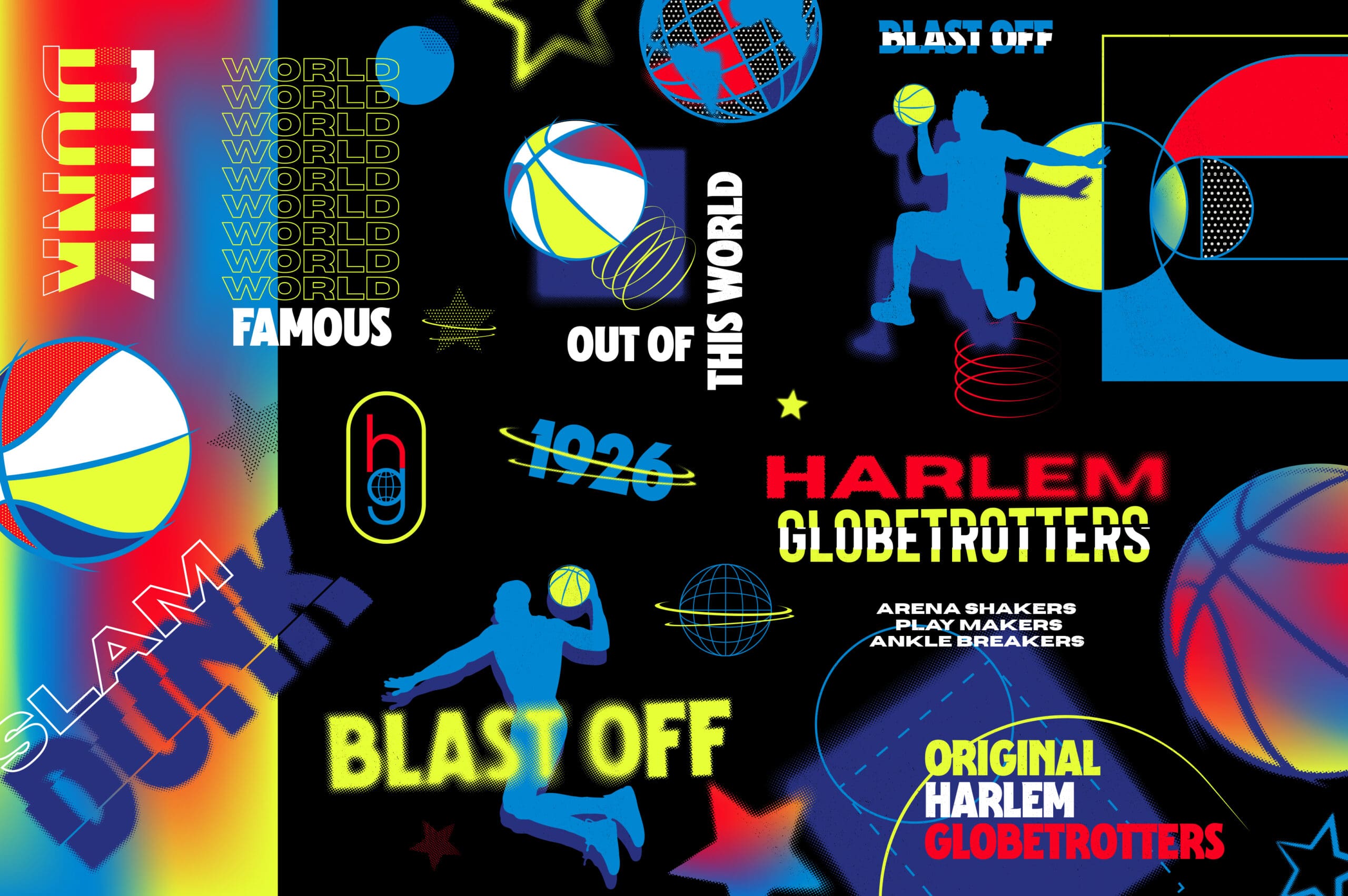
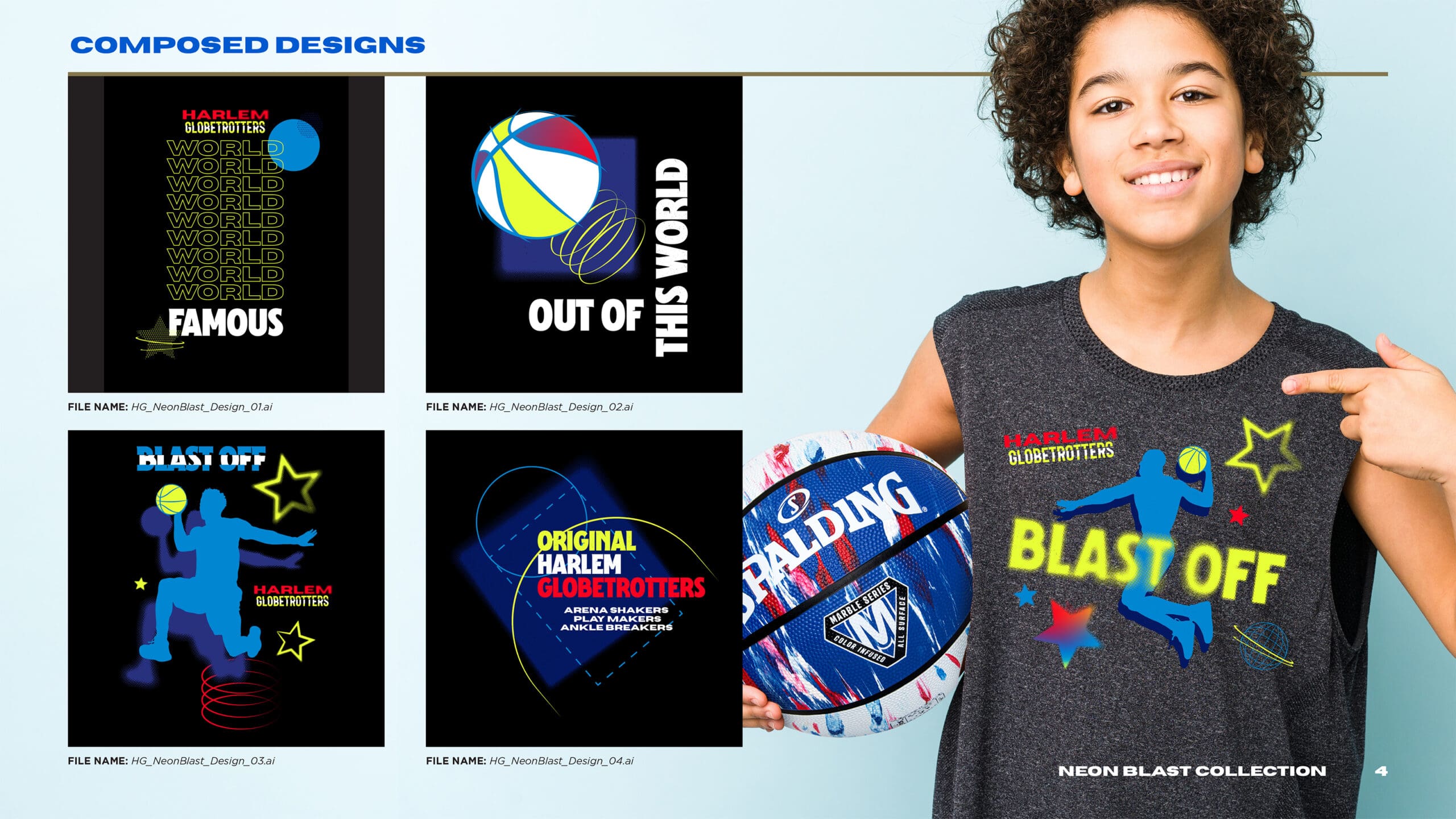
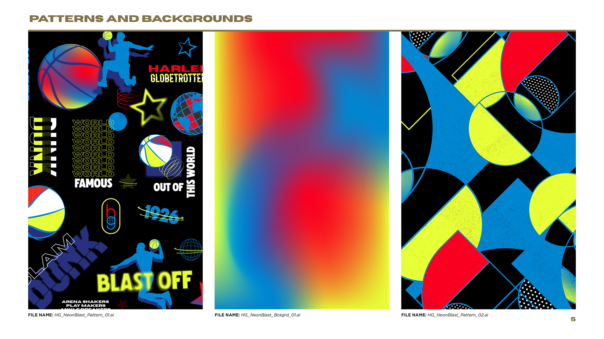
Neon Blast was geared towards younger fans with dazzling neon colors, vibrating graphic elements, and bold, in-your-face typography.
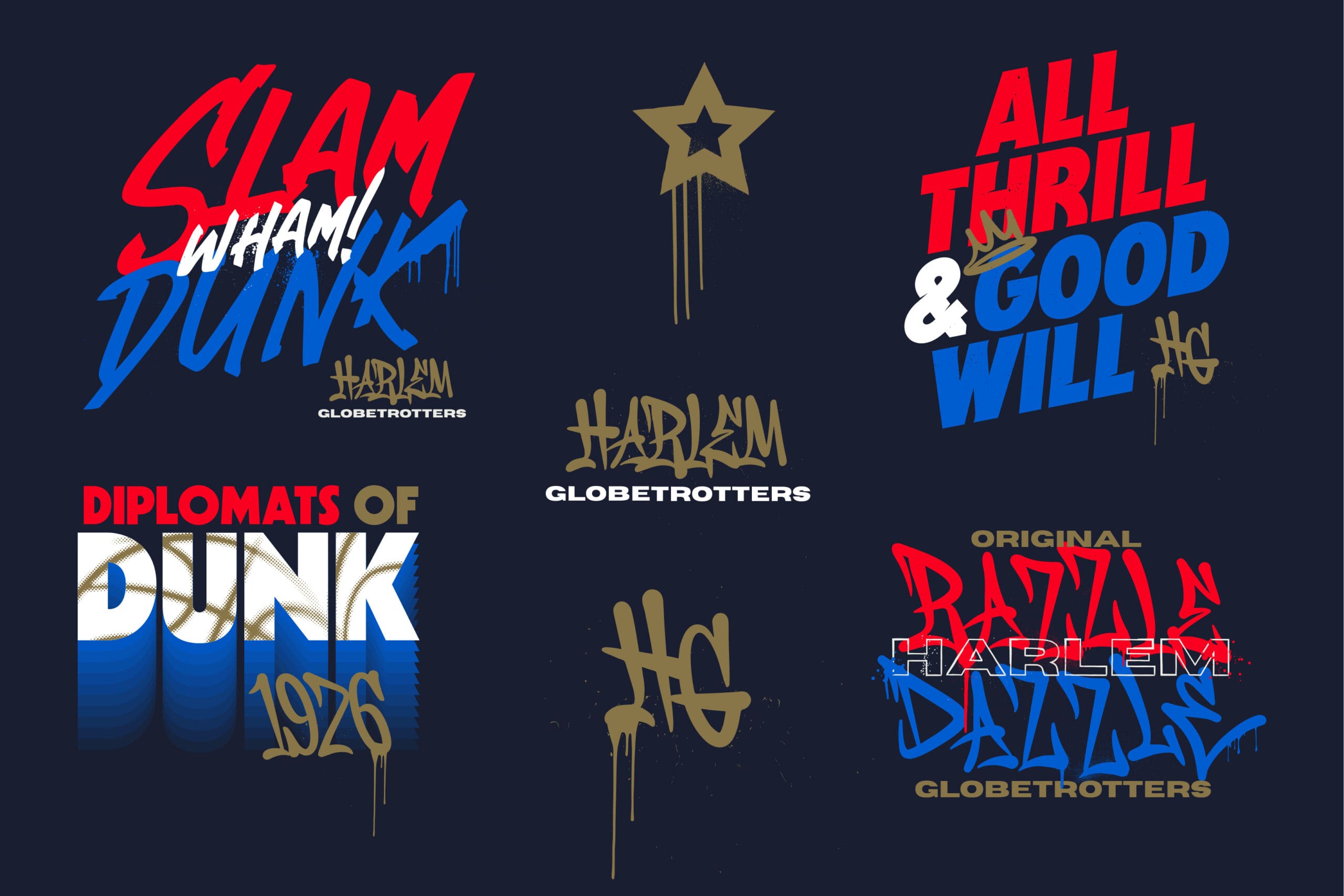
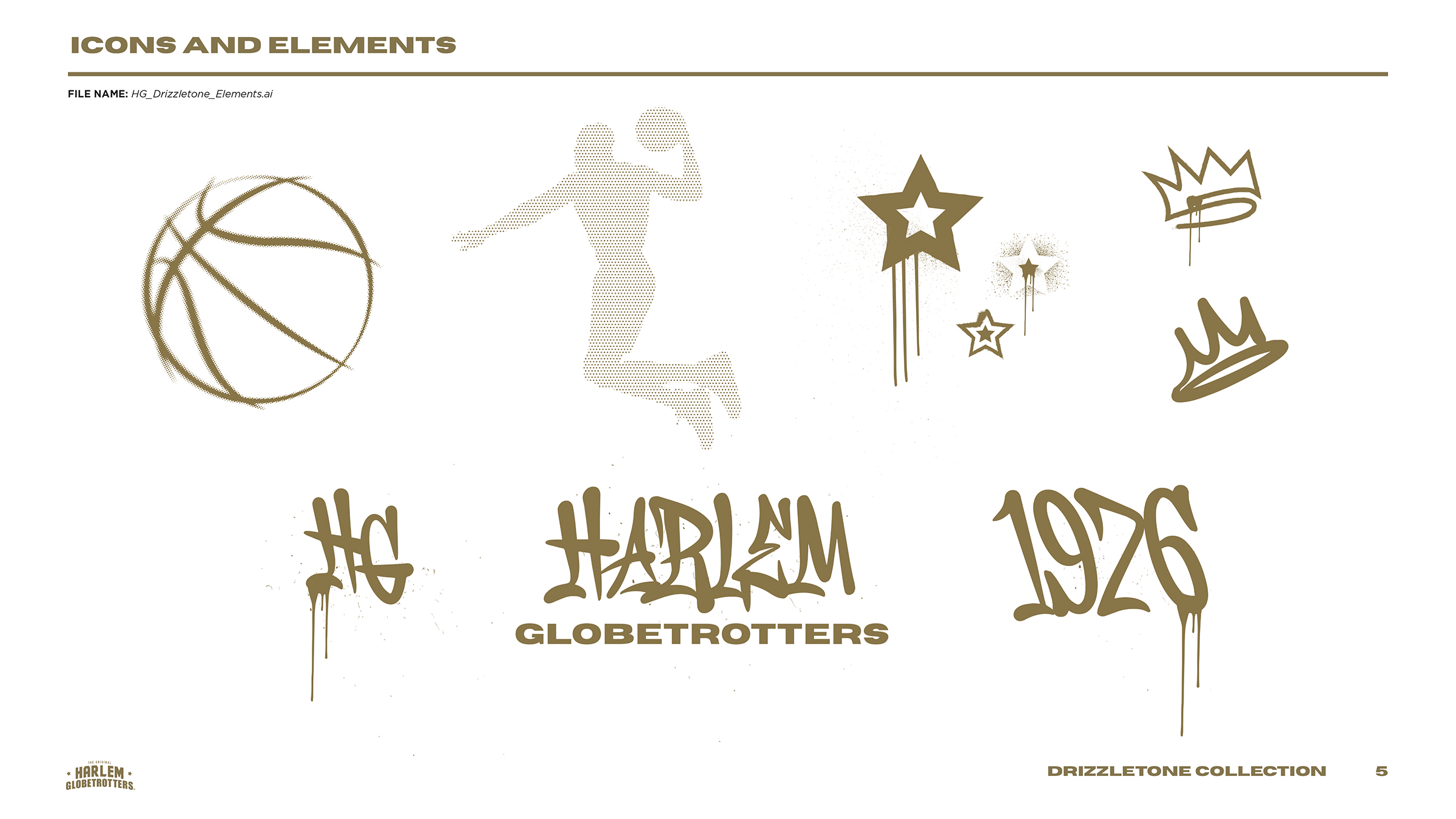
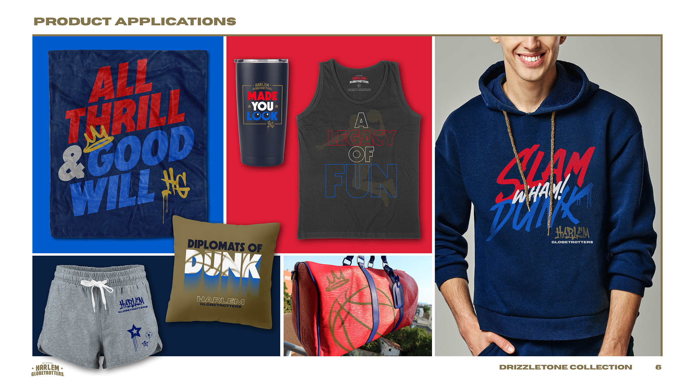
The Drizzletone collection added a touch of graffiti with expressive typography in red, white, and blue, along with dripping gold against a stark, indigo background.
The Retrotone collection combined a ’70s-style Original Harlem Globetrotters wordmark with expressive typography and vintage halftone imagery.
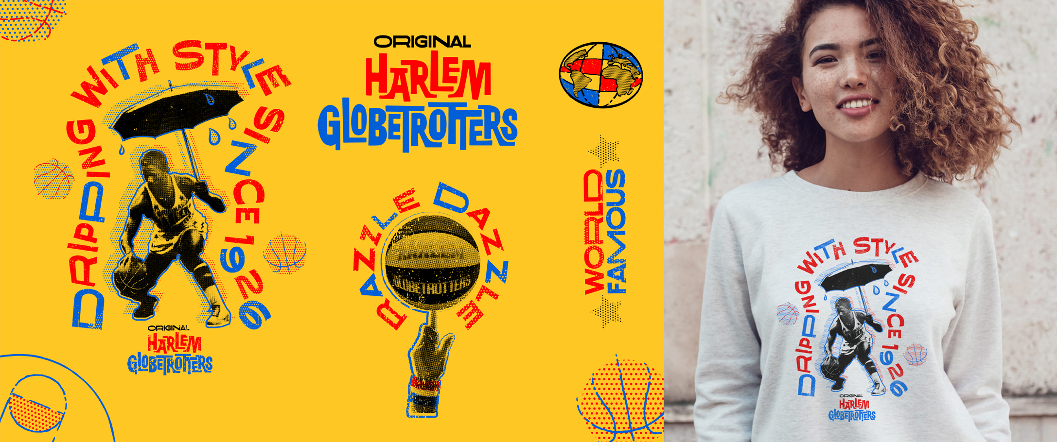
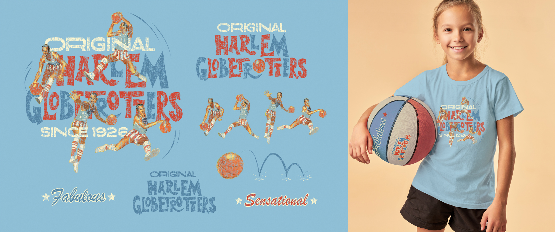
The Originals collection also used ’70s-style wordmark, this time inspired by vintage program covers and paired with retro player treatments and a softer color palette.
