Planters
Licensing Style Guide | Packaging | Creative Asset Collections | Product Vision
StyleWorks developed a style guide for the Planters merchandise licensing program. Geared toward U.S. licensees, it demonstrated how the brand’s core assets could be applied to a range of lifestyle products, while also providing original thematic assets inspired by the brand’s history and its ever-popular mascot, Mr. Peanut.
Merchandise Licensing Style Guide
Our merchandise licensing style guide gave licensees the assets, direction, and inspiration needed to extend the Planters brand to a variety of lifestyle product applications.
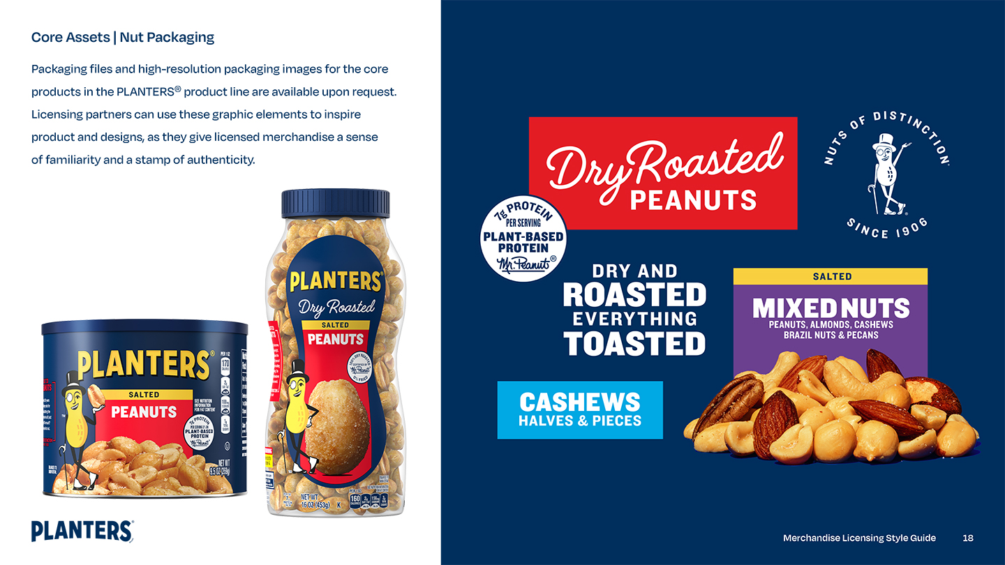
It included everything from core assets like brand logos and character art to original composed designs and packaging examples with specific instructions on product messaging.
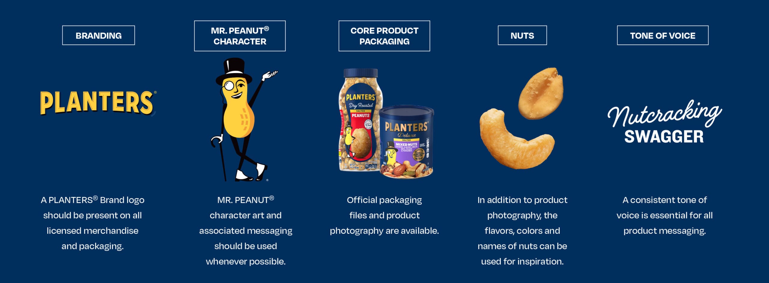
With the right creative assets and a little inspiration, merchandise licensing partners would be able to extend the brand to a wide range of new product categories, including apparel, accessories, and home décor.

Logo and Character Guidelines
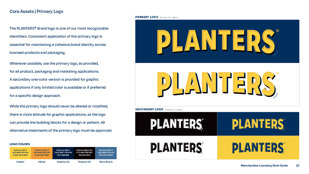
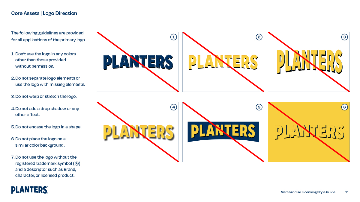
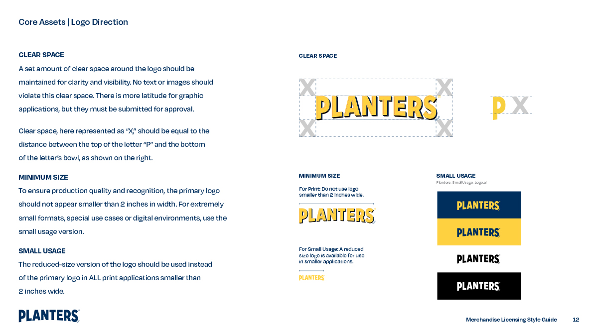
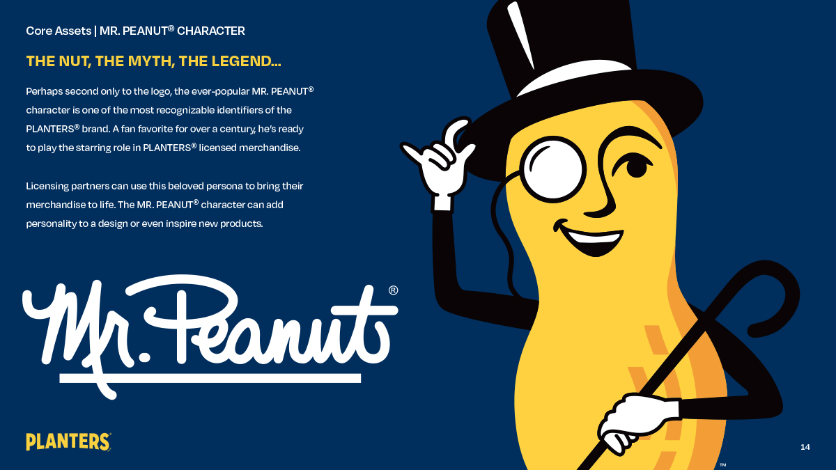
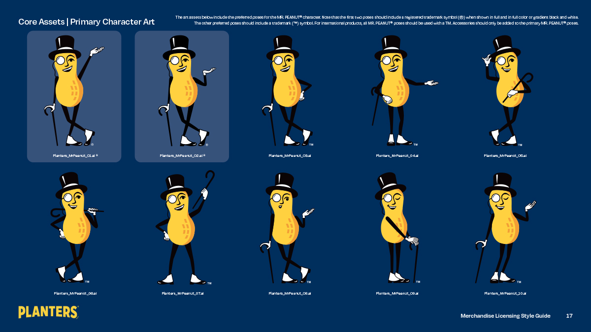
We organized the brand’s core assets, including the Planters logo and Mr. Peanut character art, and presented them along with their respective legal guidelines, indicating precisely where, when, and how to incorporate the necessary trademark symbols.
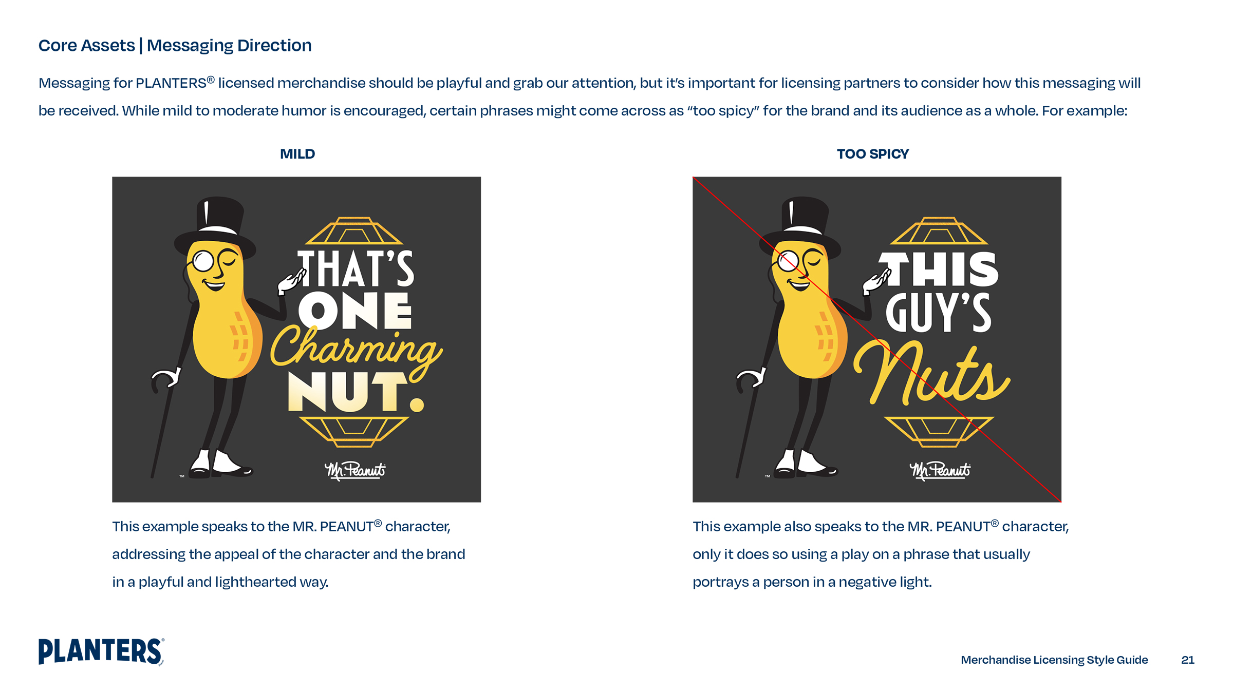
For licensees new to working with the brand, finding the right tone of voice for product messaging would be one of their biggest challenges. Our guide not only provided examples of playful product messaging but also a tutorial demonstrating how to use the Planters brand voice and when its playful tone might be taken a little too far.
Of our three original theme art collections, our first presented Planters peanuts as the ultimate snack for sports fans and Mr. Peanut as the life of the tailgate party. It featured a signature color palette and a selection of thematic designs and product messaging.

Our second collection, Art Deco Debonair, was a throwback to a time when the Mr. Peanut and the Planters brand were reaching new heights. With classy fonts, diamond-cut patterns, and a strong color palette, it could add a touch of distinction to any design.

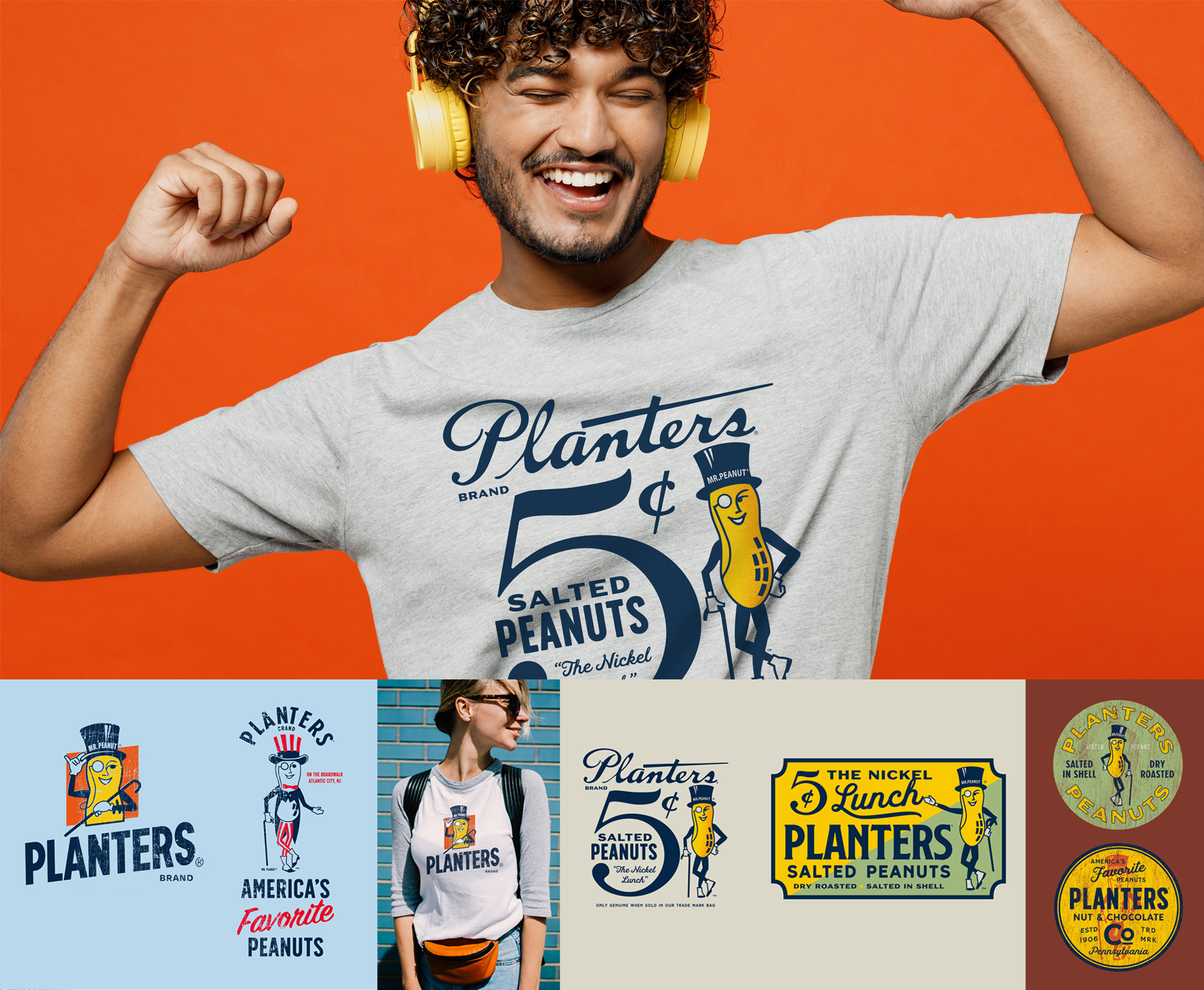
Our third collection took a nostalgic tour through Planters brand history, providing vintage art assets that could lend themselves to a variety of product applications reminding consumers of the brand’s storied past.
Branded Packaging
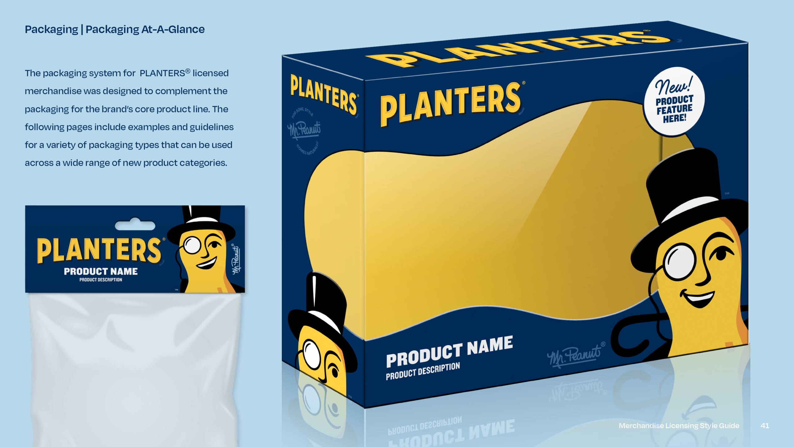
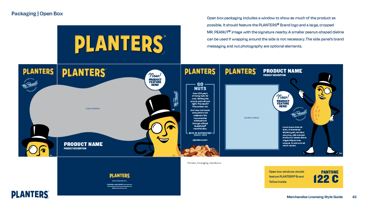
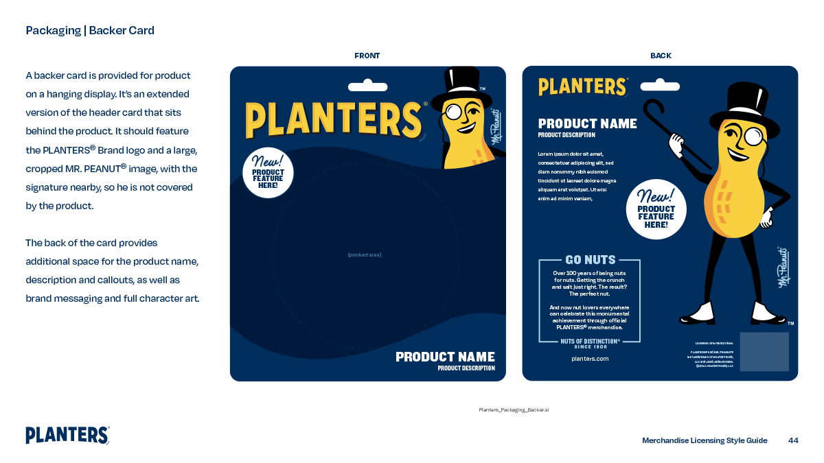
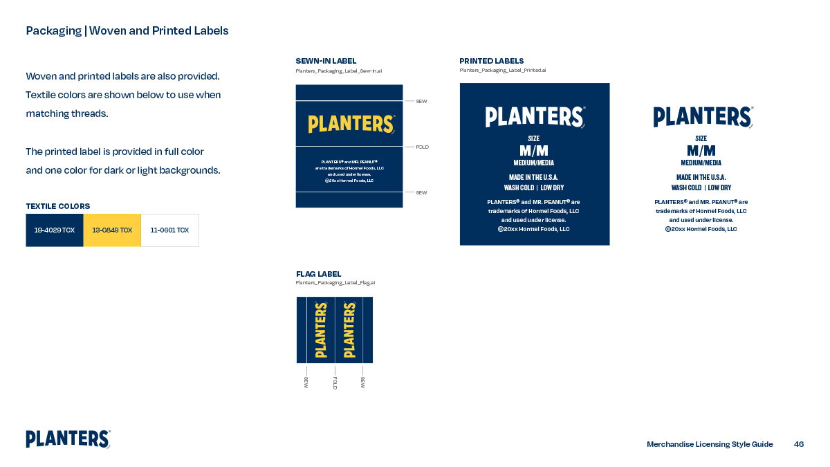
The style guide also included a packaging section with samples and design direction for licensees working with box packaging, header and backer cards, hangtags, and woven labels.
