Domo
Packaging Guide | Merchandising System | Creative Asset Collection | Product Vision
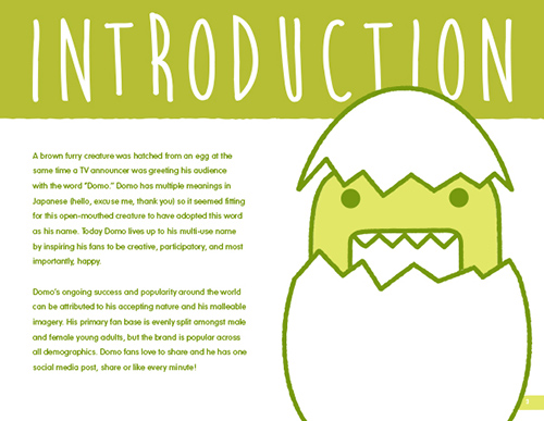
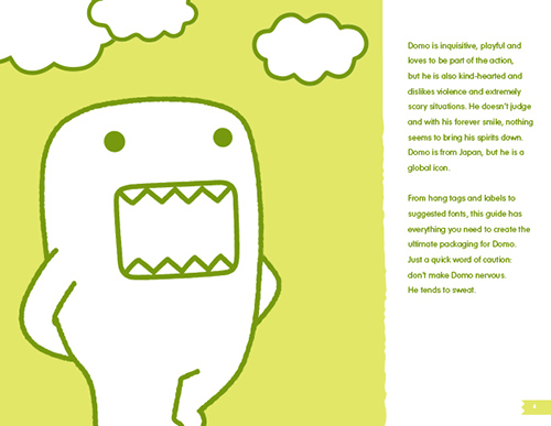
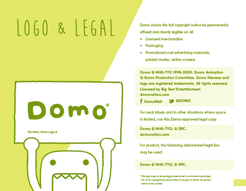
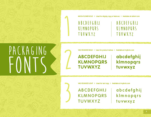
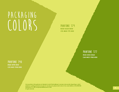
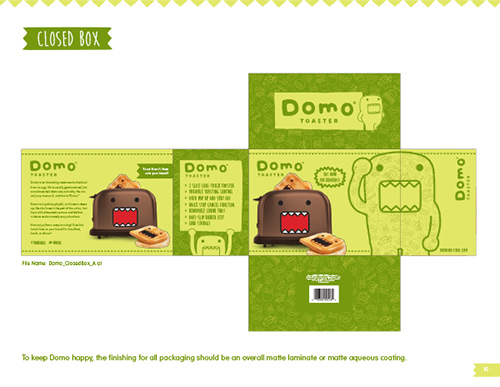
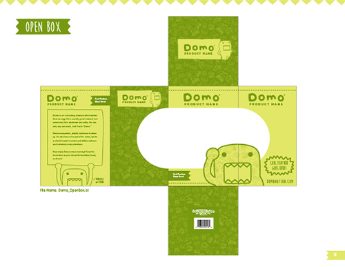
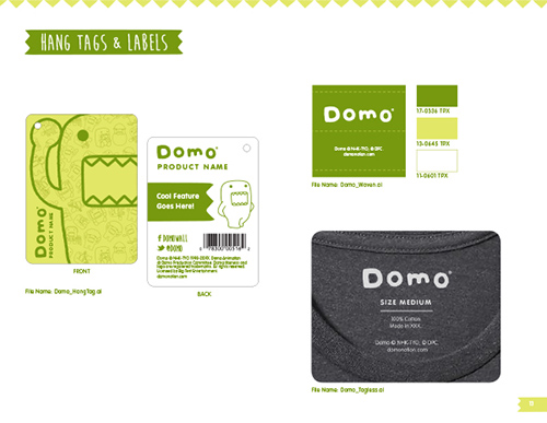
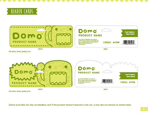
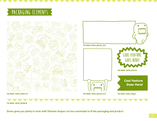
Randomly hilarious and always irreverent, we found Domo to be the perfect brand for teens and young adults. In developing a Domo packaging style guide for licensed products, we captured the essence of the brand using character line art and a monochromatic color system.
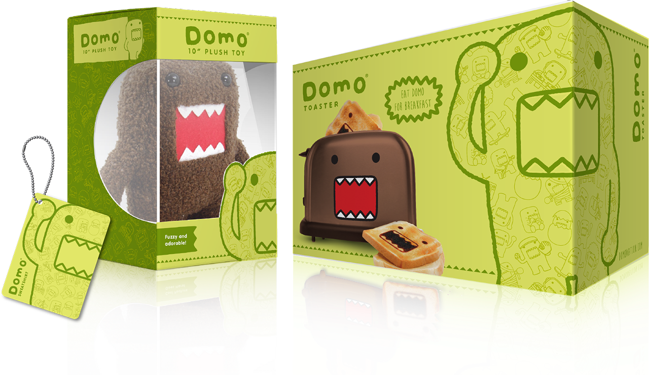
Packaging Style Guide
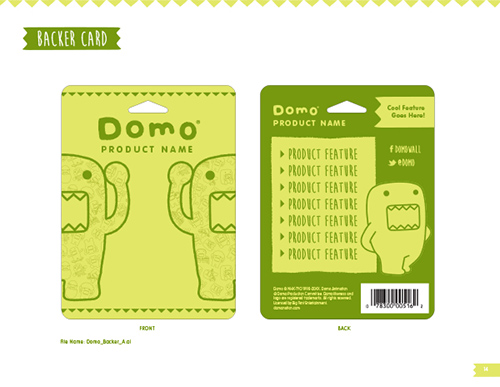
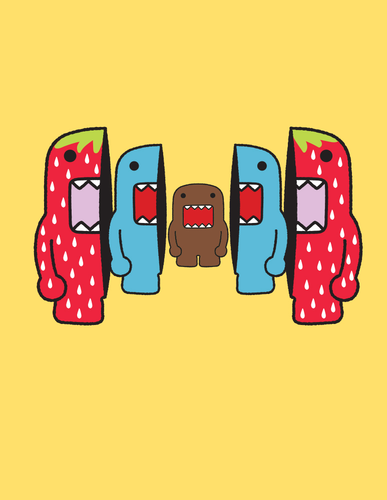
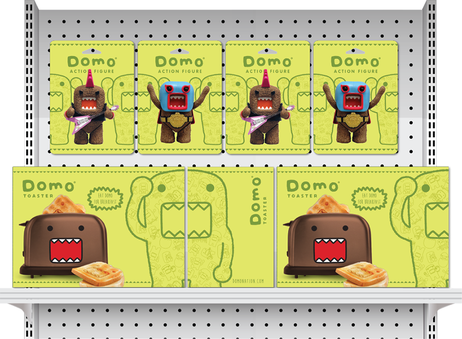
For a more eye-catching presence at retail, our packaging style guide included an original merchandising system in which cropped images of Domo could be displayed side by side to create a full view of the character.
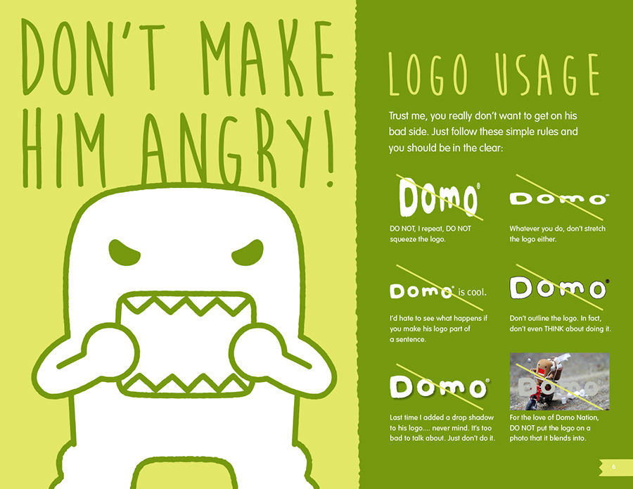
Don’t Make Him Angry!
We even allowed the brand’s quirky sense of humor to inform our directional copy in the hopes of giving licensing partners a good laugh and perhaps some added inspiration.
LOL Domo Theme Art
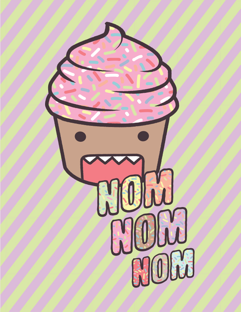
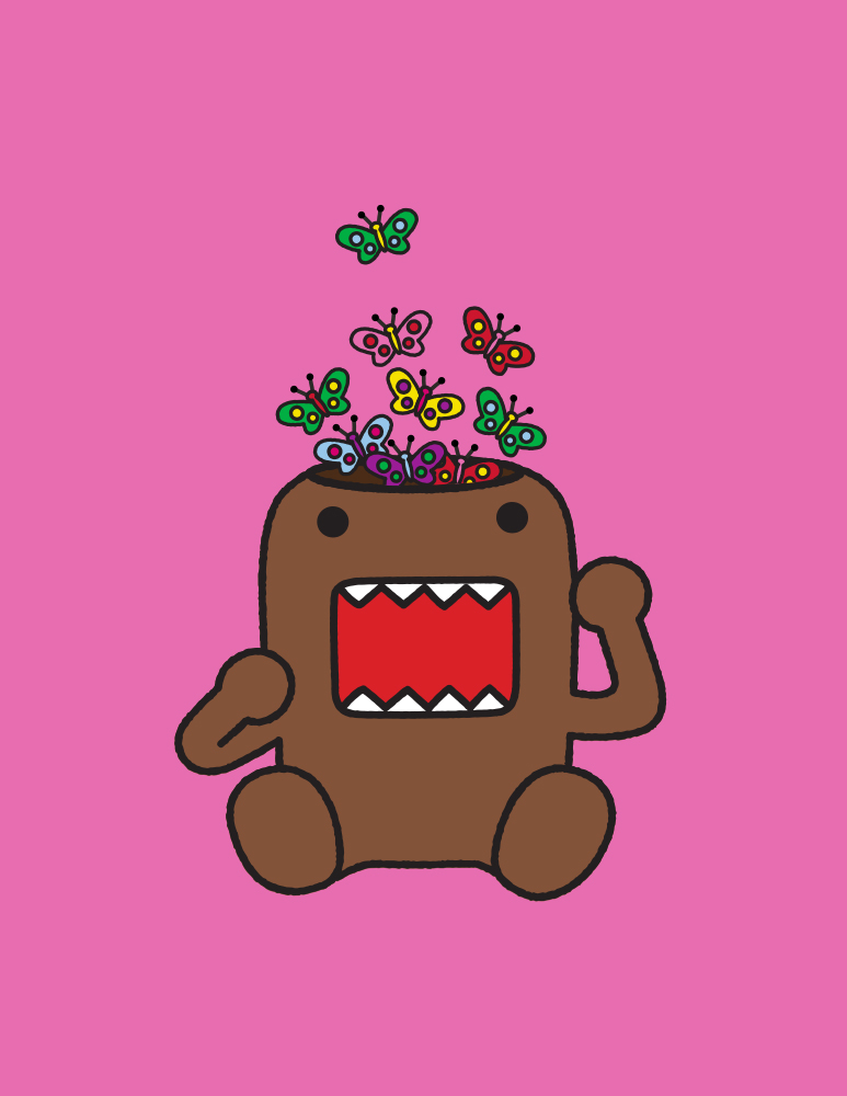
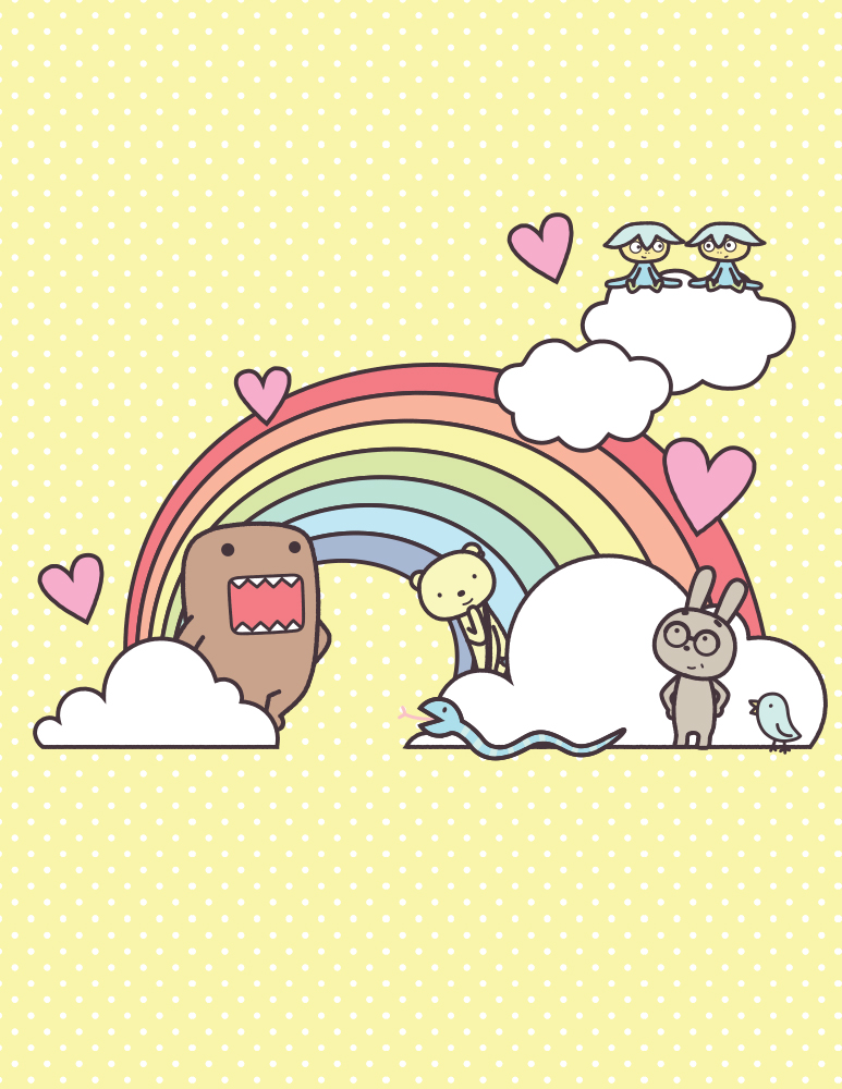
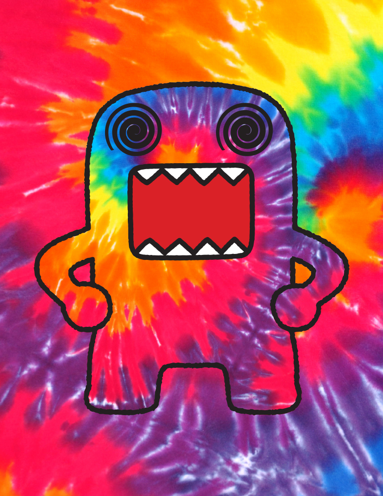
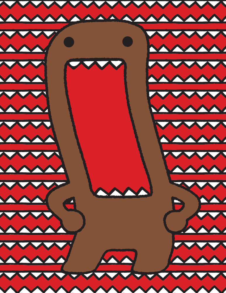
From food to flatulence, the LOL Domo collection featured the lovable monster at his funniest, with theme art based on popular memes, slanguage, body distortion, and the occasional selfie. Our final deliverable included placement prints, custom patterns, character art treatments, and product applications.
We had another chance to create a packaging system with playful character art in a recent project for popular children’s book brand Giraffes Can’t Dance.


