Spangler Candy
Style Guides | Packaging Systems | Product Visions
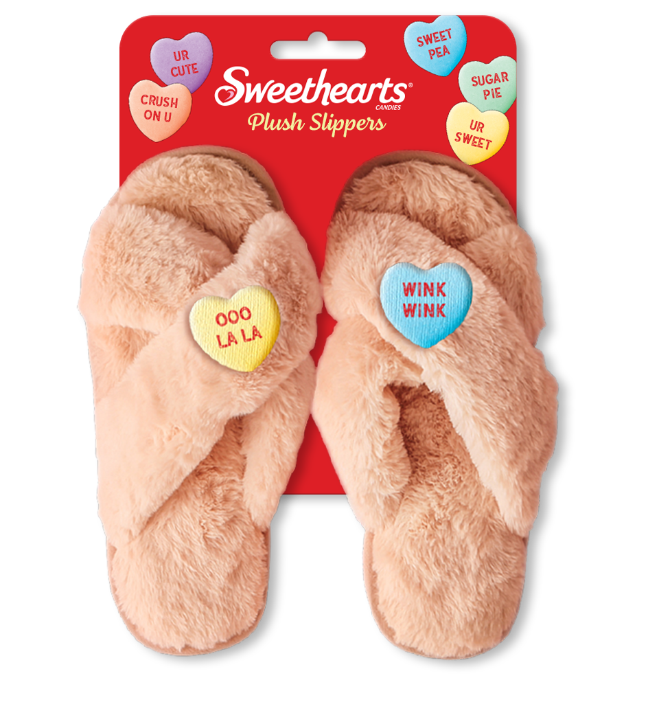
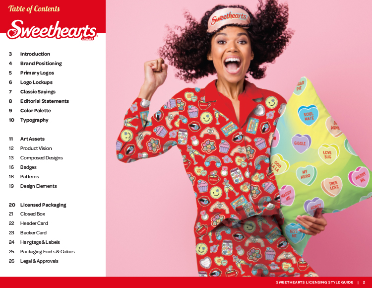
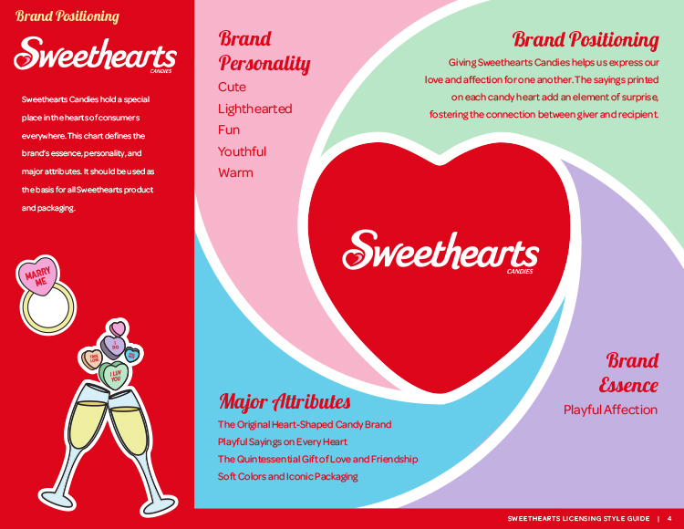
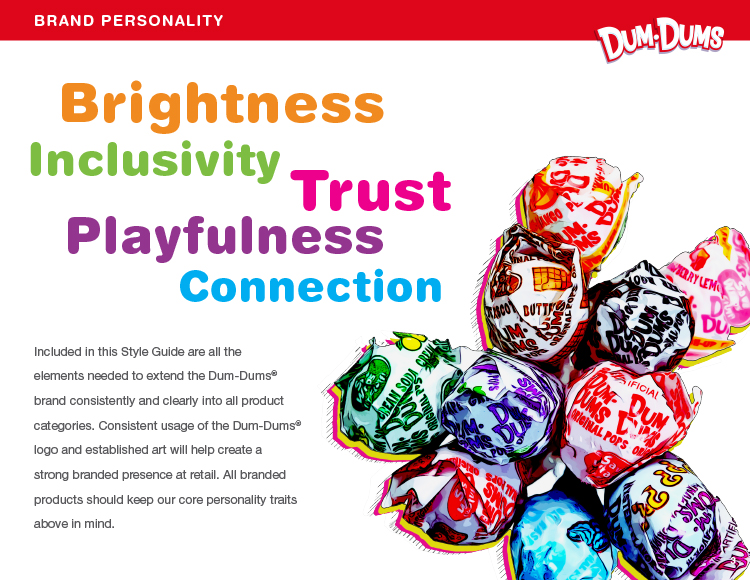
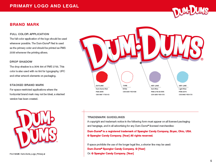
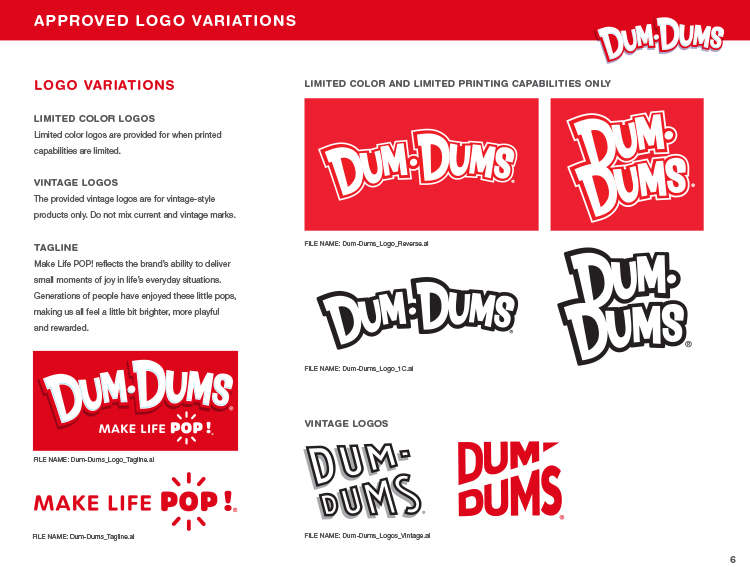
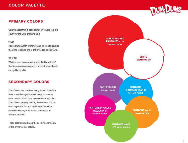
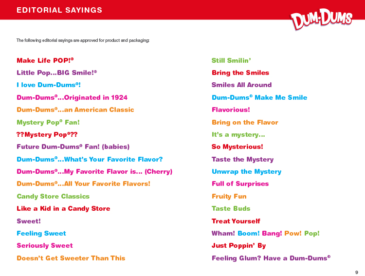
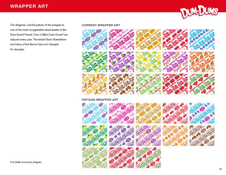
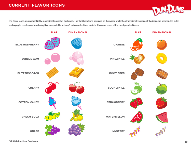
Under the direction of Lisa Marks Associates, Spangler Candy hired StyleWorks Creative to develop style guides for both the Sweethearts and Dum-Dums brands. Using their available creative assets, we demonstrated how each of the brands could be leveraged across a variety of applications, including apparel, novelty gifts, and social expression.
Packaging Systems for Style Guides
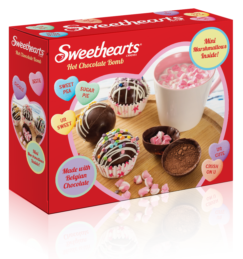
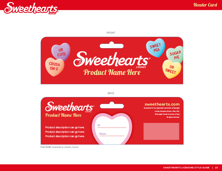
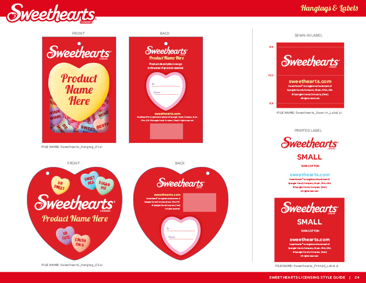
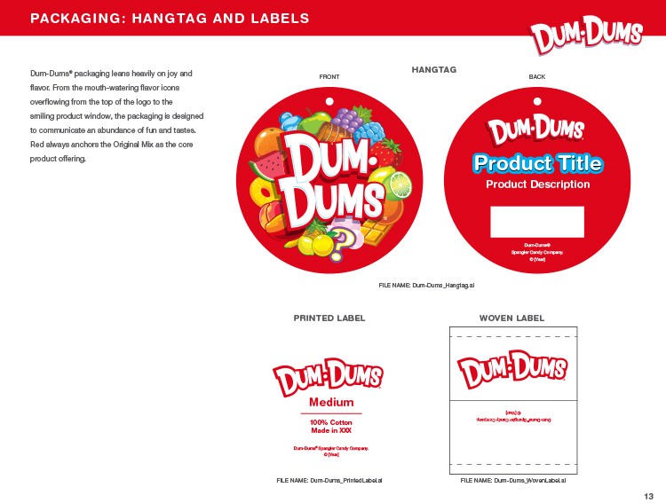
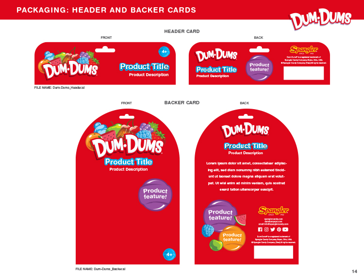
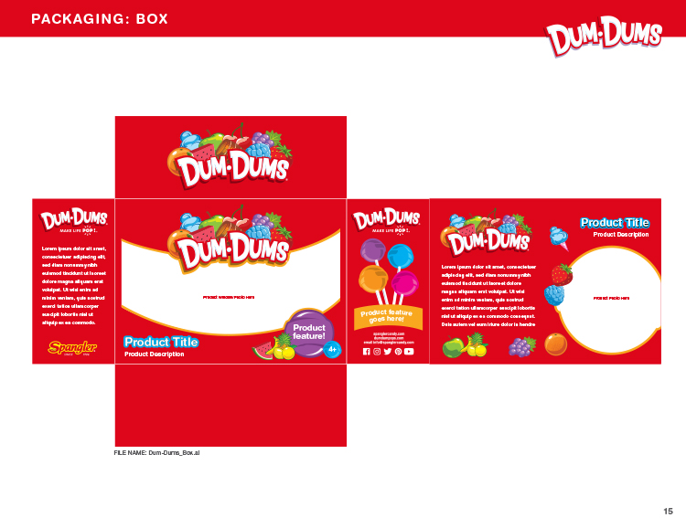
For each of our style guides, a packaging system was designed to extend the core brand identity while providing licensing partners with specific areas to feature product imagery and callouts.
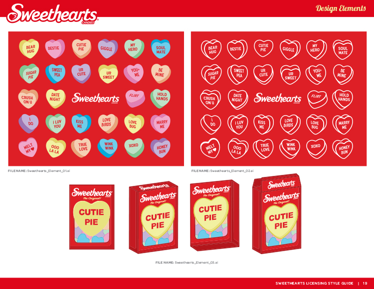
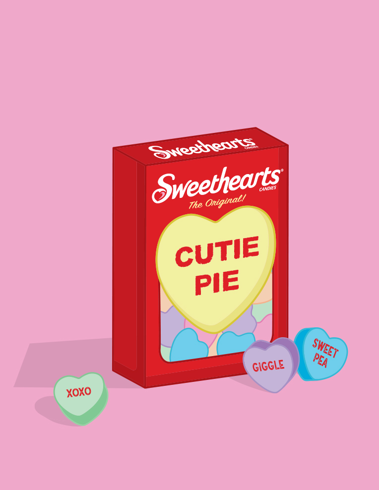
In this case, we based our packaging on the classic Sweethearts candy box.
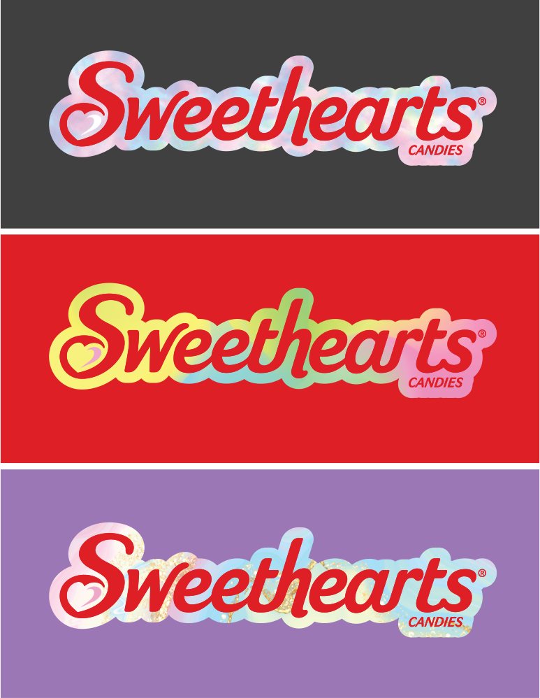
Logo Leverage
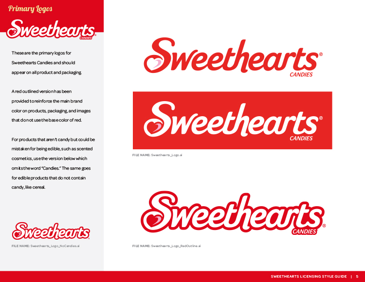
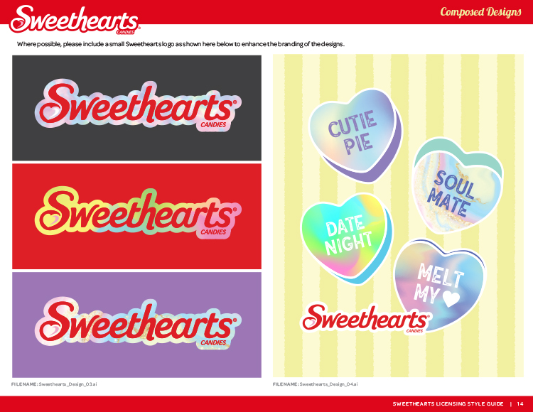
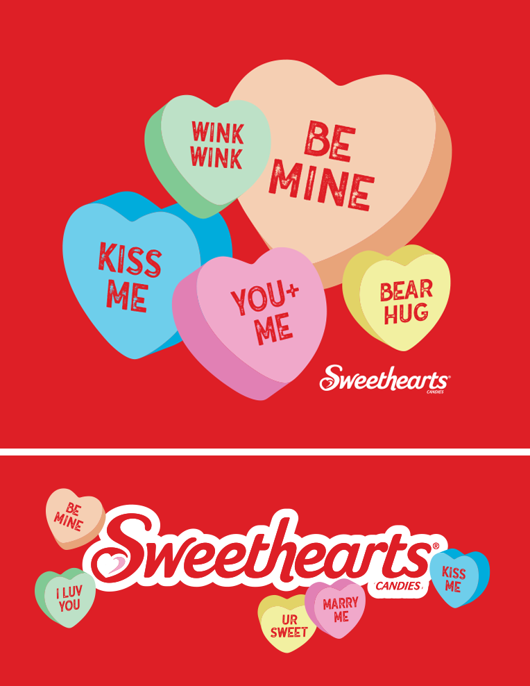
We included a few different versions of the Sweethearts logo with various fills in order to demonstrate the design latitude when working with the brand identity.
Sweet Compositions
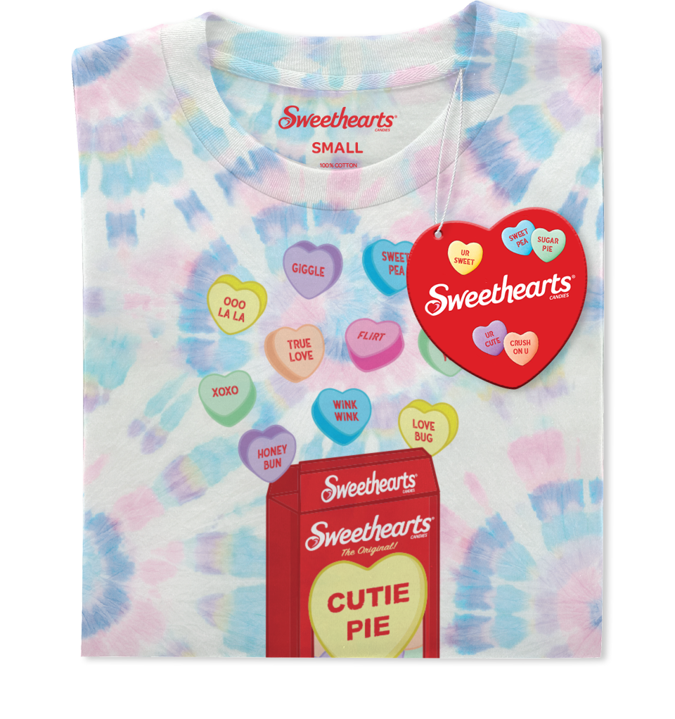
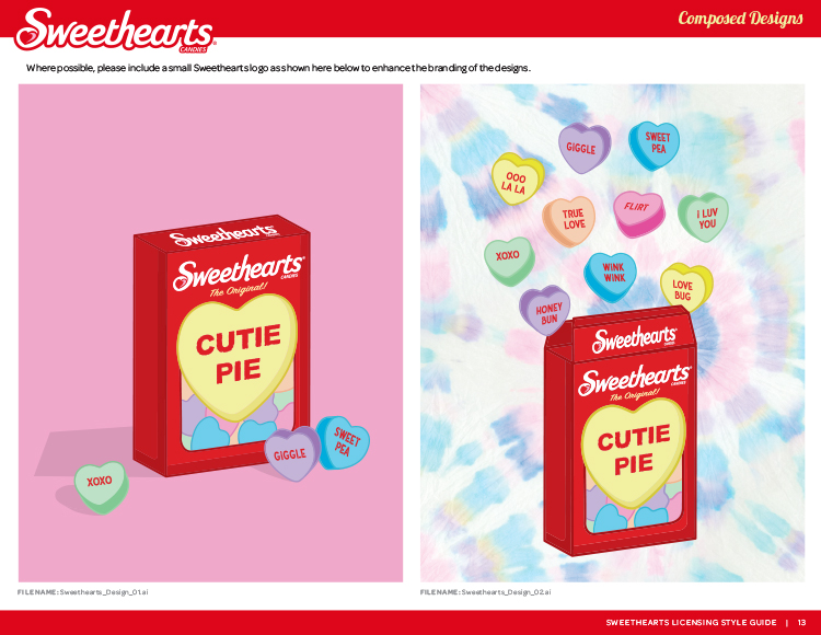
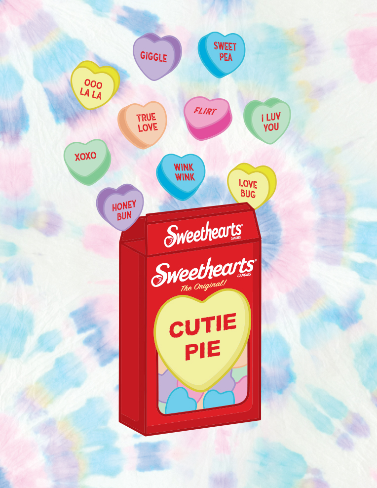
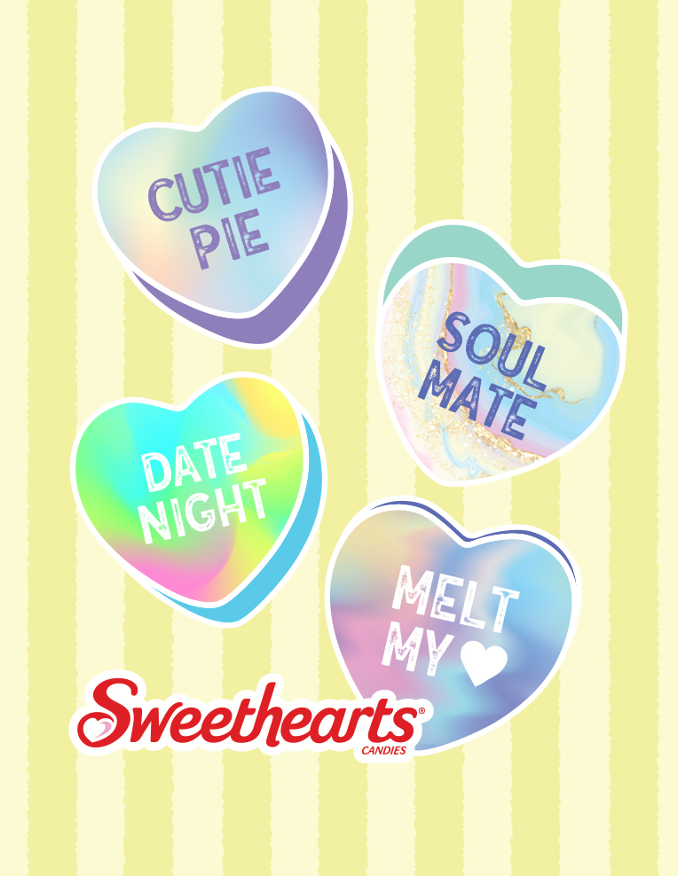
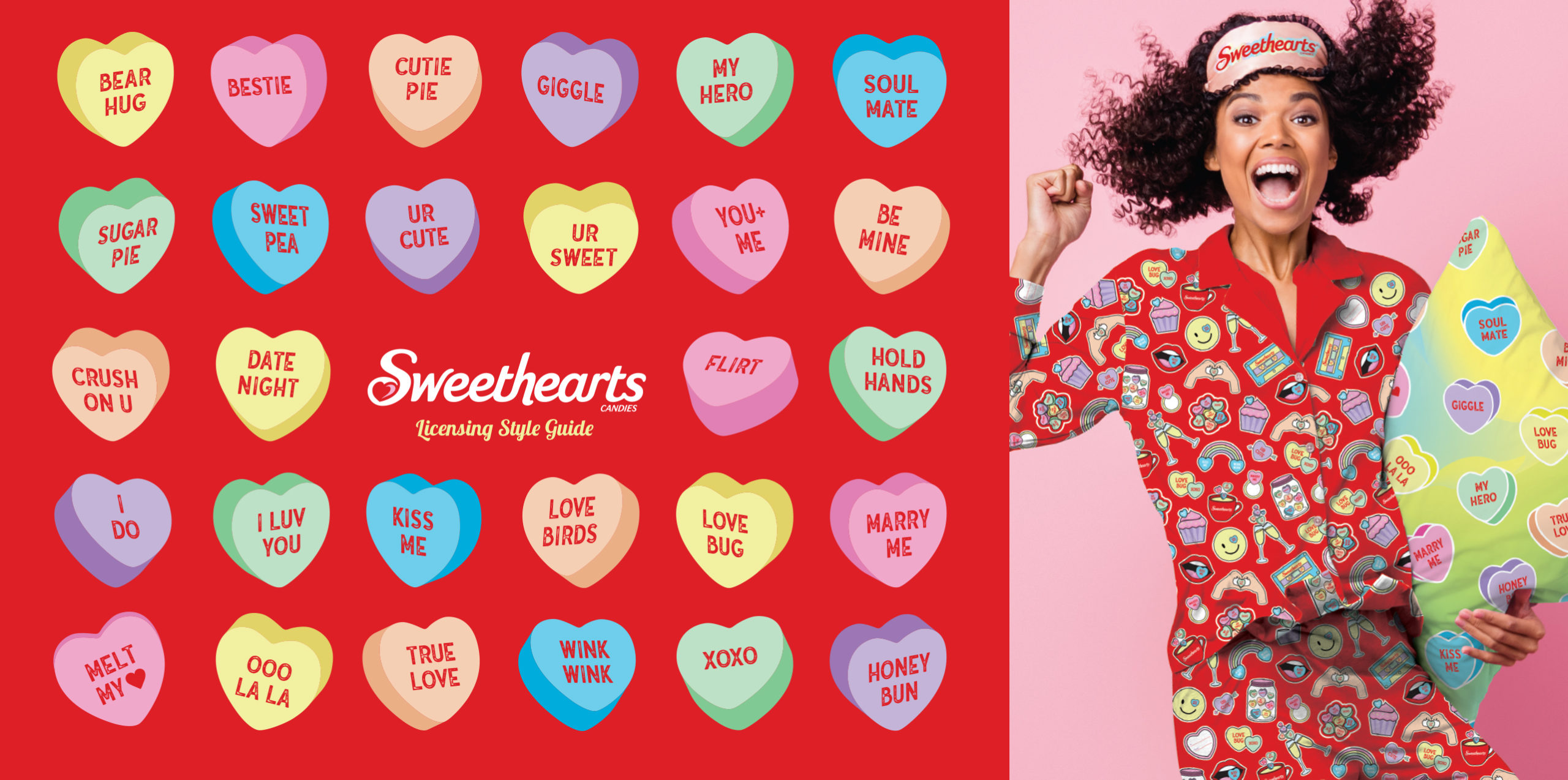
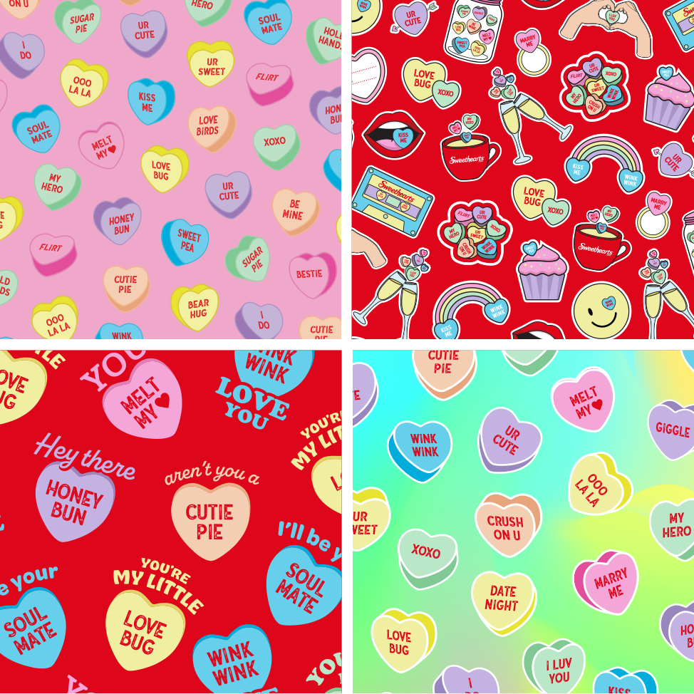
We also provided an assortment of composed designs, featuring illustrated candies and candy box packaging.
These compositions were designed to give licensing partners a variety of options when working with apparel and accessories.
Illustrated Icons
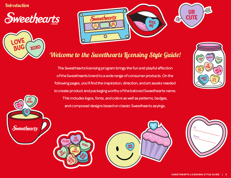
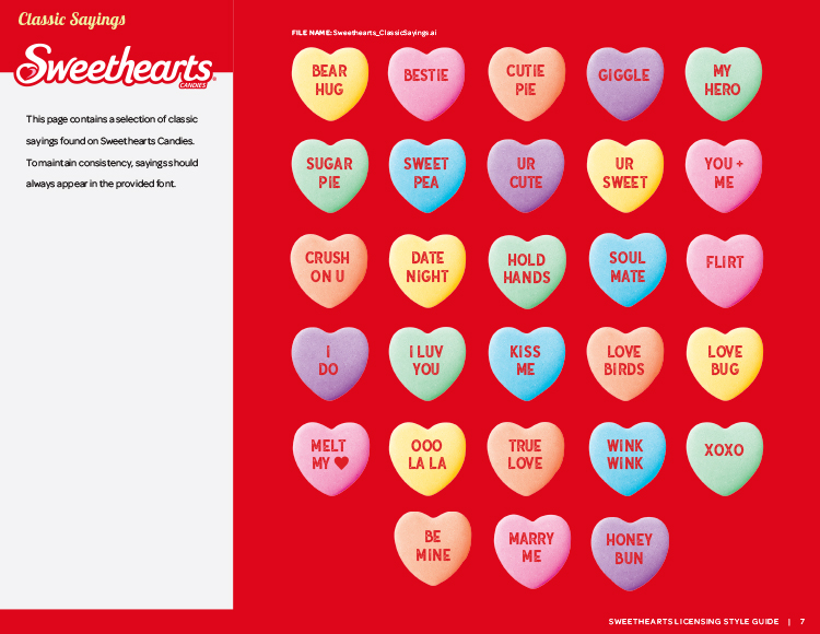
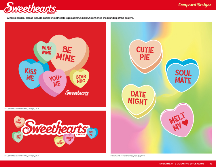
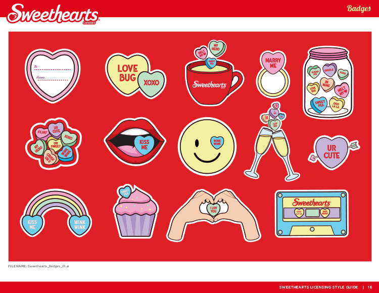
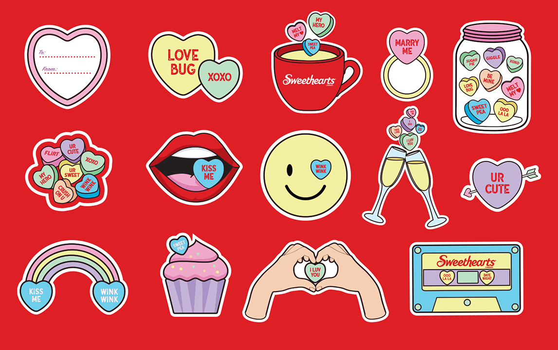
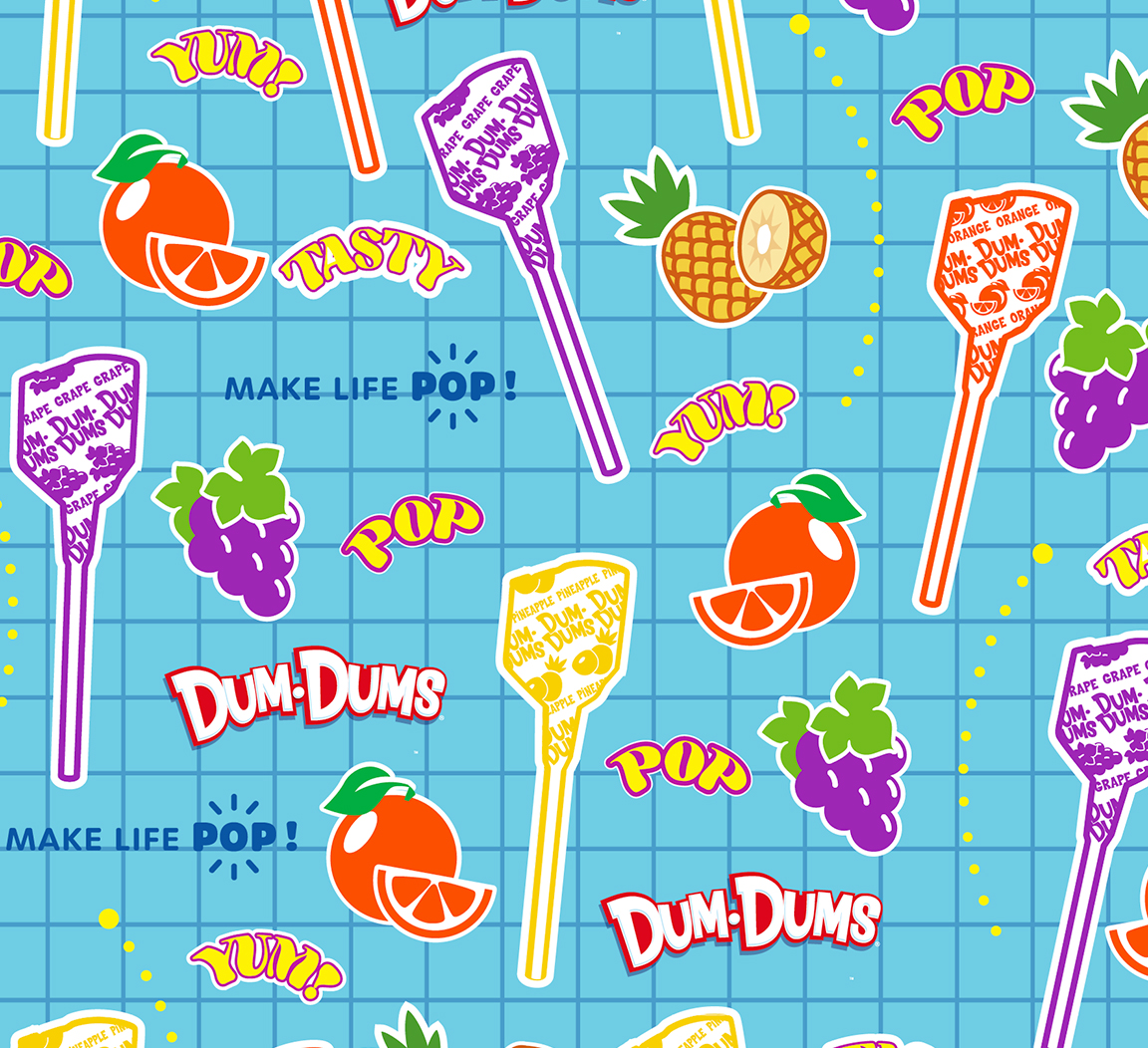
Inspired by sticker collections, we developed a series of illustrated graphic elements that could be used on their own or combined to create new designs.
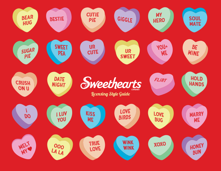
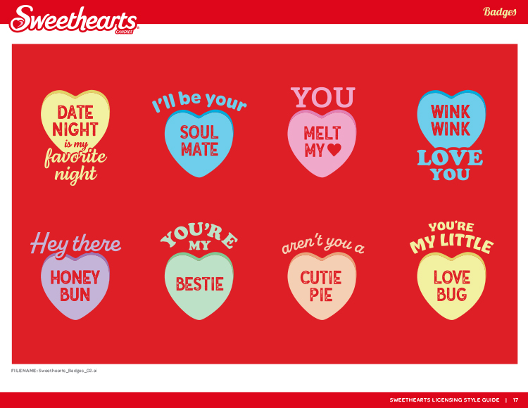
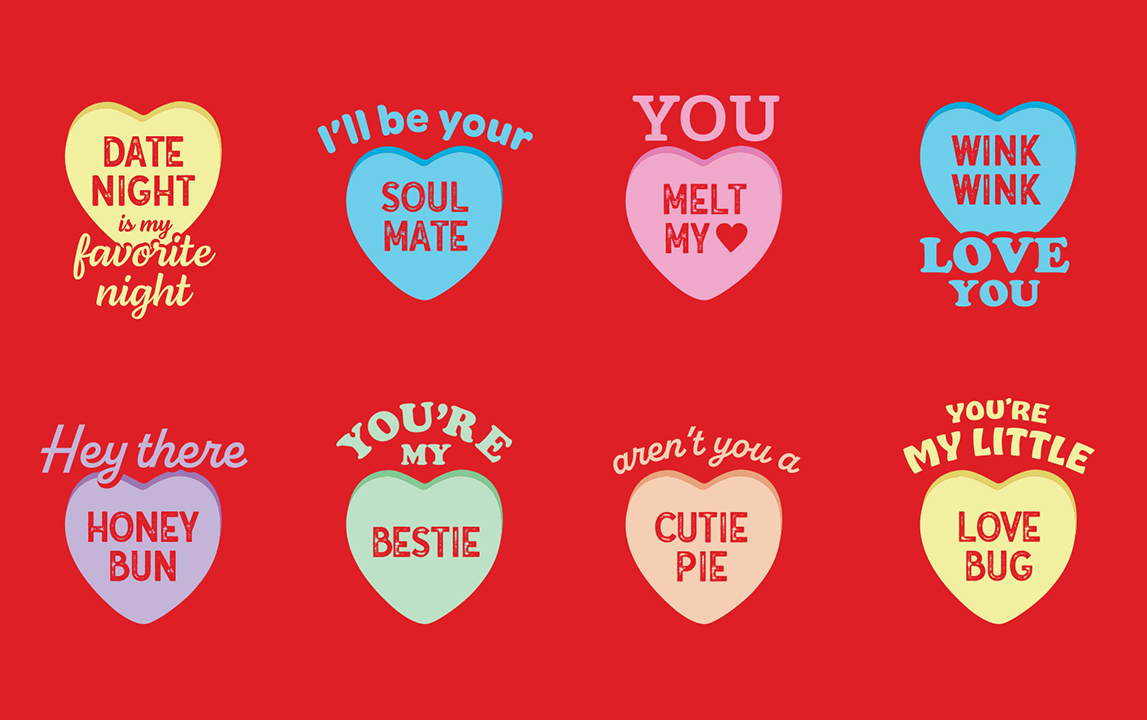
This collection also included designs of the candies themselves, each paired in a lockup with its own signature saying.
Original Patterns
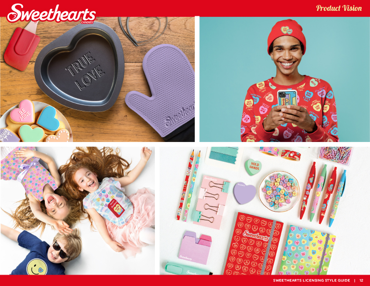
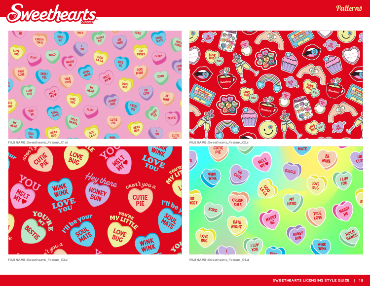
The illustrated graphic elements gave us the building blocks for an inspired collection of patterns designed for product applications such as apparel, accessories, school supplies, bakeware, and electronics.
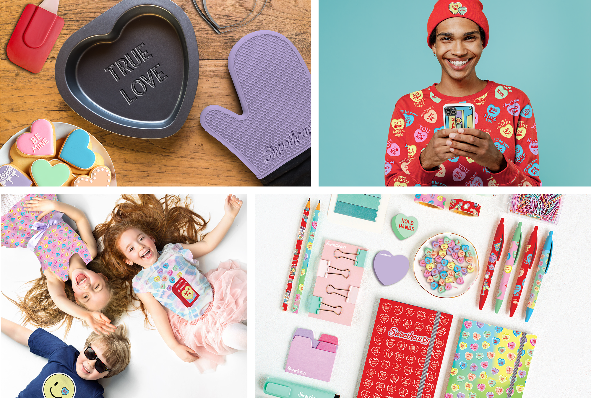
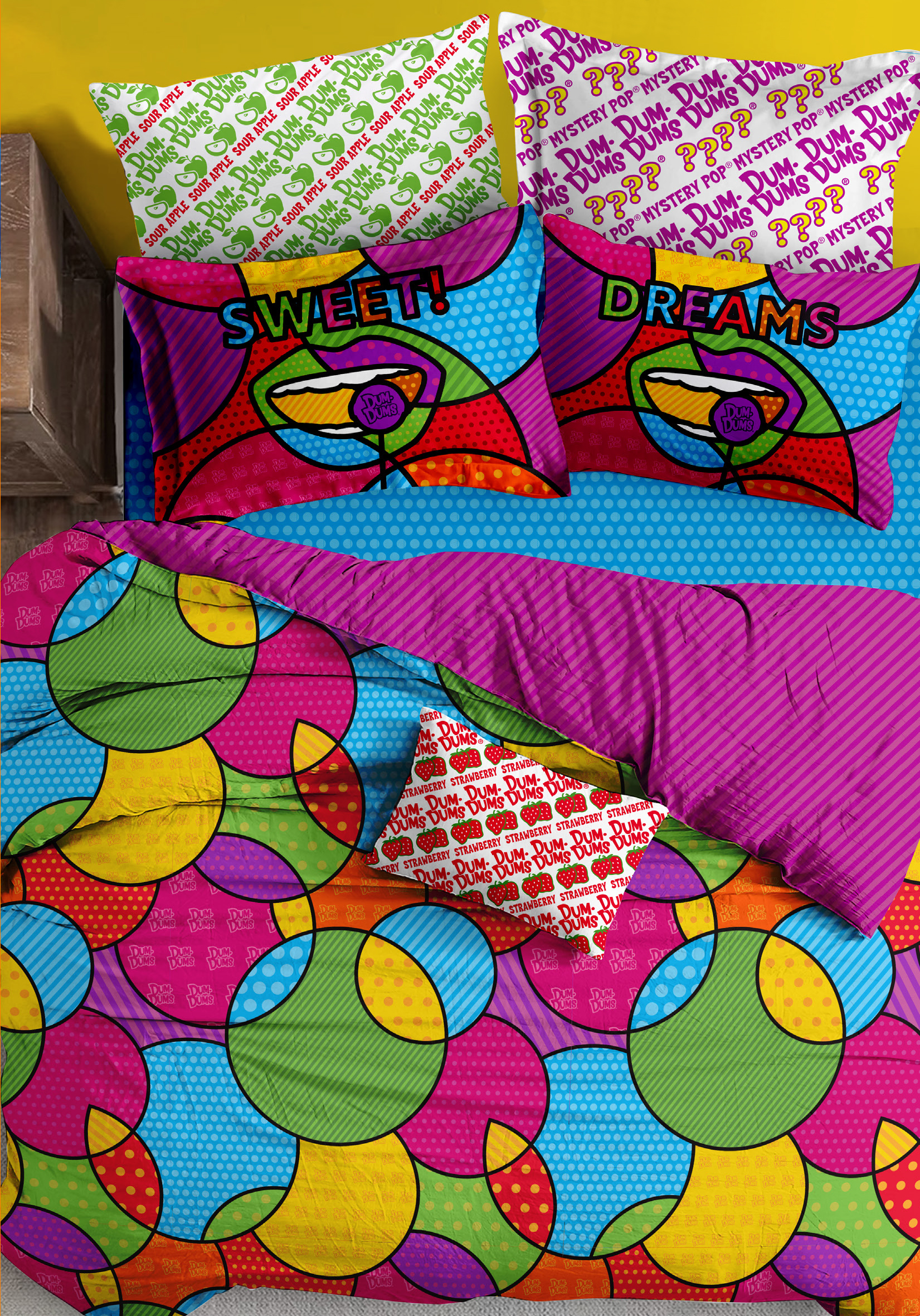
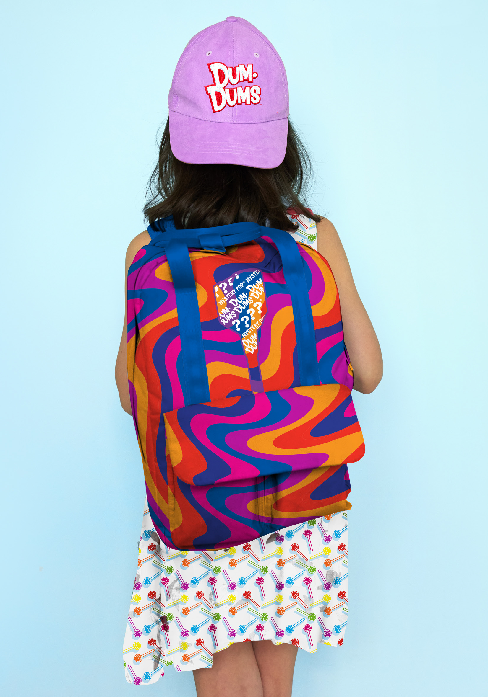
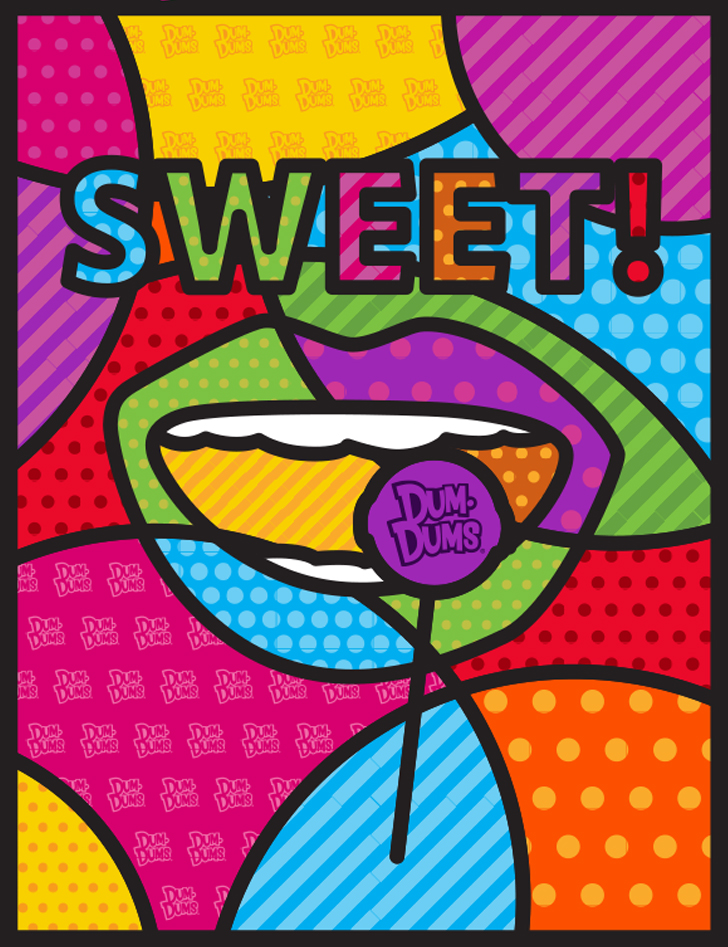
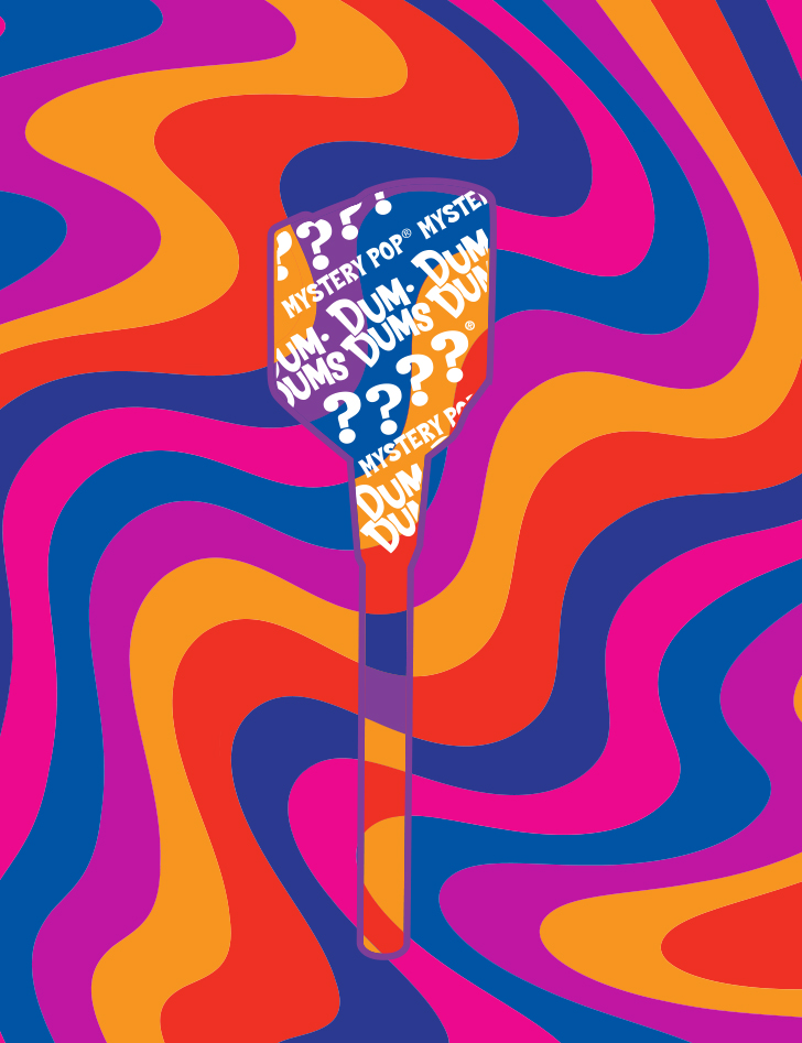
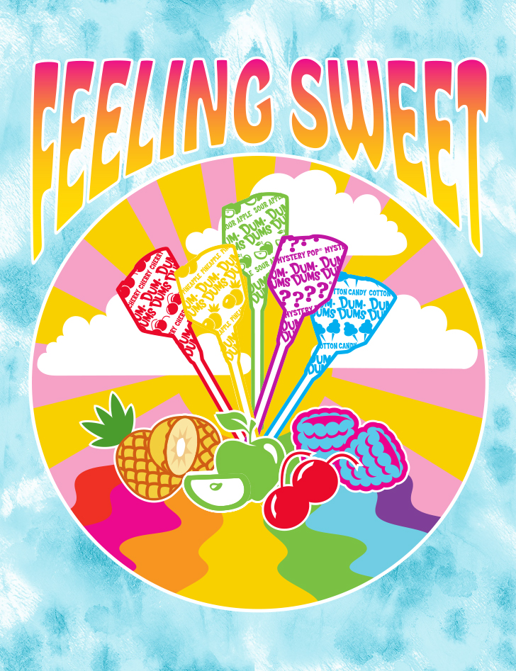
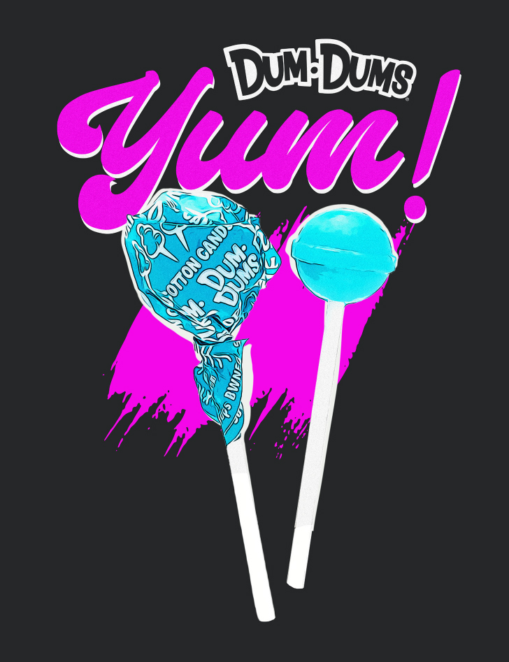
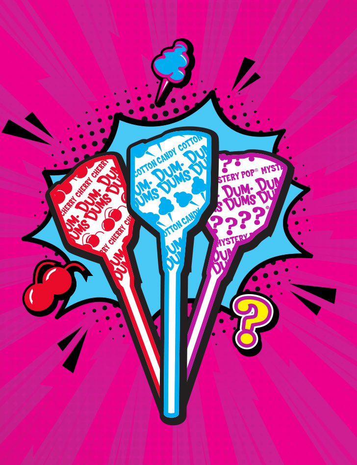
With style guides for both Sweethearts and Dum-Dums, we based our second guide on the theme “Make Life Pop!” and included a selection of composed designs as well as a product vision to demonstrate how the various graphic elements could be applied to a wide range of lifestyle products.
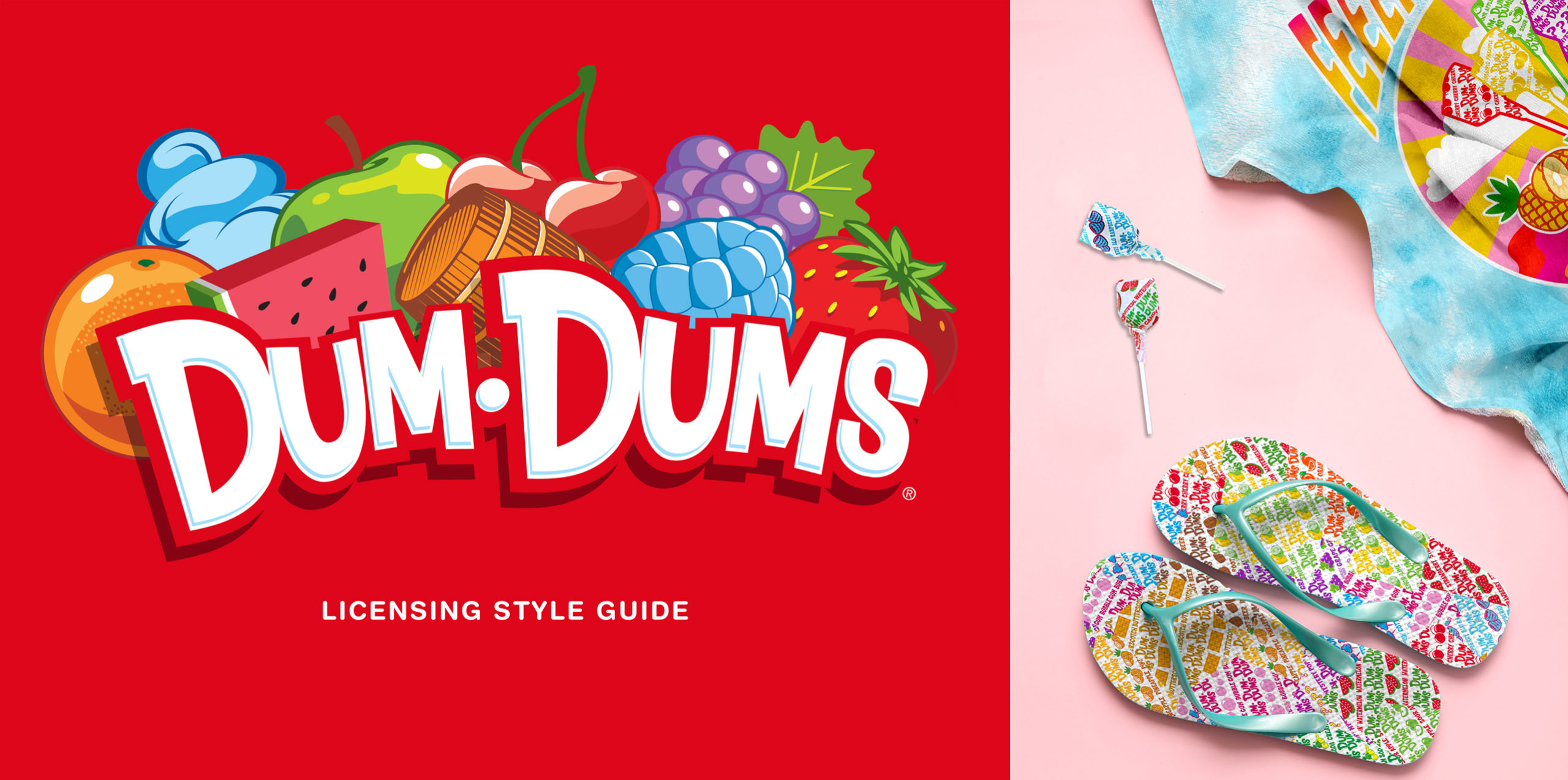
Make Life Pop!
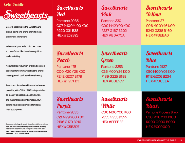
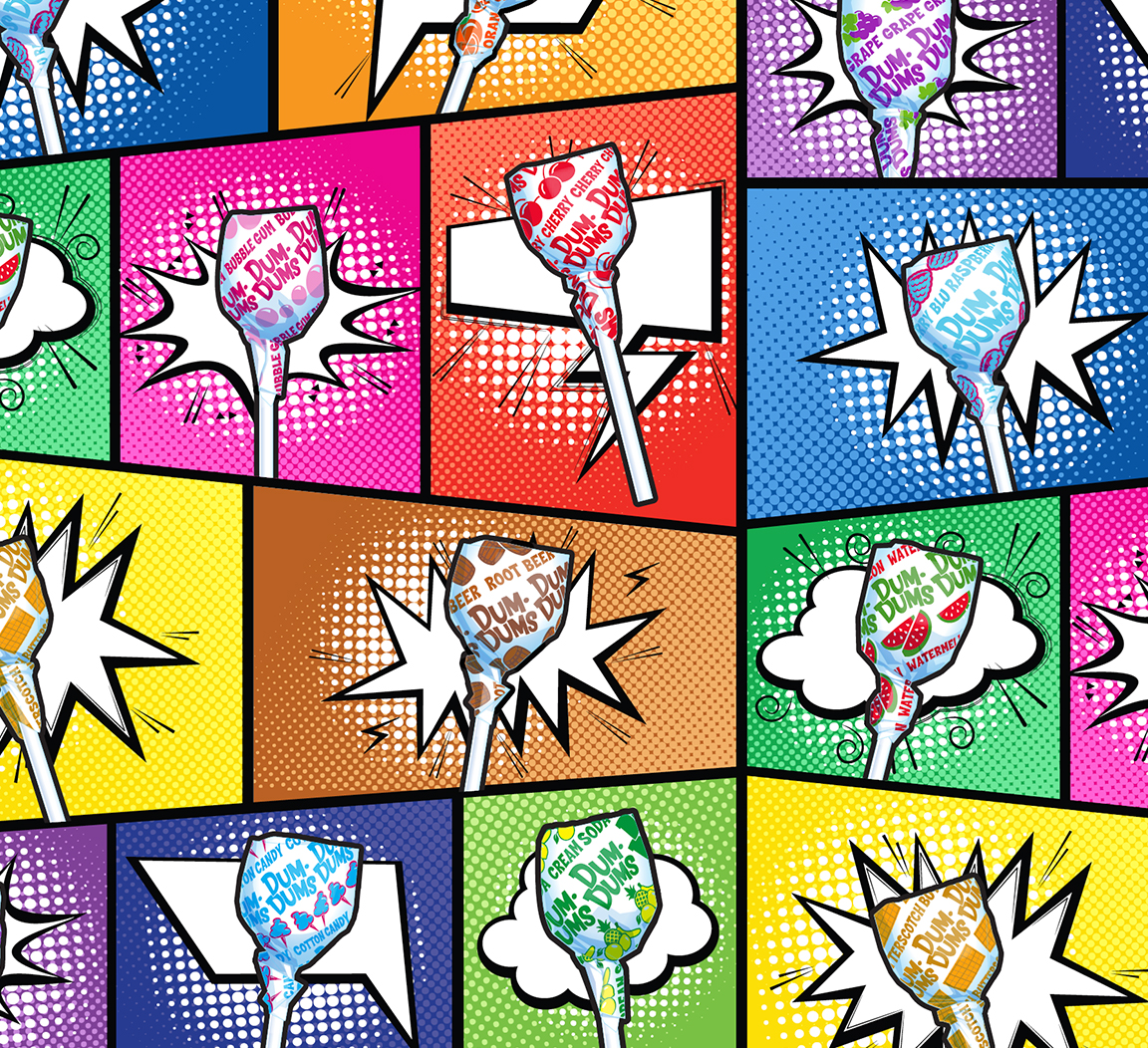
We kicked off the project with a series of mood boards to help the team narrow down the various design styles that could be featured in the guide. After settling on a contemporary pop style, we went to work with a bold color palette and a variety of playful sayings that conjured up all the fun and excitement of the brand.
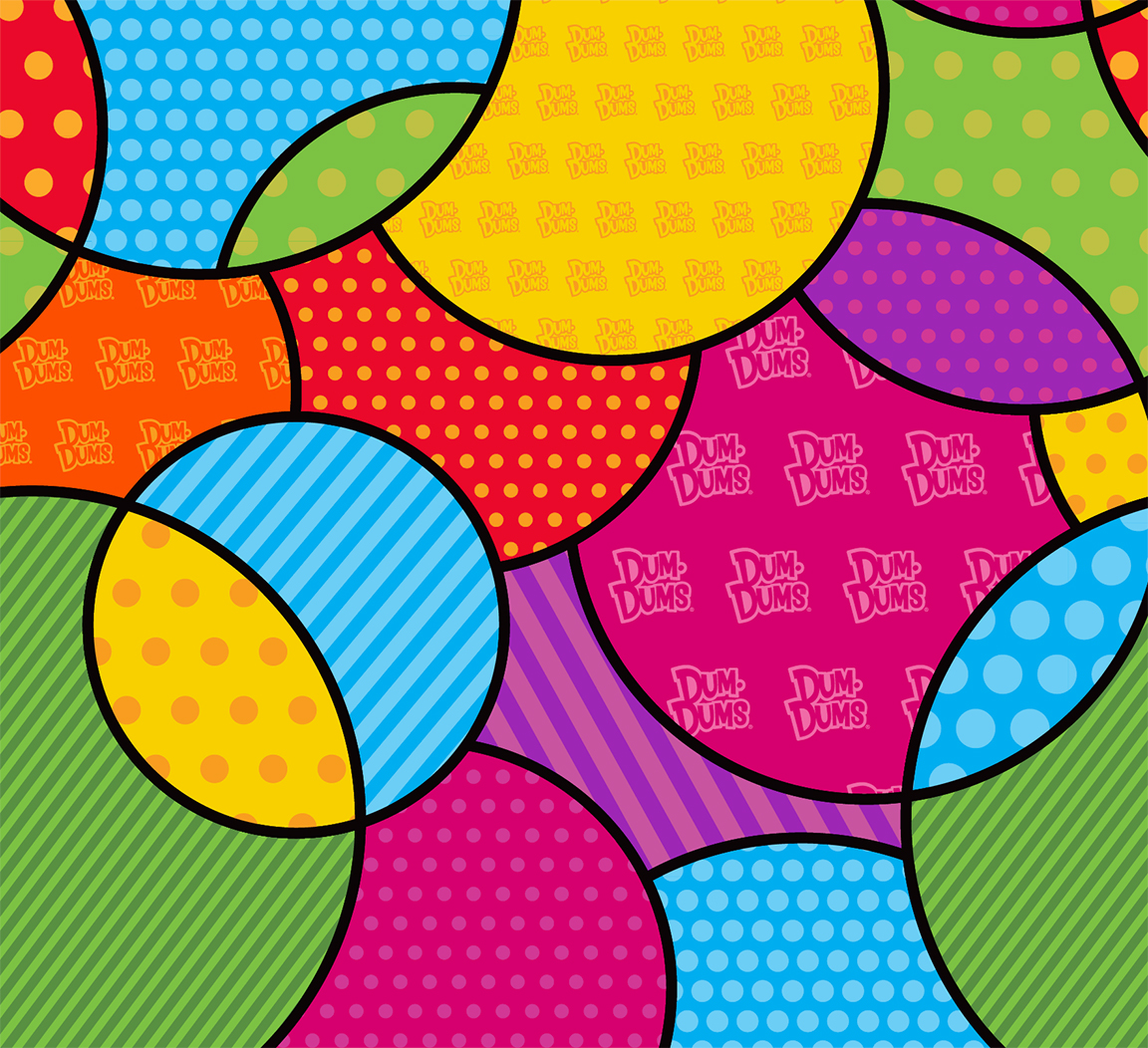
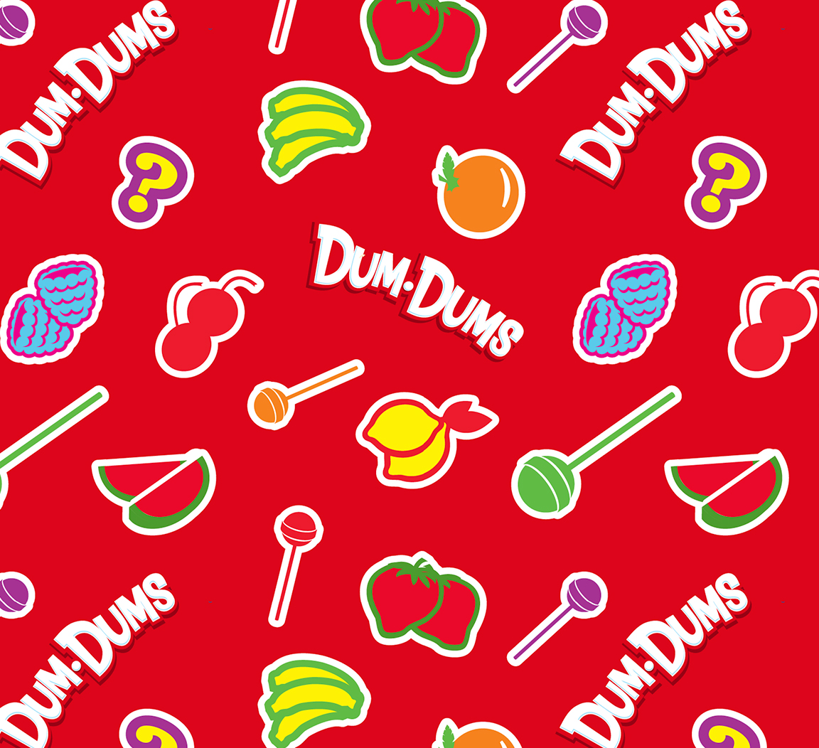
Coordinating Patterns
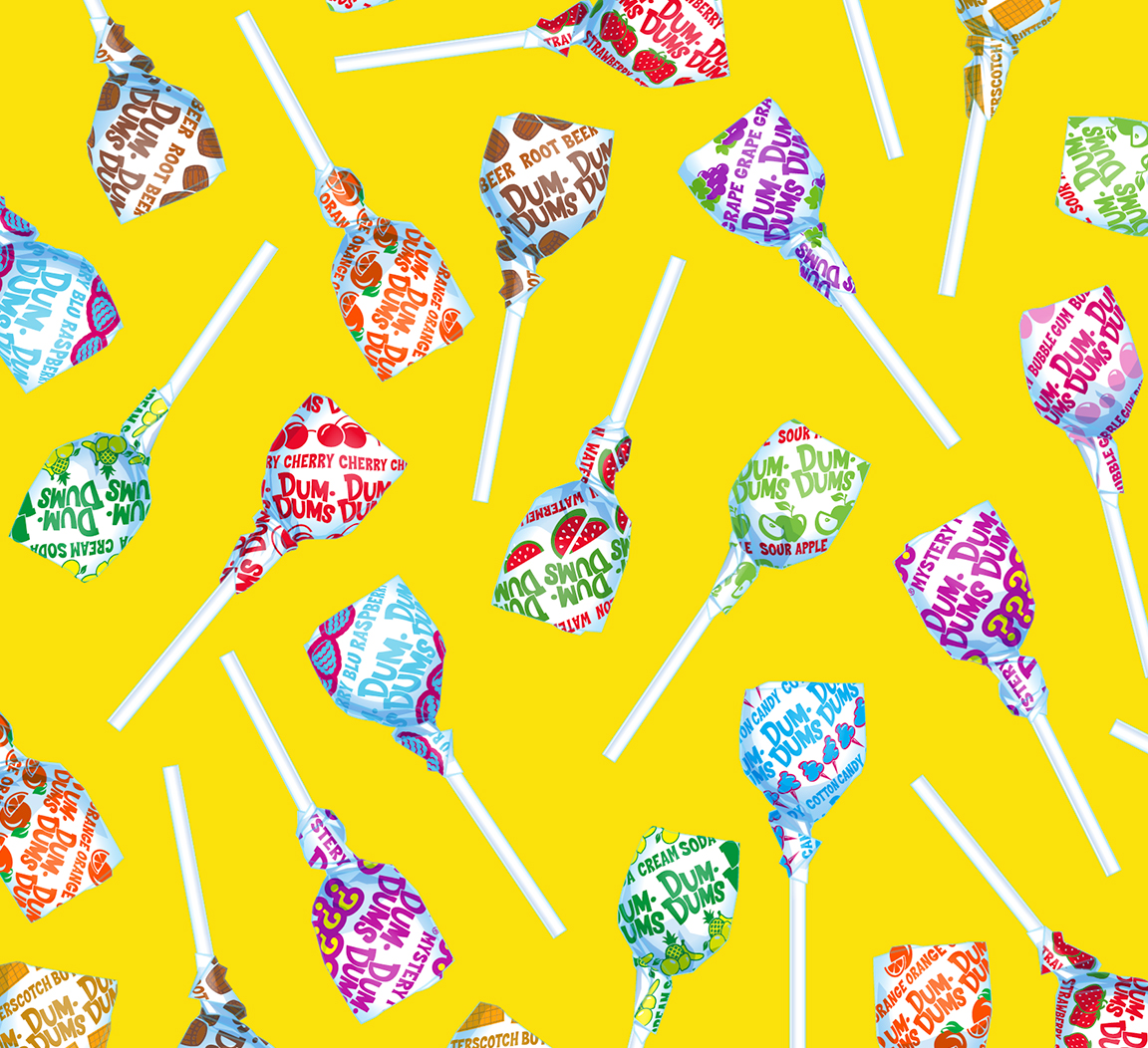
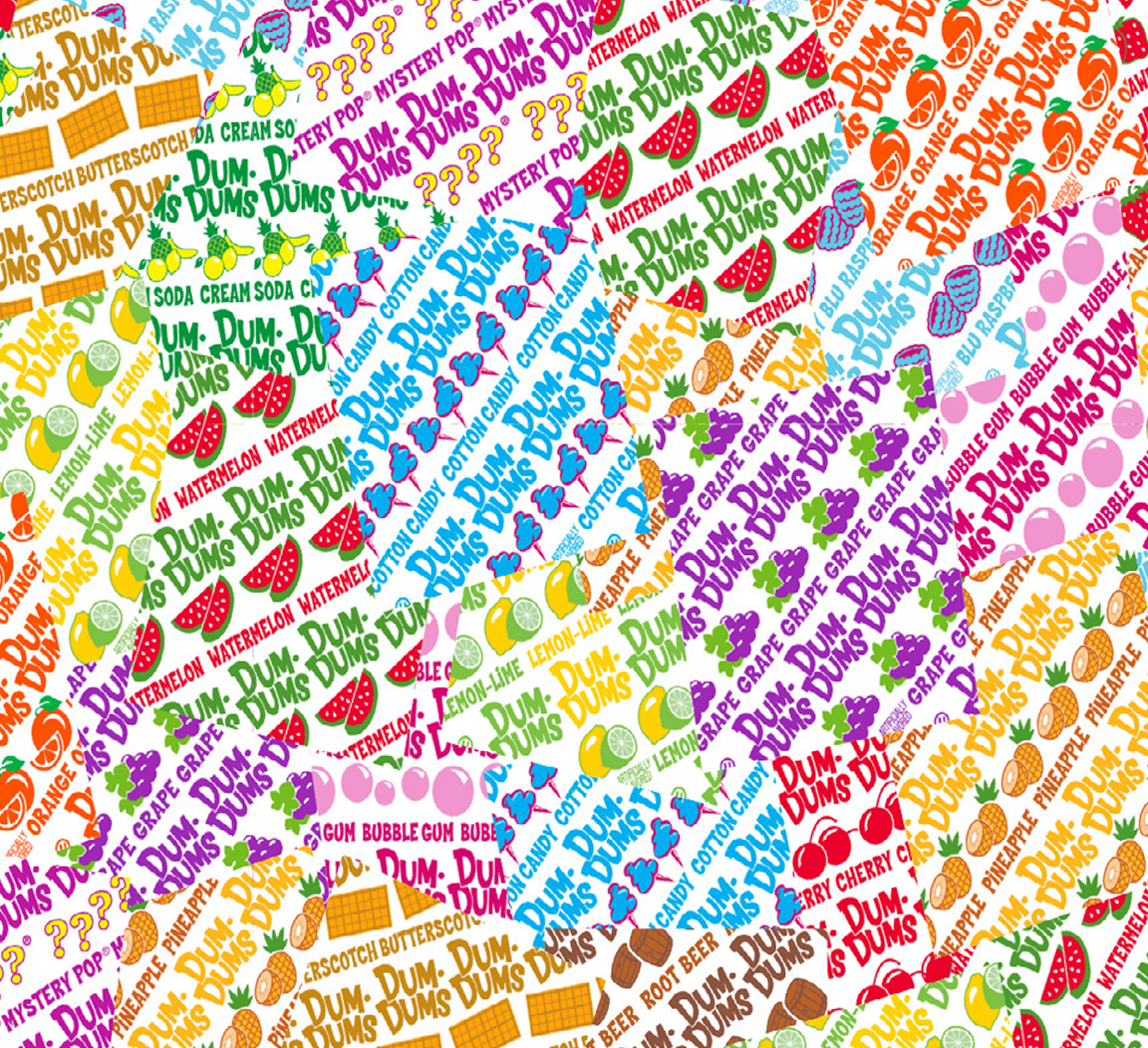
We also provided a series of coordinating patterns to further enhance the new product line. Examples of potential product applications were added to inspire licensing partners and help them visualize the licensing program from start to finish.
Other sweet projects include our design assets and packaging design for Rita’s Italian Ice. For all of our case studies, return to our portfolio.
