Tolkien
Brand Identity | Strategy & Insight | Brand Style Guide
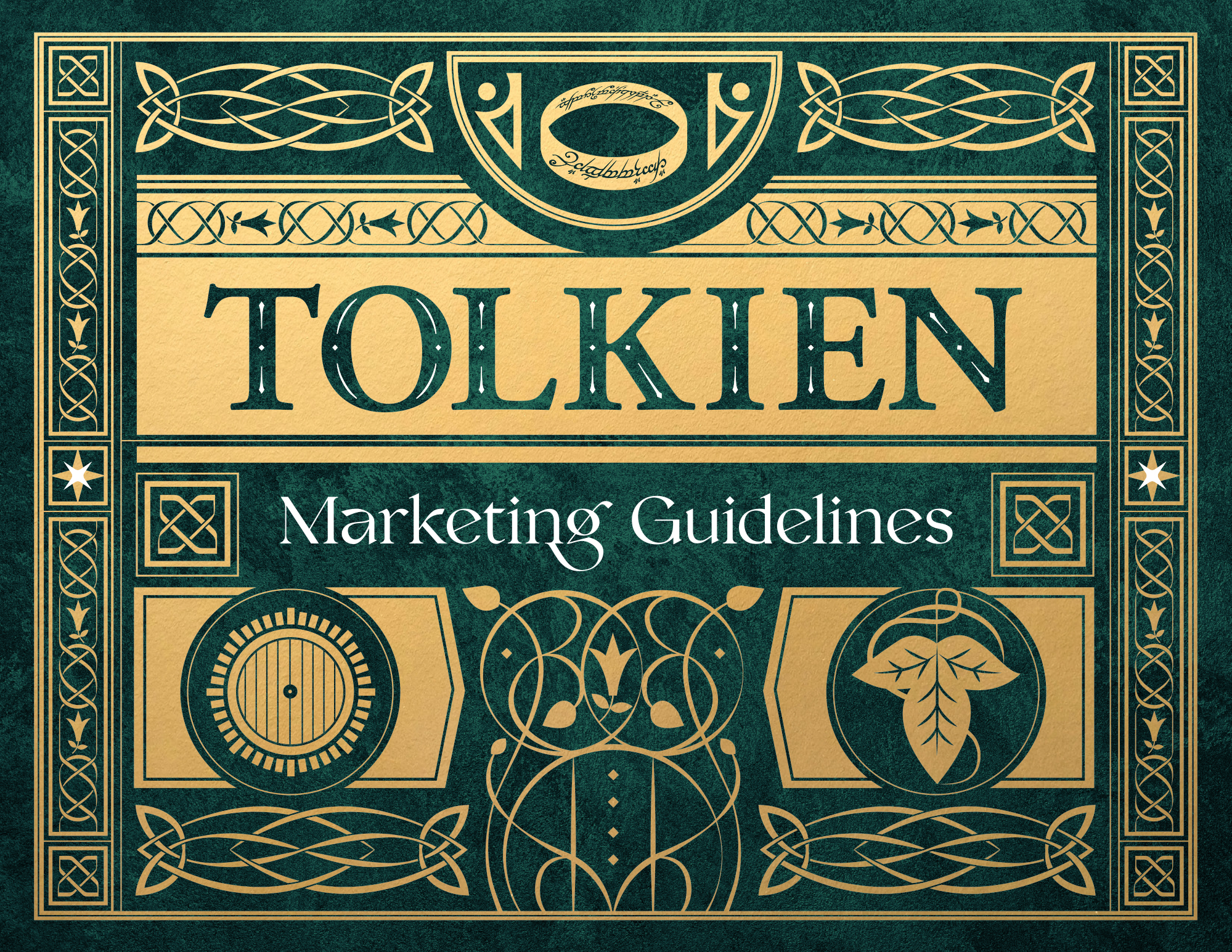
Houghton Mifflin Harcourt (now part of HarperCollins) called on StyleWorks Creative to develop a book and event marketing style guide for the J.R.R. Tolkien publishing program. Our goal was to provide the brand with a strong set of marketing guidelines and a cohesive brand identity that would celebrate the literature while standing apart from the big entertainment branding of the Tolkien-based movies.
Brand Identity
For our marketing guidelines, we began by creating a custom wordmark based on a font familiar to the Tolkien book library.
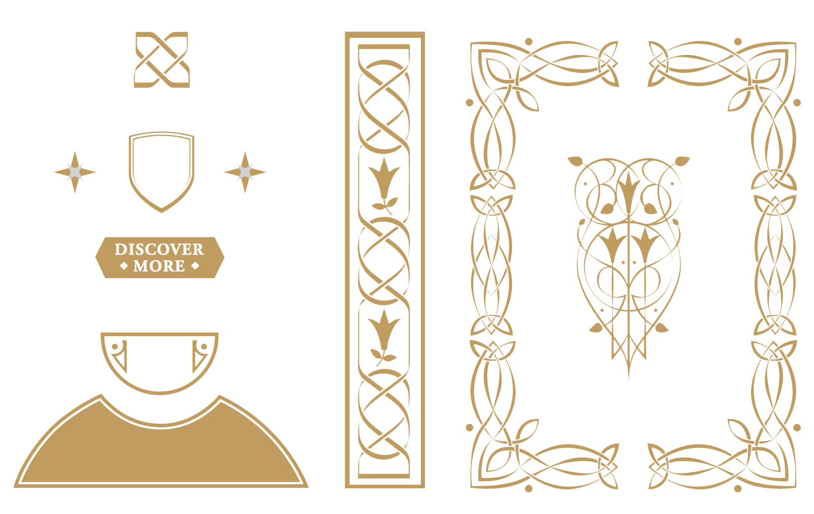
Inspired by antique Celtic and Old Norse designs, we then came up with our own system of ornate embellishments that would complement the literature without straying far from the story.

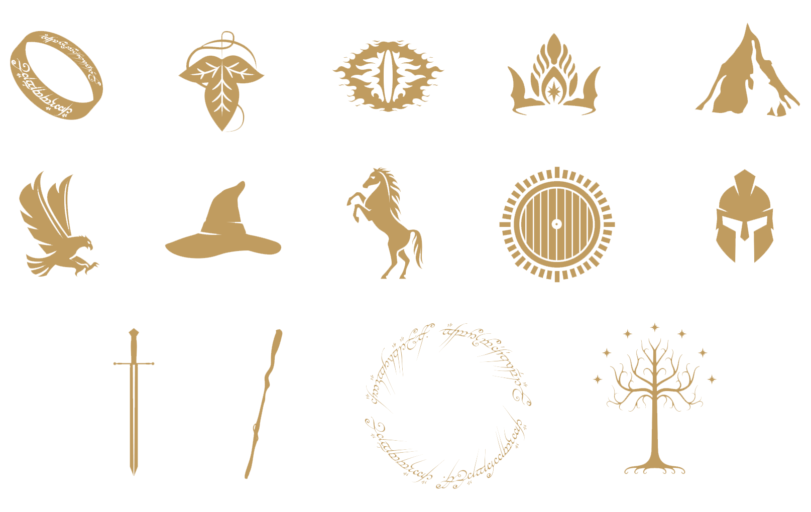
Custom Icons and Graphic Elements
We developed a selection of custom icons and other graphic elements inspired by the content of the books, including a helmet, a sword, and, of course, a ring.
Our brand identity also included scroll elements and framing shapes that could enhance the layout of a design.
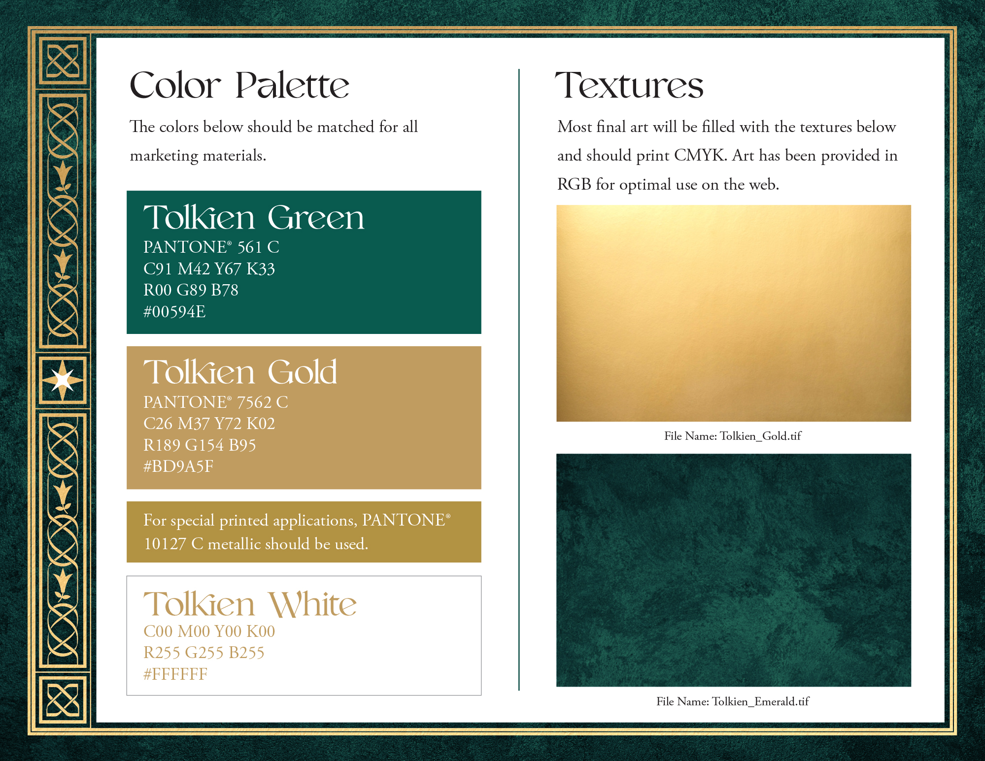
Colors and Typography
Inspired by the lushness of the Shire, as well as regal elements like crowns and scepters, we centered our color palette around green and gold.
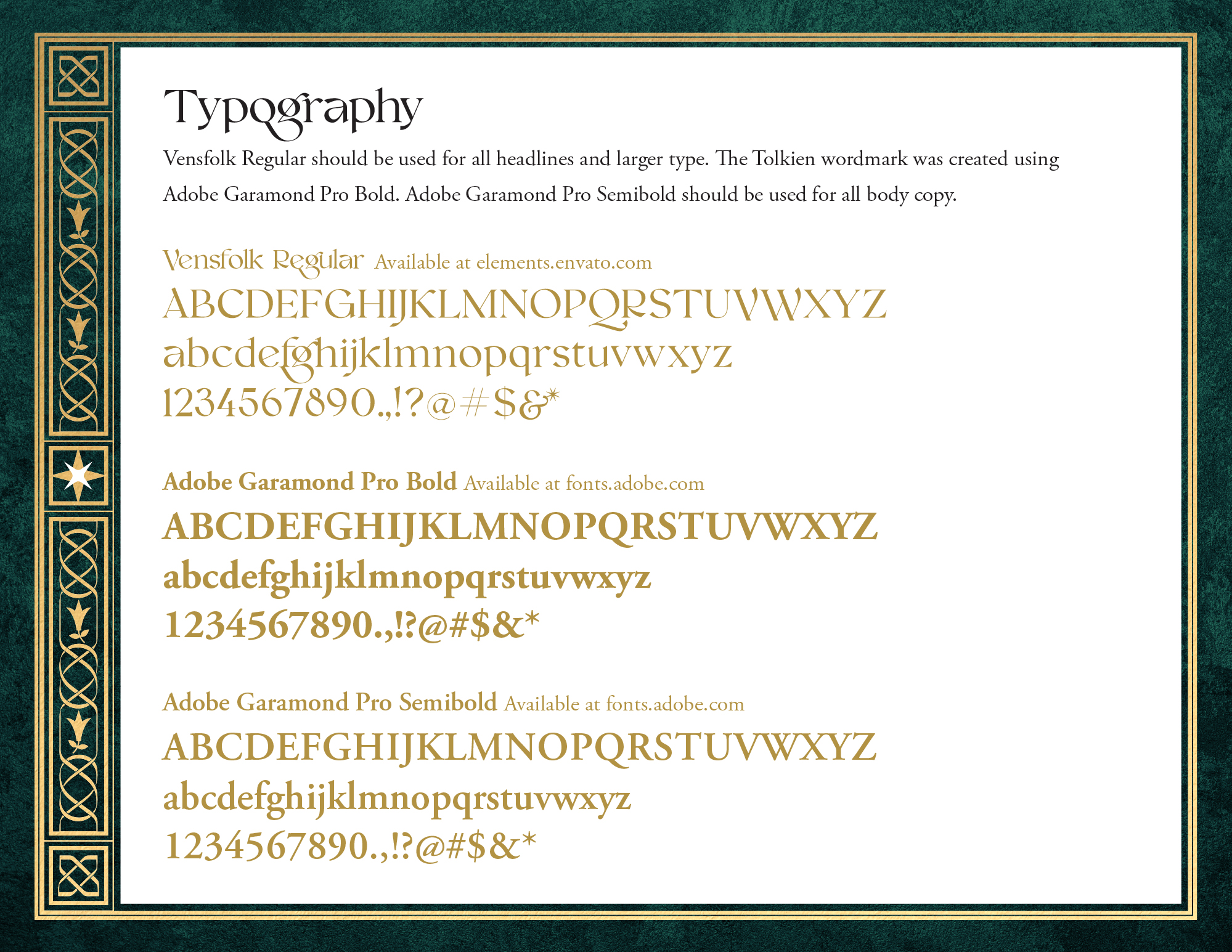
We also paired a new font, Vensfolk, with the classic Garamond, bridging the gap between old and new while appealing to readers of all ages.
Marketing Guidelines
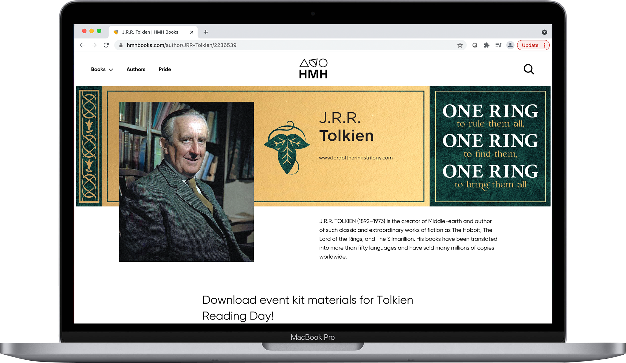
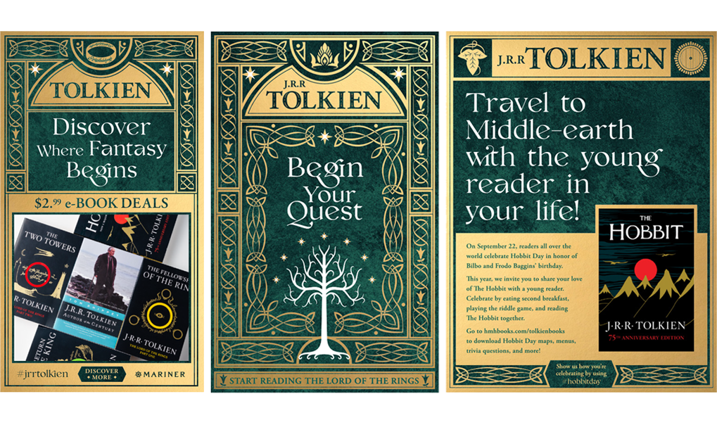
Our guide included marketing samples for both print and digital applications, each of which to be released by the HMH internal creative team.
These concepts would live on their homepage, as well as in web advertisements, flyers, and full-page ads.
Design Tutorials
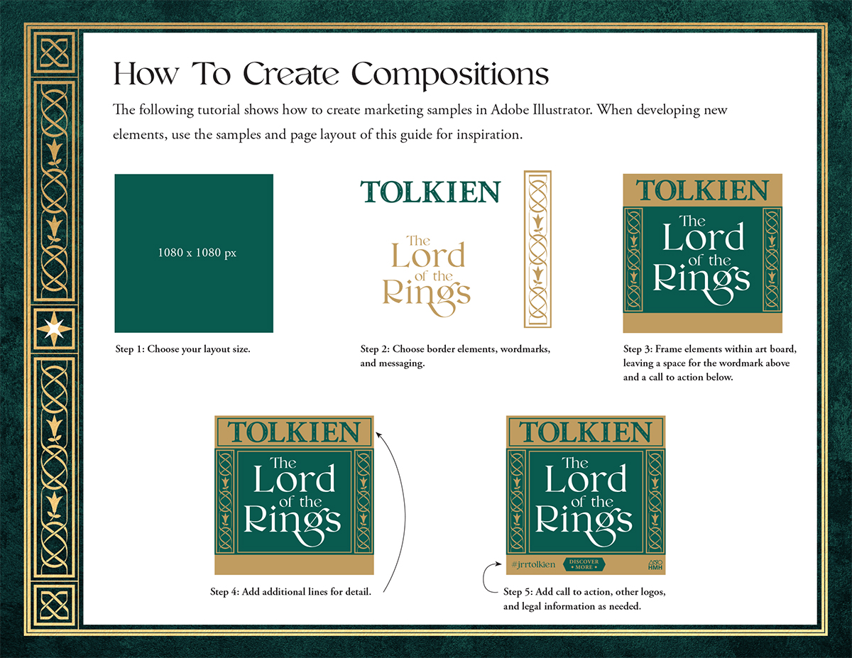
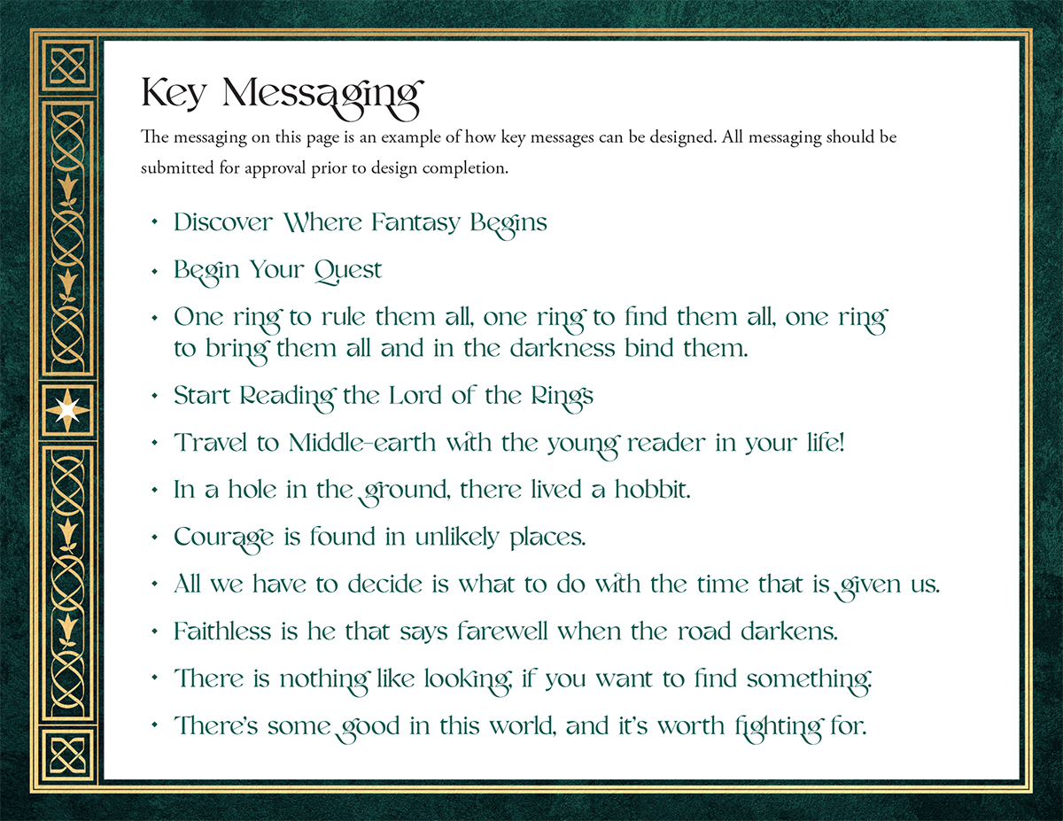
In addition to the marketing samples, we also provided the HMH creative team with examples of key messaging and an in-depth, multi-page tutorial on how to create their own compositions.
Similar projects include our brand identity for popular children’s book series Magic Tree House.
