EP
Corporate Identity | Logo Development | Icon System | Brand Guidelines
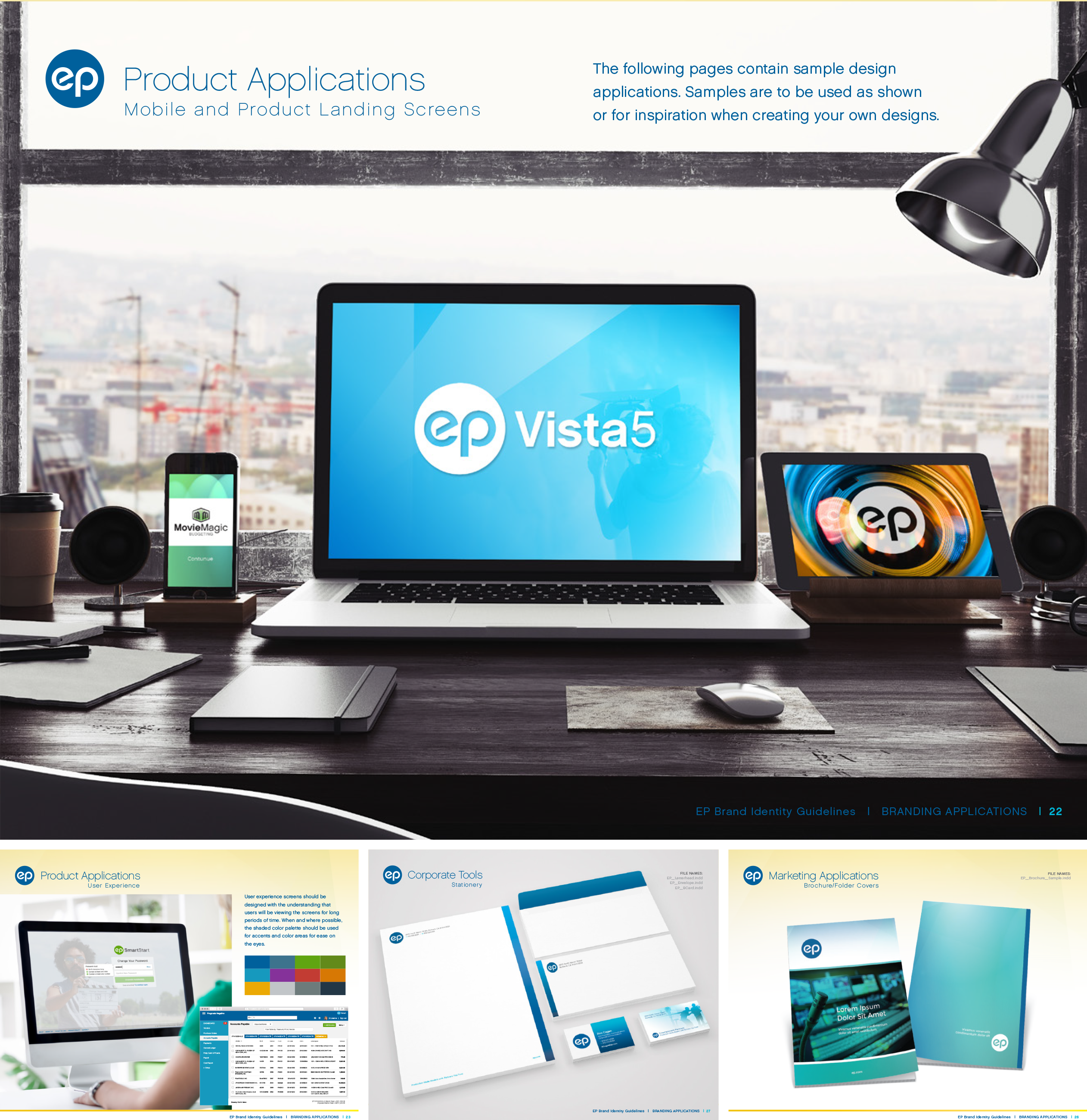
EP (Entertainment Partners) is the leading provider of account management software for the entertainment industry. As part of a major rebranding, StyleWorks Creative developed a corporate identity that included a new logo and an icon system for UX design, updating the company’s look while improving its user experience.
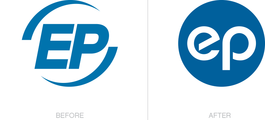
Corporate Identity & Logo
With any corporate identity design project, finding consensus among the various stakeholders can be a challenge. In this case, we found success in our very first round of logo treatments, as our streamlined approach met all requirements.
Logo Usage
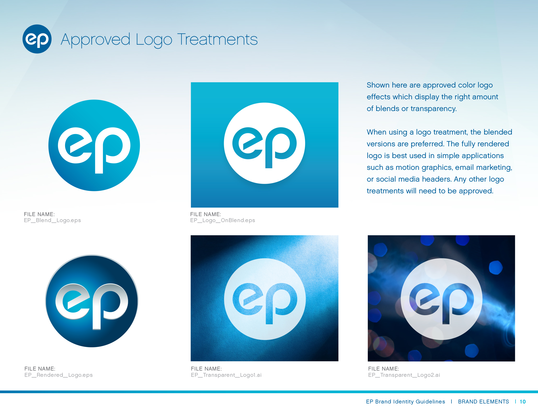
As with many of our guides, we provided ample instruction on working with the brand’s primary logo and, in this case, the application of various logo treatments.
Color Palette
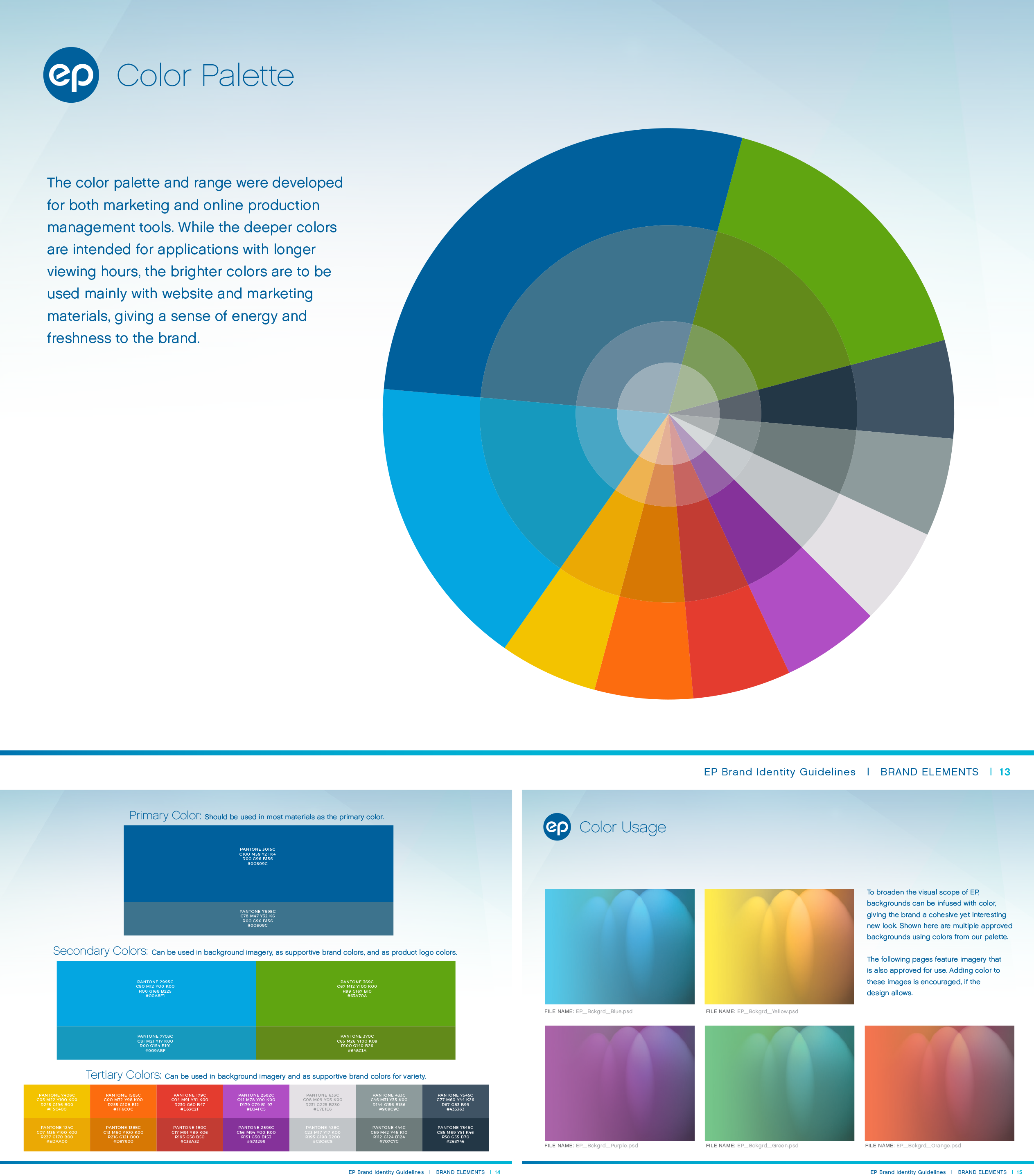
Starting with EP’s classic blue, we developed a widened color palette made up of primary, secondary, and tertiary hues that would help differentiate the company’s product line.
We also provided an alternate version for digital applications, with more subdued tones to better facilitate the user experience. This was based on extensive research from their clients.
Photography
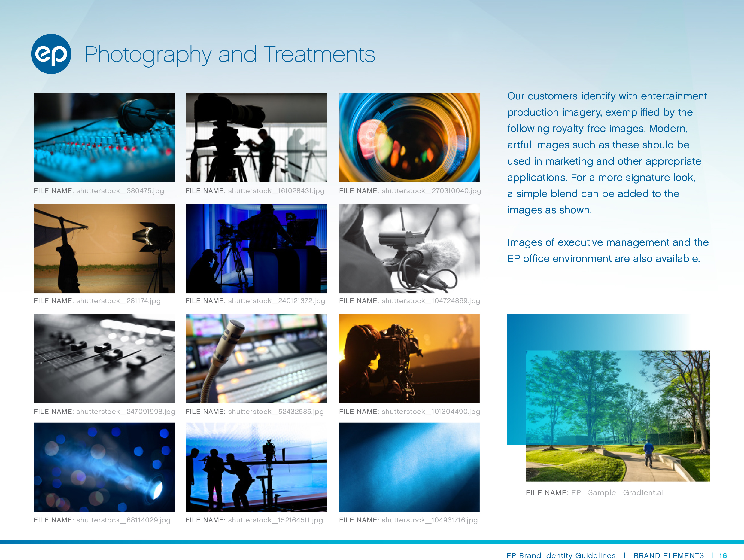
We captured the world of film and television production with a selection of behind-the-scenes photography. Our goal was to appeal directly to EP’s clientele while reaffirming the company’s importance to the industry.
Marketing Applications
Our final deliverable was an internal brand guide for EP’s entire suite of software, promoting the diversity of their product line while keeping it all contained under the EP banner.
Icons for UX Design
Also giving a sense of unity to the EP digital suite, we developed an icon system with a series of app-specific icons based on the color palette.
To see the branding in action, visit EP.com.
Other brand identity projects include our recent work on HeartBox, a gift box subscription service by Build-A-Bear, as well as Sophia the Robot by Hanson Robotics.

