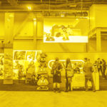
One of last year’s highlights included working with Pineapple Express to revamp THC, a cannabis lifestyle brand intertwined with Southern California’s surf and skate culture.
THC began in mid-90s, when founder Ramsey Salem and company started a guerilla marketing campaign tagging Los Angeles and beyond with thousands of stickers. With the legalization of recreational cannabis in Colorado and other states, cannabis-lovers have been coming out of the shadows, creating new markets for niche brands to expand. This was the perfect time for THC to update its look and hone its message.
Our task was to create a style guide that reexamined THC from all sides while remaining true to the brand’s origin. The branding process began with extensive research into the evolving cannabis market, which allowed us to identify a target audience that varied from your traditional enthusiast to the more health-minded medicinal user. We developed a new mission statement, a brand promise, as well as a set of values and attributes; all of which worked in concert to define the brand’s essence while clearly articulating its scope and intent.
Defining THC’s brand vision gave us a foundation to build upon.
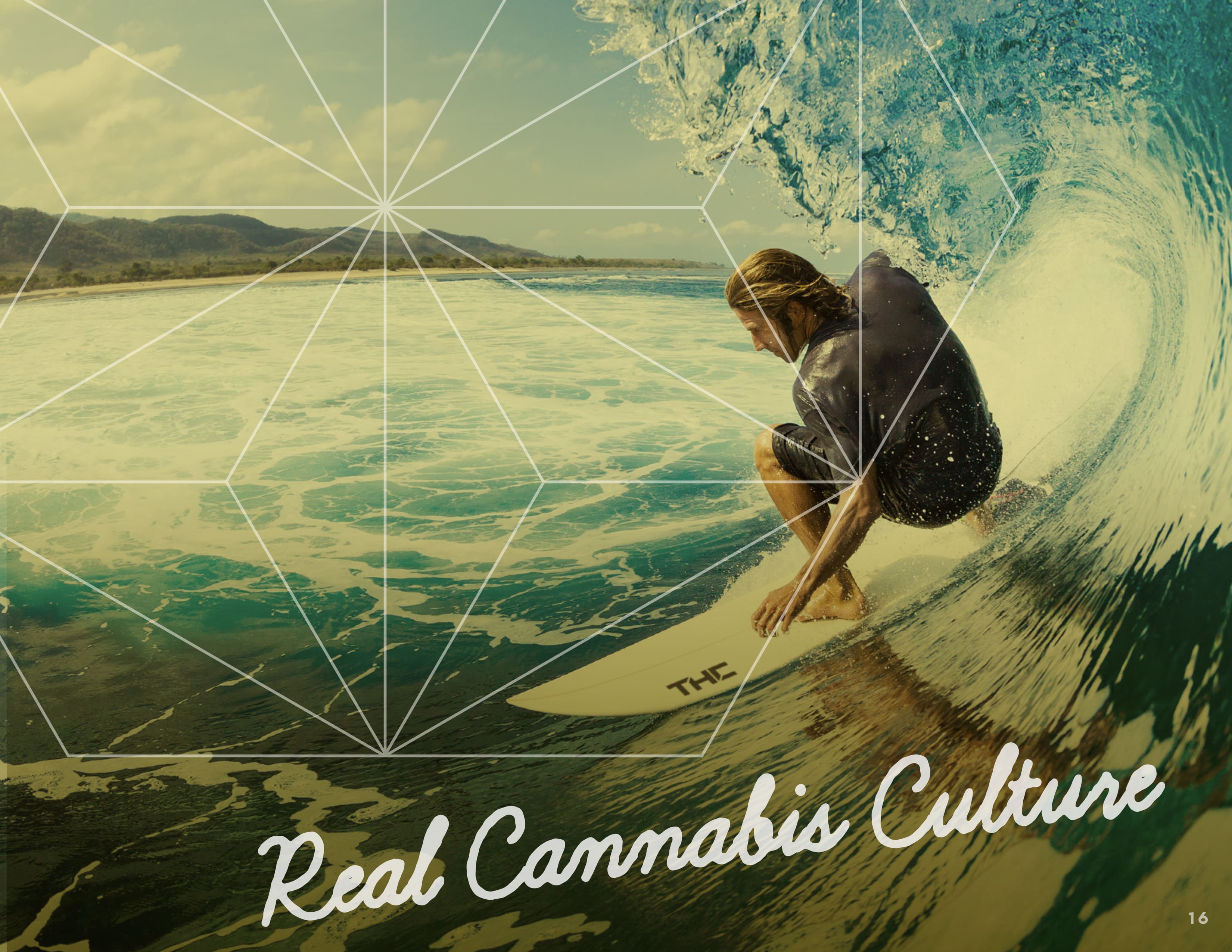
The next phase of development began with the creation of a primary logo, which consisted of an icon and wordmark. This section of the guide also included direction on logo usage and design latitude. A color palette and selection of fonts were also provided, along with a signature pattern of overlapping hemp leaves based on a traditional Japanese pattern called Asanoha. Hangtags and labels further accentuated the design elements, using the logo’s hexagon along with graphic fill treatments. Closing the section, we included lifestyle photography combining various elements of surf, skate, and cannabis culture.
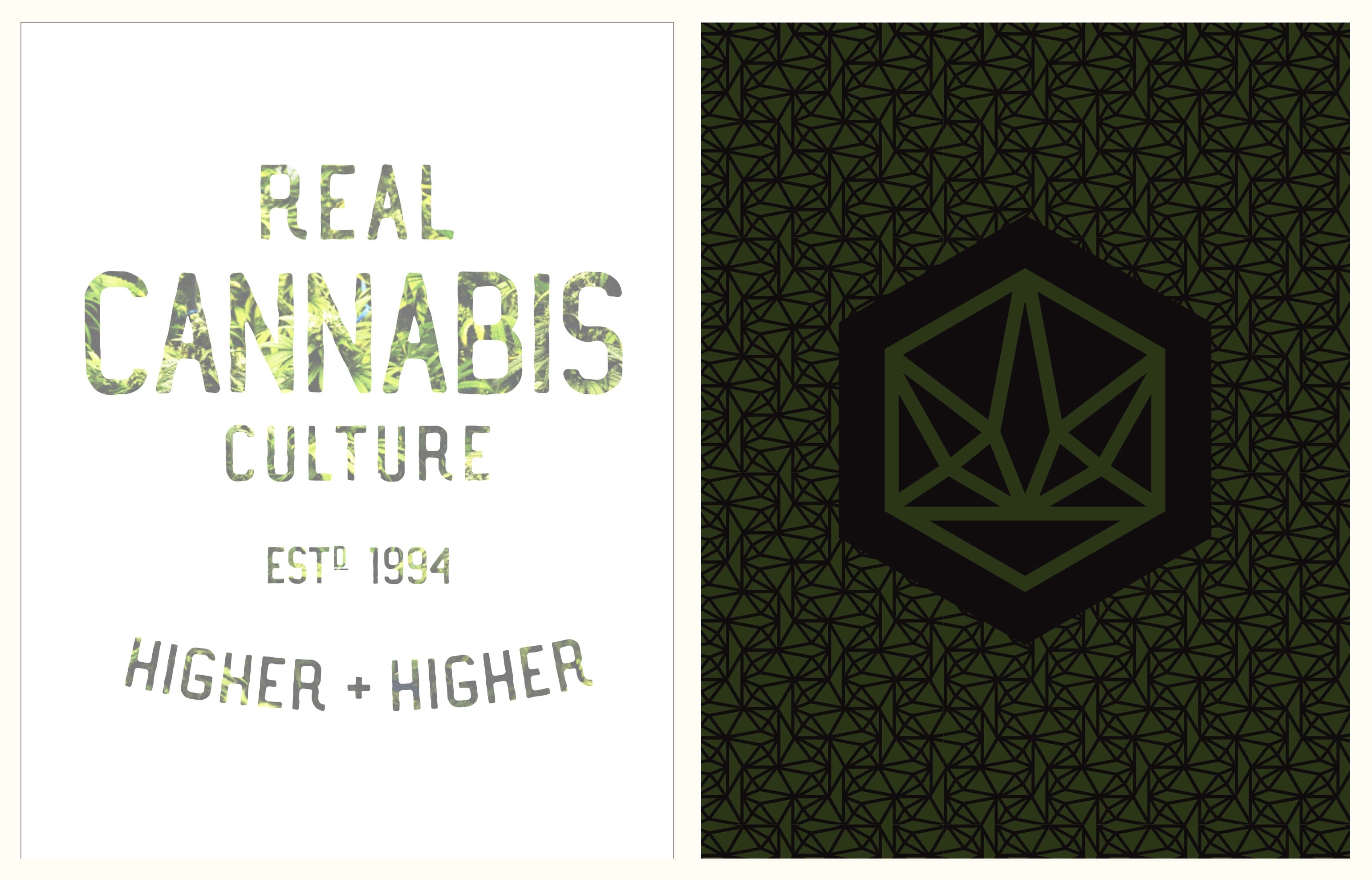
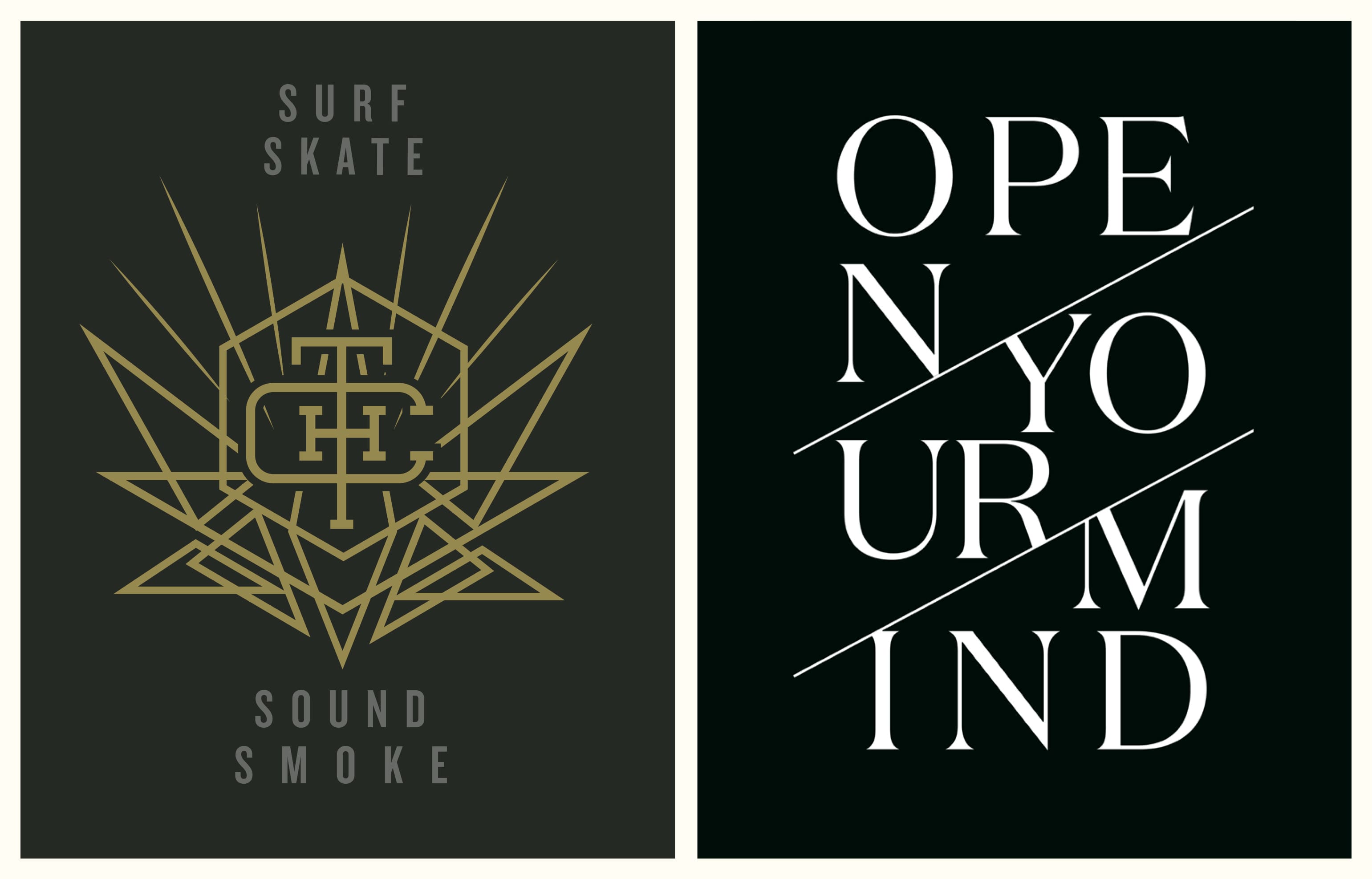
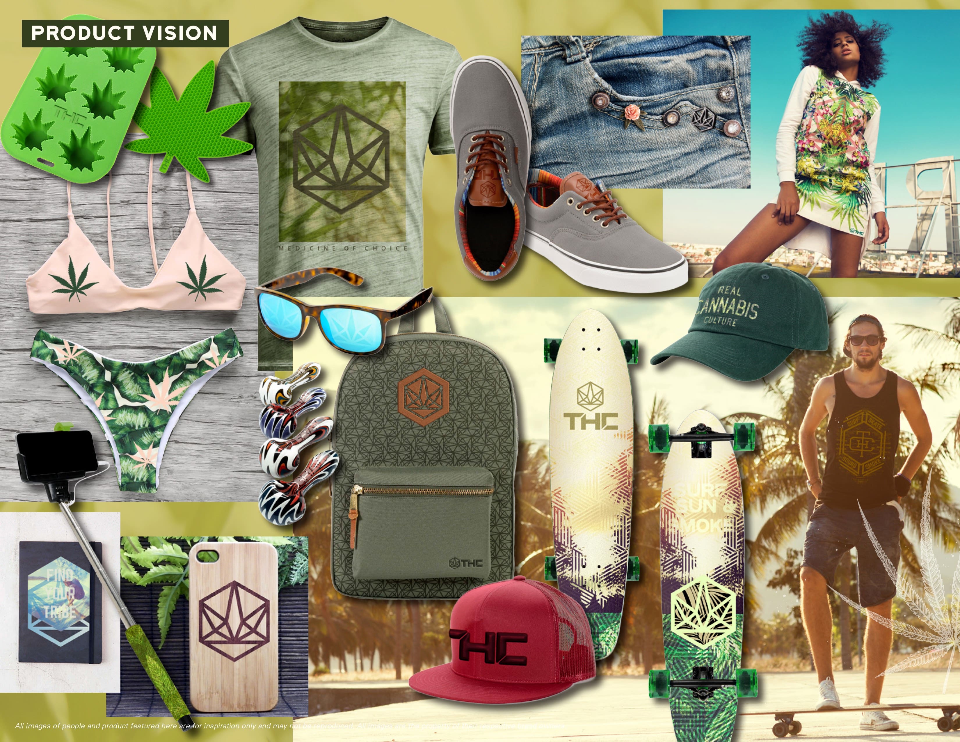
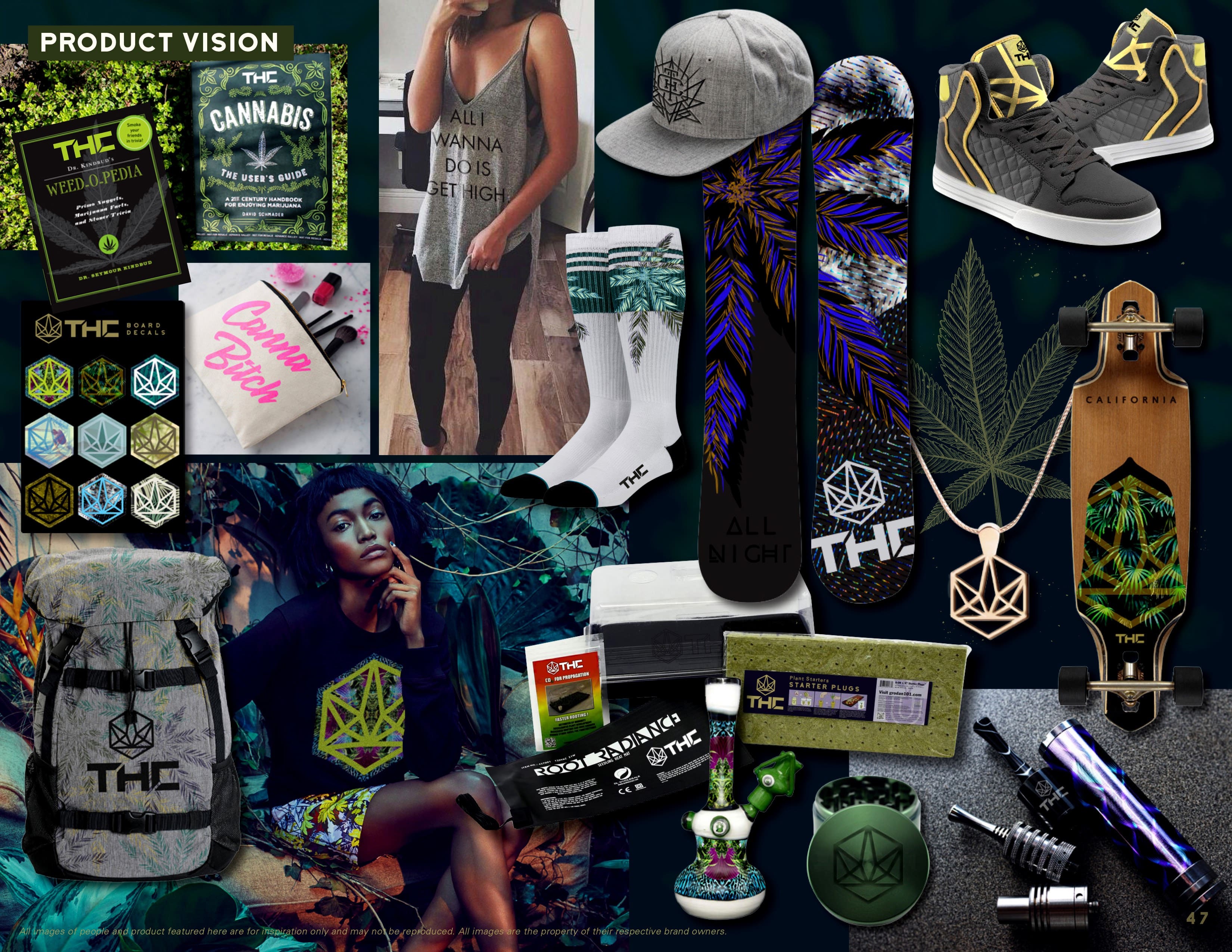
The final segment of the guide provided three trend collections to give licensees and other potential partners a wider range of aesthetic options. The first two collections were named Sativa and Indica. And like their respective strains, they each evoked a different attitude: the first with a sunnier vibe more in line with the surf and skate culture of Southern California; the second darker and grittier in tone, geared more toward a night out in the city. Both collections included a product vision montage, composed designs, patterns and backgrounds, as well as a list of sample editorial sayings. The third collection was a throwback to the original THC logo, using a variety of new logo treatments to make the image work in any situation.
To see the branding in action, check out THC.com. And to learn more about Pineapple Express, visit pineappleexpress.com.